5.1 Beginning at the end
The approach we’ll use in this Chapter will be to start off by showing you a figure which we suggest is at a standard that you could use in a poster or presentation. Using that as the aim, we will then work towards it step-by-step. You should not view this final figure as any sort of holy grail. For instance, you would be very unlikely to use this in a publication (you’d be much more likely to use some results from your hard earned-analysis). Regardless, this “final figure” is, and will only ever be, a reflection of what our personal preferences are. As with anything subjective, you may well disagree, and to some extent we hope you do. Much better that we all have slightly (or grossly) different views on what a good figure is - otherwise we may as well go back to using cookie-cutter figures.
So what’s the figure we’re going to make together?
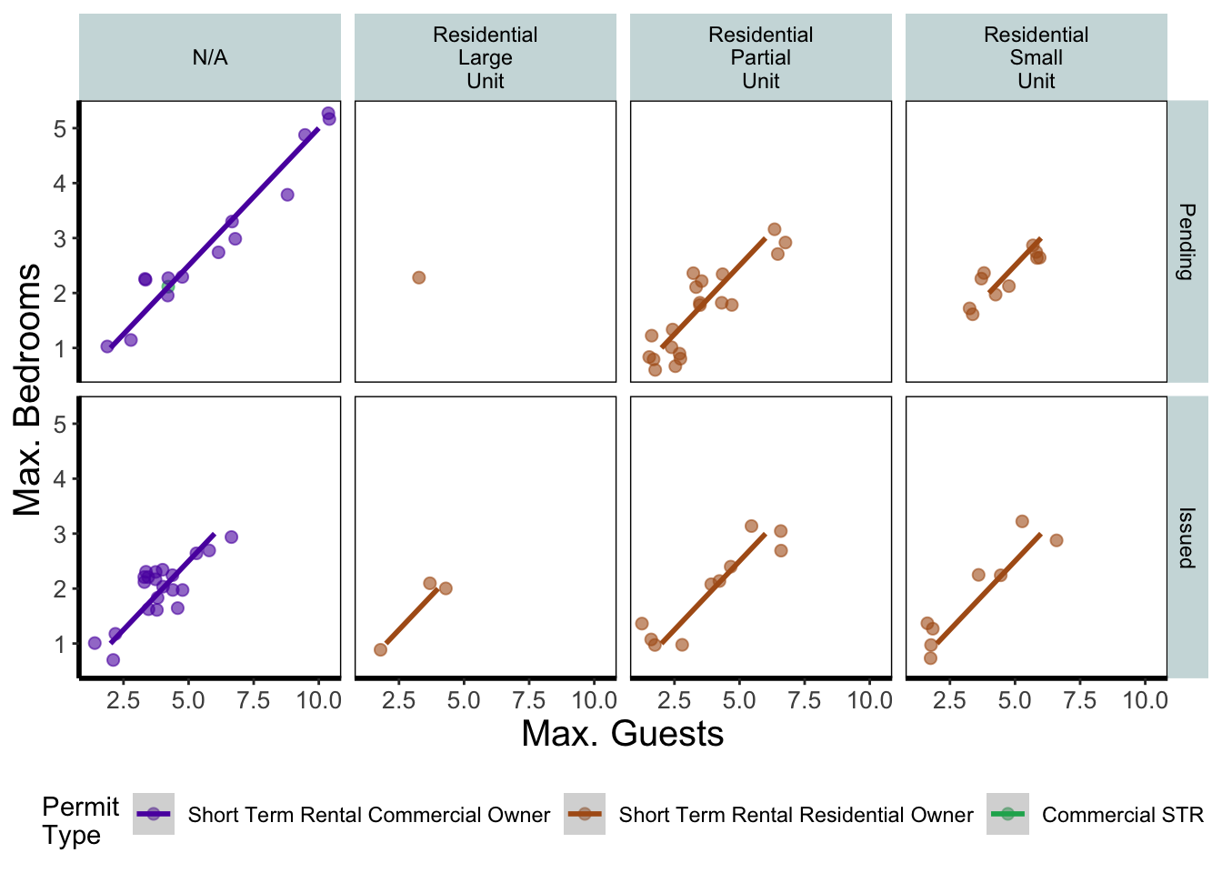
This is not an interesting figure. But it is illustrative of some of the things you can do with ggplot. On the y axes of the four plots we have the maximum number of bedrooms, and on the x axes we have the maximum number of guests. Each column of plots shows the Residential Subtype (N/A for non-residential). Each row of plots identifies which the permit is issued or is pending..
The different coloured points within each plot represent different types of permit. For example, data points coloured purple and green were commercial permits while the brown points are residential permits.
We have also added four trend lines to each plot.