Network Analysis of Internal Migration
Introduction
Places can be understood as intricate webs of connection rather than mere collections of buildings and roads. Beneath their visible structures lie countless interdependencies linking people, organizations, and activities. Transport routes move not only goods and commuters but also ideas and opportunities. Relationships among residents shape patterns of cooperation and trust. Economic exchanges tie together firms and regions, while digital communication networks influence how information and resources circulate. For planners, recognizing these overlapping systems of connection is essential, since each type of network shapes how cities function, adapt, and grow. The questions we ask about these linkages, in turn, determine the kinds of tools and analyses we bring to bear.
Network analysis offers a powerful framework for understanding these complex interconnections. By representing places as networks of nodes (e.g., individuals, organizations, locations) linked by edges (e.g., relationships, flows, interactions), we can uncover patterns and structures that traditional analyses might miss. This approach allows us to explore how different types of connections influence urban dynamics, from social cohesion to economic development.
In this post, we will explore the application of network analysis to internal migration patterns within a country. Internal migration—the movement of people from one region to another within national borders—plays a crucial role in shaping demographic trends, economic opportunities, and social dynamics. By analyzing migration flows as a network, we can gain insights into the factors driving these movements and the implications for regional development.
Data Preparation
This tutorial demonstratesnetwork analysis techniques applied to county-to-county migration data within American Community Survey by US Census. Make sure that you have CENSUS_API_KEY installed.
ACS captures detailed information on where people lived one year ago, allowing researchers, planners, and policymakers to analyze patterns of residential mobility within and across states, counties, and metropolitan areas. This dataset sheds light on domestic and international migration flows, helping to identify demographic, economic, and social characteristics associated with movers versus non-movers. By linking migration with variables such as age, income, education, and housing tenure, ACS migration data offers insights into population dynamics, urban growth, labor market shifts, and regional disparities—informing decisions in areas ranging from transportation and housing planning to workforce development and community resilience.
We’ll explore:
- Graph construction from migration flows
- Centrality measures to identify key migration hubs
- Community detection algorithms for regional clustering
# Core network analysis
library(igraph)
library(spdep)

# Spatial data handling
library(sf)
library(tigris)
library(tidycensus)

# Data manipulation
library(tidyverse)

# Visualization
library(ggplot2)
library(ggraph)
library(tmap)
library(tmaptools)
library(patchwork)

# Set options
options(tigris_use_cache = TRUE)
sf_use_s2(FALSE)
# Download county boundaries
county_sf <- tigris::counties(year = 2020, class = "sf", progress_bar = FALSE) %>%
  select(GEOID, NAME, geometry)

# Download county-to-county migration flows from ACS
migration_df <- get_flows(
  geography = "county",
  year = '2020',
  moe_level = 95
)

glimpse(migration_df)
# Rows: 1,440,390
# Columns: 7
# $ GEOID1     <chr> "01001", "01001", "01001", "01001", "01001", "01001", "0100…
# $ GEOID2     <chr> NA, NA, NA, NA, NA, NA, NA, NA, NA, "01003", "01003", "0100…
# $ FULL1_NAME <chr> "Autauga County, Alabama", "Autauga County, Alabama", "Auta…
# $ FULL2_NAME <chr> "Asia", "Asia", "Asia", "Europe", "Europe", "Europe", "U.S.…
# $ variable   <chr> "MOVEDIN", "MOVEDOUT", "MOVEDNET", "MOVEDIN", "MOVEDOUT", "…
# $ estimate   <dbl> 80, NA, NA, 195, NA, NA, 5, NA, NA, 30, 489, -459, 5, 0, 5,…
# $ moe        <dbl> 66.723404, NA, NA, 307.404255, NA, NA, 91.744681, NA, NA, 4…
tail(migration_df)
# # A tibble: 6 × 7
#   GEOID1 GEOID2     FULL1_NAME                FULL2_NAME variable estimate   moe
#   <chr>  <chr>      <chr>                     <chr>      <chr>       <dbl> <dbl>
# 1 72153  4207121344 Yauco Municipio, Puerto … East Lamp… MOVEDIN         0  35.7
# 2 72153  4207121344 Yauco Municipio, Puerto … East Lamp… MOVEDOUT       13  27.4
# 3 72153  4207121344 Yauco Municipio, Puerto … East Lamp… MOVEDNET      -13  27.4
# 4 72153  5513384250 Yauco Municipio, Puerto … Waukesha … MOVEDIN        31  59.6
# 5 72153  5513384250 Yauco Municipio, Puerto … Waukesha … MOVEDOUT        0  26.2
# 6 72153  5513384250 Yauco Municipio, Puerto … Waukesha … MOVEDNET       31  59.6
From the glimpses of the data few things are obvious about the data cleaning that needs to happen
- GEOID columns are fips codes, but some GEOIDs are NA (e.g. international migration)
- There are three variables related to migration counts. We might want to focus only on net migration. These net migration values can be negative.
- Self-loops (within-county migration) may or may not be useful to keep
- Some GEOIDs are not counties (length > 5)
- Some county pairs have very little migration. So we may need to impose a threshold.
As has been the theme, these are not exhaustive but illustrative of kinds of judgments we need to make.
withinUS_migration_df <-
  migration_df %>%
  filter(!is.na(GEOID1) & !is.na(GEOID2)) %>%
  filter(str_length(GEOID1) == 5 & str_length(GEOID2) ==5) %>%
  filter(variable == "MOVEDNET") %>%
  filter(GEOID1 != GEOID2)

nrow(withinUS_migration_df)
# [1] 406348

glimpse(withinUS_migration_df)
# Rows: 406,348
# Columns: 7
# $ GEOID1     <chr> "01001", "01001", "01001", "01001", "01001", "01001", "0100…
# $ GEOID2     <chr> "01003", "01005", "01007", "01015", "01017", "01019", "0102…
# $ FULL1_NAME <chr> "Autauga County, Alabama", "Autauga County, Alabama", "Auta…
# $ FULL2_NAME <chr> "Baldwin County, Alabama", "Barbour County, Alabama", "Bibb…
# $ variable   <chr> "MOVEDNET", "MOVEDNET", "MOVEDNET", "MOVEDNET", "MOVEDNET",…
# $ estimate   <dbl> -459, 5, -36, -21, -7, 6, 18, -6, -116, -111, -27, 51, -86,…
# $ moe        <dbl> 471.829787, 9.531915, 73.872340, 40.510638, 19.063830, 14.2…
It might be helpful to see how the migration flows work for one county. Let’s focus on Orange county (fips 37135)
withinUS_migration_df %>%
  filter(GEOID1 == "37135" | GEOID2 == "37135") %>%
  select(GEOID1, GEOID2, estimate) %>%
  arrange(desc(abs(estimate)))
# # A tibble: 700 × 3
#    GEOID1 GEOID2 estimate
#    <chr>  <chr>     <dbl>
#  1 37119  37135      -746
#  2 37135  37119       746
#  3 37001  37135       537
#  4 37135  37001      -537
#  5 37135  37147      -452
#  6 37147  37135       452
#  7 37063  37135       293
#  8 37135  37063      -293
#  9 12011  37135      -263
# 10 37129  37135      -263
# # ℹ 690 more rows
This dataset immediately points to some interesting artefacts about the data. For example, there is a dual for each county pair. For example, there is a flow of 746 from Orange County to Mecklenburg (37119) and a flow of 746 from Mecklenburg County to Orange County. Yet they represent the same flow. We need to get only keep one.
We will use the pmin and pmax functions to create sorted columns for each county pair and then use distinct to deduplicate.
withinUS_migration_df2 <- withinUS_migration_df %>%
  mutate(sorted_col1 = pmin(GEOID1, GEOID2),
         sorted_col2 = pmax(GEOID1, GEOID2)) %>%
  distinct(sorted_col1, sorted_col2, .keep_all = TRUE) %>%
  select(-sorted_col1, -sorted_col2)  # Remove temporary columns

nrow(withinUS_migration_df2)
# [1] 203174
You should see that the dataset is exactly half as large as before.
Graph Construction
Now that we have a cleaned migration dataset, we can construct a graph object using the igraph package. In this graph, counties will be represented as nodes, and migration flows between them will be represented as edges.
In the process of this construction, we will also reverse the flow of the edge based on the sign of the net migration value, so that we end up with non-zero edge weights.The weight of each edge will correspond to the absolute value of the net migration between the two counties.
# First remove small migration flows
withinUS_migration_df2 <-
  withinUS_migration_df2 %>%
  filter(estimate > 50 | estimate < -50)


G1 <- graph_from_data_frame(
  d = withinUS_migration_df2,
  directed = TRUE)

G1
# IGRAPH 57d2fdb DN-- 3083 40279 --
# + attr: name (v/c), FULL1_NAME (e/c), FULL2_NAME (e/c), variable (e/c),
# | estimate (e/n), moe (e/n)
# + edges from 57d2fdb (vertex names):
#  [1] 01001->01003 01001->01029 01001->01031 01001->01035 01001->01045
#  [6] 01001->01047 01001->01051 01001->01055 01001->01073 01001->01089
# [11] 01001->01097 01001->01101 01001->01109 01001->01113 01001->01123
# [16] 01001->01125 01001->01131 01001->12033 01001->13073 01001->13135
# [21] 01001->20103 01001->22015 01001->24017 01001->35001 01001->35009
# [26] 01001->45085 01001->49049 01001->51153 01001->51810 01001->53053
# [31] 01003->01015 01003->01019 01003->01029 01003->01045 01003->01053
# + ... omitted several edges


E(G1)$weight <- withinUS_migration_df2$estimate

G1 <- reverse_edges(G1, E(G1)[E(G1)$weight<0])

E(G1)$weight <- abs(E(G1)$weight)
You can access the vertices and edges using V and E functions.
Remember a graph can have multiple components. i.e. there is no ‘valid’ path between all pairs of nodes.
V(G1)%>% head
# + 6/3083 vertices, named, from 57dd412:
# [1] 01001 01003 01005 01007 01009 01011

E(G1) %>% head
# + 6/40279 edges from 57dd412 (vertex names):
# [1] 01003->01001 01029->01001 01031->01001 01001->01035 01045->01001
# [6] 01001->01047

E(G1)$weight %>% head
# [1] 459 116 111  51  86  94

# Graph summary
cat("Graph Properties:\n")
# Graph Properties:
cat("Vertices:", vcount(G1), "\n")
# Vertices: 3083
cat("Edges:", ecount(G1), "\n")
# Edges: 40279
cat("Density:", edge_density(G1), "\n")
# Density: 0.004239089
cat("Directed:", is_directed(G1), "\n")
# Directed: TRUE
cat("Weighted:", is_weighted(G1), "\n")
# Weighted: TRUE
cat("Number of components:", components(G1)$no, "\n")
# Number of components: 3
You can extract subgraphs for a subset of vertices. E.g. you can extract just the California subgraph as follows.
CA_sample <- V(G1)[str_sub(V(G1)$name, 1,2) == "06"]
CA_G1 <- induced_subgraph(G1, CA_sample)


# plot using ggraph
library(ggraph)
ggraph(CA_G1, layout = 'kk') +
    geom_edge_fan(show.legend = FALSE) +
    geom_node_point()
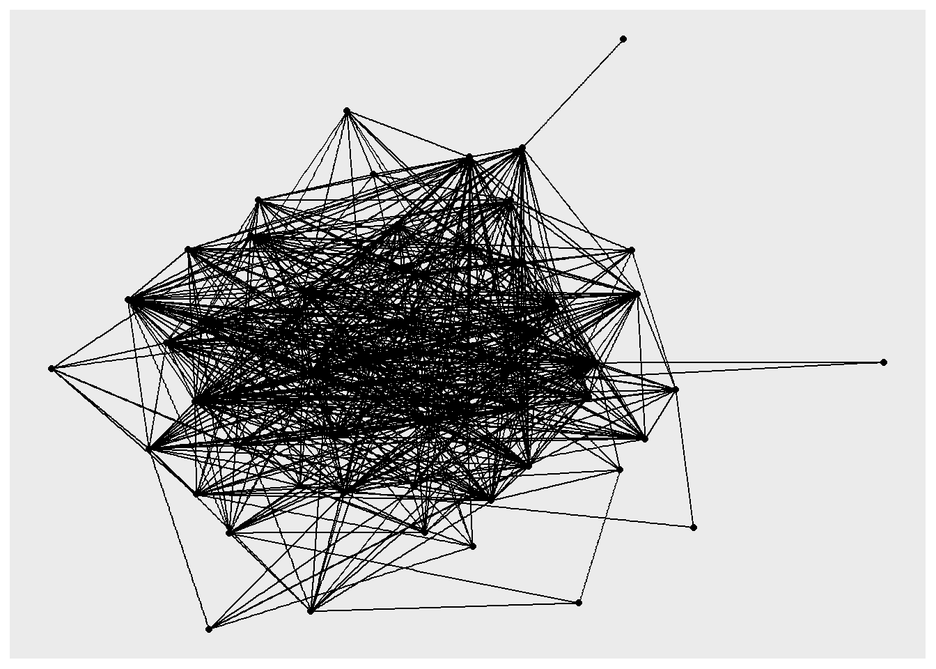
Note that the graph does not respect the geographic locations. If you want to fix the positions relative to their lat/long coordinates, you should can specify them using layout parameters.
Exercise
- Use different layouts (such as star and cricle) to visualise the network.
- Use different edge attributes to style the edges of the above graph
- Style the vertices using for e.g. number of incoming trips per day, or their location in different boroughs.
Adjacency matrix
One representation of a graph is an adjacency matrix. It is a square matrix used to represent a finite graph. The elements of the matrix indicate whether pairs of vertices are adjacent or not in the graph. Each row and each column represents a single vertex. $ A $ is and adjacency matrix, whose elements $ a_{ij} $ is 0 when vertices/nodes $ i $ and $ j $ are not adjacent. If the graph is undirected and unweighted then $ a_{ij} $ is 1 only when they are adjacent. In the case of a directed graph, the matrix is not symmetric. In our case, we have a weighted directed graph with the weights representing the flow between two counties. To visualise a portion of this matrix try
as_adjacency_matrix(G1, attr = "weight")[1:6, 1:6]
# 6 x 6 sparse Matrix of class "dgCMatrix"
#       01001 01003 01005 01007 01009 01011
# 01001     .     .     .     .     .     .
# 01003   459     .     .     .     .     .
# 01005     .     .     .     .     .    52
# 01007     .     .     .     .     .     .
# 01009     .     .     .     .     .     .
# 01011     .     .     .     .     .     .
Adjacency matrix is very important as it allows us to perform matrix operations much more efficiently as we will see in other tutorials
Degree Distribution and Strength
In network analysis, degree distribution describes how connections (or links) are spread among nodes—essentially showing how many nodes have few versus many connections. It provides insight into the overall structure of the network, such as whether it is centralized around a few highly connected hubs or more evenly connected. Strength, on the other hand, extends this idea to weighted networks, where connections have varying intensities or capacities. A node’s strength is the sum of the weights of its links, capturing not just how many connections it has but also how strong or important those connections are. Together, degree and strength reveal both the topology and the intensity of interactions within a network.
# Strength (weighted degree)
V(G1)$in_strength <- strength(G1, mode = "in")
V(G1)$out_strength <- strength(G1, mode = "out")

# Degree distribution plots
deg_data <- tibble(
  in_str = V(G1)$in_strength,
  out_str = V(G1)$out_strength
)

p1 <- ggplot(deg_data, aes(x = in_str)) +
  geom_histogram(bins = 30, fill = "steelblue", alpha = 0.7) +
  scale_x_log10() +
  labs(title = "In-strength Distribution", x = "In-strength (log scale)", y = "Count") +
  theme_minimal()

p2 <- ggplot(deg_data, aes(x = out_str)) +
  geom_histogram(bins = 30, fill = "coral", alpha = 0.7) +
  scale_x_log10() +
  labs(title = "Out-strength Distribution", x = "Out-strength (log scale)", y = "Count") +
  theme_minimal()

p1 + p2
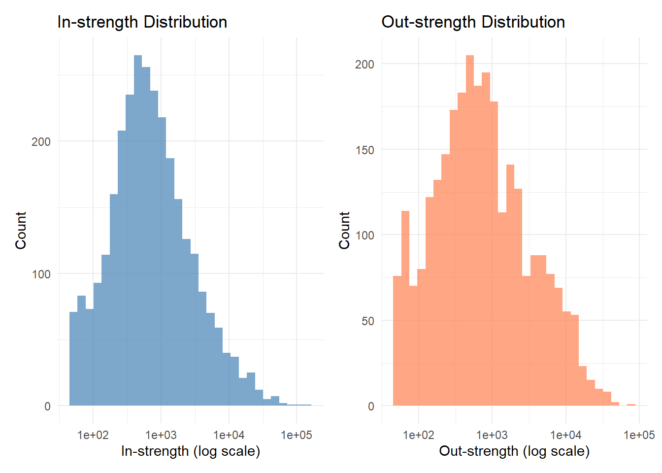
The degree distribution in a migration flow graph show how many counties each county exchanges migrants with—whether most places have only a few migration connections or some act as major hubs linking to many others. The strength of a node reflects the total volume of migration associated with it, summing the number of people moving in and out. Areas with high degree and strength are migration hubs, attracting and sending large numbers of movers to many destinations, while areas with low values are more isolated or stable. Analyzing degree and strength together helps reveal whether migration is concentrated around a few key centers or more evenly distributed across the network.
tibble(
  name = V(G1)$name,
  in_strength = V(G1)$in_strength) %>%
  arrange(desc(in_strength)) %>%
  slice_head(n = 10) %>%
  select(name, in_strength) %>%
  knitr::kable()
| name | in_strength |
|---|---|
| 06037 | 143791 |
| 17031 | 96129 |
| 36047 | 77452 |
| 12086 | 58136 |
| 36081 | 56865 |
| 48113 | 52080 |
| 06073 | 51701 |
| 48201 | 51014 |
| 36061 | 48548 |
| 06059 | 45896 |
The table above shows the top 10 counties by in-strength, indicating they are major destinations for internal migration. These counties attract large numbers of movers from various origins, highlighting their role as key migration hubs within the network.
Centrality Measures
In a migration network, centrality measures help identify which counties play the most influential roles in shaping population movement patterns. Degree centrality highlights areas with many migration connections, indicating places that are broadly linked to others as sources or destinations. Betweenness centrality identifies regions that act as intermediaries or “bridges” through which migration flows pass, revealing potential transit hubs or gateway regions. Closeness centrality measures how easily a region can reach all others in the network, capturing accessibility and potential influence over migration dynamics. Eigenvector centrality emphasizes areas connected to other highly connected regions, showing influence within the broader migration system. Together, these measures uncover the structural importance of different places—distinguishing between migration attractors, gateways, and peripheral regions—offering valuable insights for understanding regional interdependence and mobility patterns.
Borrowing from web and information networks, hub regions are those that send migrants to many important destinations, acting as major sources or dispersal centers. Authority regions, by contrast, are key destinations that receive migrants from many influential origins. A region with high hub centrality may represent an area with strong outward migration links—such as people moving out for jobs or education—while one with high authority centrality may be an attractive destination due to economic opportunities or urban amenities. Combined with other centrality measures like degree, betweenness, and eigenvector centrality, the hub–authority framework helps distinguish between migration senders, receivers, and intermediaries, revealing how population movements are structured around dominant centers and supporting regions within the wider mobility system.
# Multiple centrality measures

V(G1)$betweenness <- betweenness(G1, directed = TRUE, weights = 1/E(G1)$weight)
V(G1)$closeness <- closeness(G1, mode = "all", weights = 1/E(G1)$weight)
V(G1)$eigenvector <- eigen_centrality(G1, directed = TRUE,
                                     weights = E(G1)$weight)$vector
V(G1)$pagerank <- page_rank(G1, weights = E(G1)$weight)$vector

# Hub and authority scores (for directed networks)
hub_auth <- hub_score(G1, weights = E(G1)$weight)
V(G1)$hub <- hub_auth$vector
V(G1)$authority <- authority_score(G1, weights = E(G1)$weight)$vector

# Extract centrality data
centrality_df <- tibble(
  fips = V(G1)$name,
  betweenness = V(G1)$betweenness,
  closeness = V(G1)$closeness,
  eigenvector = V(G1)$eigenvector,
  pagerank = V(G1)$pagerank,
  hub = V(G1)$hub,
  authority = V(G1)$authority,
  in_strength = V(G1)$in_strength,
  out_strength = V(G1)$out_strength
)

centrality_df %>%
        arrange(desc(pagerank)) %>%
        select(fips, pagerank, in_strength, out_strength) %>%
        head(10) %>%
        knitr::kable()
| fips | pagerank | in_strength | out_strength |
|---|---|---|---|
| 36061 | 0.0194967 | 48548 | 16160 |
| 36047 | 0.0152540 | 77452 | 12009 |
| 17031 | 0.0125918 | 96129 | 12644 |
| 06037 | 0.0112714 | 143791 | 24008 |
| 36081 | 0.0094103 | 56865 | 11187 |
| 12086 | 0.0053119 | 58136 | 13055 |
| 48201 | 0.0051530 | 51014 | 35574 |
| 06073 | 0.0050836 | 51701 | 30208 |
| 36005 | 0.0048895 | 33568 | 13418 |
| 36059 | 0.0045158 | 25140 | 17744 |
Community Detection
Finding a community structure in a network is to identify clusters of nodes that are more strongly connected within the cluster than to nodes outside the cluster. In a migration network, community detection aims to identify groups of regions that are more strongly connected to each other through migration flows than to regions outside their group.
By detecting such clusters, we can uncover hidden regional systems and patterns of spatial integration or fragmentation. For example, community detection might reveal clusters of interconnected cities forming regional migration corridors or identify peripheral areas that are loosely tied to core migration hubs. Understanding these communities helps planners and policymakers recognize functional regions, target regional development efforts, and anticipate how shifts in employment, housing, or climate might reshape internal migration patterns.There are many algorithms that identify community structures.
## Multiple Community Detection Algorithms
# Convert to undirected for community detection
G_undir_weighted <- as.undirected(G1, mode = "collapse",
                                  edge.attr.comb = list(weight = "sum"))

# 1. Louvain (fast, good quality)
comm_louvain <- cluster_louvain(G_undir_weighted, weights = E(G_undir_weighted)$weight)

# 2. Walktrap (random walks)
comm_walktrap <- cluster_walktrap(G_undir_weighted, weights = E(G_undir_weighted)$weight)


# 3. Label Propagation (very fast)
comm_label_prop <- cluster_label_prop(G_undir_weighted,
                                      weights = E(G_undir_weighted)$weight)

# Store memberships
V(G1)$comm_louvain <- comm_louvain$membership
V(G1)$comm_walktrap <- comm_walktrap$membership
V(G1)$comm_label_prop <- comm_label_prop$membership

# Compare algorithms
comm_compare <- data.frame(
  Algorithm = c("Louvain", "Walktrap", "Label Propagation"),
  N_Communities = c(length(unique(comm_louvain$membership)),
                    length(unique(comm_walktrap$membership)),
                    length(unique(comm_label_prop$membership))),
  Modularity = c(modularity(comm_louvain),
                 modularity(comm_walktrap),
                 modularity(comm_label_prop))
)

knitr::kable(comm_compare, digits = 3,
             caption = "Community Detection Algorithm Comparison")
Table: (#tab:community_detection)Community Detection Algorithm Comparison
| Algorithm | N_Communities | Modularity |
|---|---|---|
| Louvain | 13 | 0.506 |
| Walktrap | 377 | 0.465 |
| Label Propagation | 98 | 0.442 |
Exercise
- Map these clusters using tmap or ggplot2
Conclusions
Network analysis techniques provide a very useful set of tools that we can apply in many contexts in urban analytics. Networks are ubiquitous and the above two are but few of the situations where network tools can be readily applied. They need to be used more, and used judiciously.
Nikhil Kaza
Professor
My research interests include urbanization patterns, local energy policy and equity