Regions of Deprivation

Introduction
This post was last updated on 2025-08-13
In addition to obvious networks, we can also use graph theory to think though some non-obvious applications. One place this often crops up in planning is to think about adjacency/proximity as a graph. See my post on employment centers and paper on delineating areas.
In this post, I will demonstrate how to use networks for other spatial analysis. We can think of polygons as nodes and two nodes are connected if they have a relationship. These relationships can be spatial (e.g. sharing a boundary) or non-spatial (e.g. sharing a common attribute) or a combination of both.
Acquire data
Much of data acquisition follows the post on tidycensus. So I won’t repeat much of it, except to provide an uncommented source code below. In this case, I am focusing on both the Carolinas.
options(tigris_use_cache = TRUE)
library(tidyverse)
library(tidycensus)
library(tigris)
library(sf)
library(tmap)
library(RColorBrewer)
library(igraph)


NC_SC <- c('37', '45') # FIPS code for NC and SC.

### Download  geographies of interest

ctys <- tigris::counties() %>%
          filter(STATEFP %in% NC_SC) %>%
          st_transform(4326) %>%
          select(GEOID, NAME)


######### Download variables of interest. ###


pop <- map_dfr(NC_SC, function(us_state) {
                          get_decennial(geography = "county",
                                  variables = "P1_001N",
                                  state = us_state,
                                  geometry = FALSE
                                  )
  }) %>%
  select(GEOID, pop_census = value)


# Calculate Poverty Rate by first downloading people below poverty & number of people for whom poverty status is determined.
# https://www.socialexplorer.com/data/ACS2022_5yr/metadata/?ds=ACS22_5yr&table=B17001

pov <- map_dfr(NC_SC, function(us_state) {
                          get_acs(geography = "county",
                                  variables = "B17001_002",  # People below poverty
                                  summary_var = 'B17001_001', # Denominator
                                  state = us_state,
                                  geometry = FALSE,
                                  year = 2022)
  })


pov_rate <- pov %>%
  rename(pop_acs = summary_est,
         pov_est = estimate) %>%
  mutate(pov_rate = pov_est/pop_acs) %>%
  select(GEOID, NAME, pov_est, pop_acs, pov_rate)

### Calculate Unemployment rate ####
### https://www.socialexplorer.com/data/ACS2022_5yr/metadata/?ds=ACS22_5yr&table=B23001
### To do that first need to figure out Labor Force ####


# Only focusing on Female Unemployment Rate. If you want to use the male ones, please use this commented code
#lf_m <- paste("B23001_", formatC(seq(4,67,7), width=3, flag="0"), "E", sep="")
# You may need to add them up to get the total labor force and total unemployed persons.


lf_f <- paste("B23001_", formatC(seq(90,153,7), width=3, flag="0"), "E", sep="")

lf <- map_dfr(NC_SC, function(us_state) {
                          get_acs(geography = "county",
                                  variables = c(lf_f),
                                  state = us_state,
                                  geometry = FALSE,
                                  year = 2022)
  })


#unemp_m <- paste("B23001_", formatC(seq(8,71,7), width=3, flag="0"), "E", sep="") # See above comment
unemp_f <- paste("B23001_", formatC(seq(94,157,7), width=3, flag="0"), "E", sep="")

unemp <- map_dfr(NC_SC, function(us_state) {
                          get_acs(geography = "county",
                                  variables = c(unemp_f),
                                  state = us_state,
                                  geometry = FALSE,
                                  year = 2022)
  })


lf_t <- lf %>%
  group_by(GEOID) %>%
  summarize(lf_est = sum(estimate, na.rm=T))

unemp_t <- unemp %>%
  group_by(GEOID) %>%
  summarize(unemp_est = sum(estimate, na.rm=T))

unemp_rate <- left_join(lf_t, unemp_t, by='GEOID') %>%
  filter(lf_est >0) %>%
  mutate(unemp_rate = unemp_est/lf_est)

df <- left_join(pov_rate, unemp_rate, by='GEOID')
df <- left_join(df, pop, by=c('GEOID'))

rm(pov, pov_rate, unemp, unemp_rate, lf, lf_t, unemp_t, pop, lf_f, unemp_f)
Spatial Relationships as a Graph/Network
If you have a any relationship between a pair of objects, you can represent it as a graph. Spatial relationships are no different and different types of spatial relationships present different graphs. Recall that if a relationship is present, then the nodes are considered adjacent.
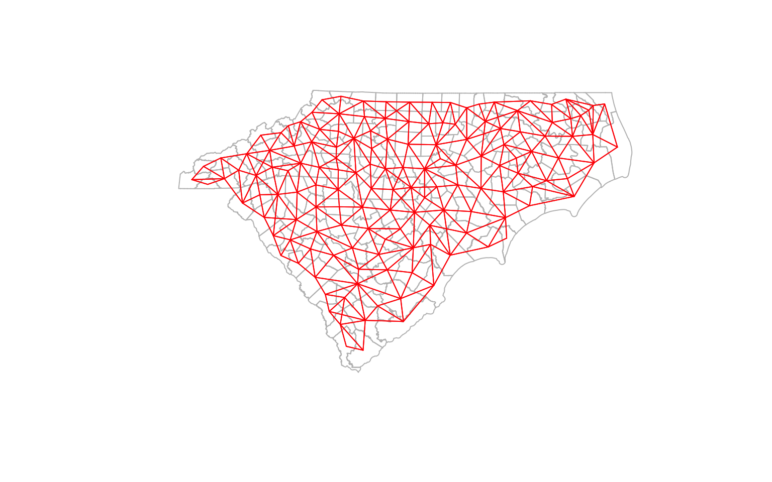
Queen Contiguity
In the case of spatial data, adjacency can be defined by sharing a boundary segment (Rook) or a point (Queen).There are many other types of spatial relationships (e.g. overlaps, contains) that might be of interest.
Recall that a graph can be represented as an adjacency matrix where the nodes are both rows and columns. In this case, the adjacency matrix is a binary matrix, where 1 represents adjacency and 0 represents no adjacency. We can use spdep package to construct the neighbour list for common spatial relationships such as adjacency and distances.
library(spdep)
cty_nb <- poly2nb(ctys, queen=TRUE, row.names = ctys$GEOID)
# Construct a neighborhood object
coords <- st_centroid(ctys, of_largest_polygon = T) %>% st_coordinates()
plot(st_geometry(ctys), border = 'gray')
plot(cty_nb, coords, col='red', points=F, add=T) # Quickly visualise the graph
K-nearest Neighbors
There is no reason to think of adjacency as just sharing a boundary. It could be based on some other criteria. For example, we could think of adjacency as being close in distance. In this case, we could specify three closest neighbours as the adjacency. Note that this is not a symmetric relationship, unlike the queen contiguity.
cty_knn <- knn2nb(knearneigh(coords, k=3), row.names = ctys$GEOID)
cty_knn <- make.sym.nb(cty_knn) # Make it symmetric

diff_nb_knn <-diffnb(cty_knn, cty_nb)

# This is an old school way of plotting and arranging them. If you don't understand it, don't worry about it. It is used for illustration purposes only
opar <- par()
par(mfrow = c(1, 2)) # Create a 1 x 2 plotting matrix
# The next 2 plots created will be plotted next to each other

plot(st_geometry(ctys),border="grey", main = "KNN Graph")
plot(cty_knn, coords, col='black',points=F, add=T) # Quickly visualise the graph


plot(st_geometry(ctys), border="grey", main = 'Differences between Contiguity (black) and KNN (dashed red)')
plot(cty_nb, coords, col='black', points=F, add=T)
plot(diff_nb_knn, coords, col='red', points=F,add=T, lty=2) # Quickly visualise the graph
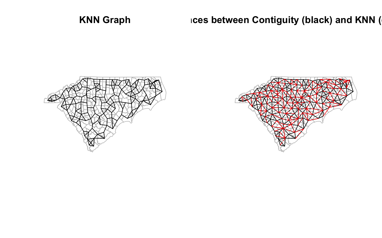
par(opar) # Reset the plotting matrix
Neighbors based on travel times conditioned on road networks
We don’t even need to rely on geographic relationships to identify the neighbours. We could use maximum travel times (e.g. say 1.5 hr) as a proxy for adjacency . We could use the road network to calculate travel times between the centroids of the counties. I am not going to explain this code in detail, but it is an example of how to get a quick and dirty travel times using OpenStreetMap data.
library(dodgr)
library(osmdata)
library(osmextract)

#add extra tags for routing
et = c("oneway", "maxspeed", "lanes")

#extract nc, sc road network using osmextract

rds_nc<- oe_get_network(place  = "north carolina", mode = "driving", extra_tags = et, quiet =T) %>%
        filter(highway %in% c("motorway", 'motorway_link', 'primary', 'primary_link'))

rds_sc<- oe_get_network(place  = "south carolina", mode = "driving", extra_tags = et, quiet = T)%>%
        filter(highway %in% c("motorway", 'motorway_link', 'primary', 'primary_link'))

rds <- rbind(rds_nc, rds_sc)
rm(rds_nc, rds_sc)

net <- weight_streetnet (rds, wt_profile = "motorcar")
nodes <- st_centroid(ctys, of_largest_polygon = T) %>%
          st_coordinates()

traveltimes <- dodgr_times(net, from = nodes, to = nodes)
rownames(traveltimes) <- ctys$GEOID
colnames(traveltimes) <- ctys$GEOID
traveltime_adjacency <- ifelse(traveltimes > 1.5*60*60 | is.na(traveltimes), 0, 1) # 1.5 hours travel time on major roads


cty_tt <- mat2listw(traveltime_adjacency, style="B", zero.policy=TRUE, row.names = ctys$GEOID)
cty_tt_n <- cty_tt$neighbours

cty_tt_n <- make.sym.nb(cty_tt_n) # Make it symmetric

# Visualise

diff_nb_tt <- diffnb(cty_nb, cty_tt_n)
diff_nb_tt_knn <- diffnb(cty_knn, cty_tt_n)

opar <- par()
par(mfrow = c(1, 2)) # Create a 1 x 2 plotting matrix
# The next 2 plots created will be plotted next to each other

plot(st_geometry(ctys),border="grey", main = "Travel Time Adjacency")
plot(cty_tt_n, coords, col='black', points=T, add=T) # Quickly visualise the graph


plot(st_geometry(ctys), border="grey", reset = F, main = 'Differences between KNN (black) and Travel Time (dashed red)')
plot(cty_knn, coords, col='black', points=T, add=T)
plot(diff_nb_tt_knn, coords, col='red', add=T, lty=2) # Quickly visualise the graph
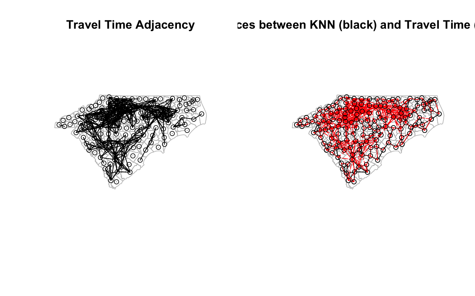
par(opar) # Reset the plotting matrix
Neighbour of Neighbours of…
There is no reason to think that neighbourhood relationship should be of first order. For example, you might be interested in calculating the population of the neighbours of the neighbours. Recall that binary adjacency matrix $ A $ is a representation of paths of length 1 for each vertex. $ A^2 $ is then a representation of number of paths of length 2 and so on. Therefore, $ A^n + A $ is a representation of number of paths of at least length $ n $ between any two nodes. Thus arbitrarily large order of neighbourhoods can be easily constructed. You can then binarise the matrix to get the adjacency matrix of the second order neighbours.
Fortunately, spdep has a function called nblag that can help us with this.
cty_nb2 <- nblag(cty_nb, 2) %>% nblag_cumul # This gives us the second order neighbourhood


opar <- par()
par(mfrow = c(1, 2)) # Create a 1 x 2 plotting matrix
# The next 2 plots created will be plotted next to each other

plot(st_geometry(ctys),border="black", lwd =.1, main = "First Order Neighbours")
plot(cty_nb, coords, col='blue', points=F, add=T, lwd =.3) # Quickly visualise the graph


plot(st_geometry(ctys), border="black", reset = F, lwd=.1,main = 'Second Order Neighbours')
plot(cty_nb2, coords, col='blue', points=F, add=T, lwd = .3)
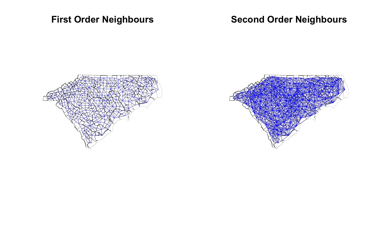
par(opar) # Reset the plotting matrix
Use of Graphs for Spatial Analysis
Until now we constructed the network from spatial relationships. Once it is constructed it can be useful for a number of analyses. For example, occasionally, it becomes useful not only to look at attributes of the ‘focal’ geography, but also calculate some notion of aggregate neighbourhood attributes. From this, one could derive if the focal geography is an anomaly or if it is consistent with the neighbourhood trend. This becomes important when figuring out hotspots or clusters in Spatial Statistics.
Calculating Neighborhood Attributes
For the moment, let me restrict attention to calculating neighbourhood level attributes. In this tutorial, I am going to stick with matrix algebra rather than general graph theory (as it is faster). Recall that 1 in a binary adjacency matrix represent the neighbours in a graph. So matrix multiplication with the relevant attribute will automatically yield aggregate neighbourhood attribute, because multiplying every value except the nieghbour’s with 0, results in 0.
Say for example, we want to calculate how many people live in the adjacent county. I am going to use travel time adjacency as an example.
library(skimr)
diag(traveltime_adjacency) <- 0 # Set diagonal to 0, so that we don't count the population of the focal geography.

df <- df %>%
          arrange(match(GEOID, row.names(traveltime_adjacency))) # Ensure that the order of the rows is the same as the order of the adjacency matrix

df <- df %>%
      mutate(N_pop_census_tt = drop(traveltime_adjacency  %*% pop_census)) # This gives us the total population of the neighbours. drop converts it from 1 column matrix to a vector.

df %>%
  select("pop_census","N_pop_census_tt") %>%
  skim # see how this shakes out.
| Name | Piped data |
| Number of rows | 146 |
| Number of columns | 2 |
| _______________________ | |
| Column type frequency: | |
| numeric | 2 |
| ________________________ | |
| Group variables | None |
Table 1: Data summary
Variable type: numeric
| skim_variable | n_missing | complete_rate | mean | sd | p0 | p25 | p50 | p75 | p100 | hist |
|---|---|---|---|---|---|---|---|---|---|---|
| pop_census | 0 | 1 | 106560.4 | 159008.7 | 3245 | 25680.5 | 53084 | 127886.2 | 1129410 | ▇▁▁▁▁ |
| N_pop_census_tt | 0 | 1 | 1085306.8 | 1309155.6 | 0 | 6030.5 | 458143 | 1898918.0 | 4684239 | ▇▂▂▁▁ |
Exercise
- What if you use a different neighbourhood relationship, for example, based on the thresholds distances of centroids? What if you used queen contiguity as a neighbourhood relationship? Does it change the neighbourhood values?
- What is the interpretation, when you do not set the diagonal elements of the adjacency matrix? What impact does it have on calculations of neighbourhood totals?
- What if you want to calculate the average population of the neighbours instead of the total population of the neighbours?
It is interesting to note that neighbourhood population has a minimum value 0, even when the minimum value of population is non-zero. This means that there are some counties, that do not have any neighbours. Let’s visualise who they are and see if the road network is contributing to the issue?
library(widgetframe)

island_geoids <- row.names(traveltime_adjacency)[rowSums(traveltime_adjacency) == 0]# This gives us the counties with no neighbours.


m1 <-
  ctys %>%
  filter(GEOID %in% island_geoids) %>%
  tm_shape() +
  tm_fill(col='red', alpha =.5) +
  tm_shape(rds)+
  tm_lines(col='grey') +
  tm_basemap("CartoDB.Positron") +
  tm_tiles("CartoDB.PositronOnlyLabels")

tmap_mode("plot") # Need to do this to deal with Github file size issues. Set it to view if you want a html widget.
#frameWidget(tmap_leaflet(m1))
m1
Exercise
-
In particular, please pay attention to Brunswick county next to Wilmington. You should expect that it is possible to reach Wilmington (New Hanover) within an 90 min. Why then does this not have any neighbours? Is it the issue with the choice of the network or with the centroid of the county?
-
Do you have any islands, when you use queen contiguity? What if you use tracts instead of counties?
Clusters of Deprivation
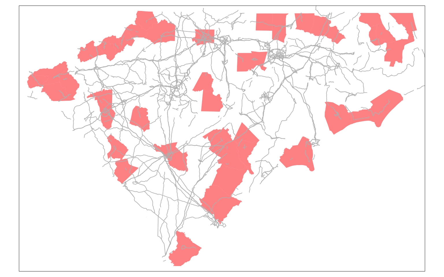
Let us now turn our attention to the analysis of deprivation. I will use poverty and female unemployment as proxies for deprivation. I arbitrarily define Deprivation to be a combination of poverty and unemployment. In this instance, I am picking 25% and 10% as thresholds respectively.
distressed_cty <- df %>%
                     filter(unemp_rate > .10 | pov_rate > .25)

distressed_cty_shp <- right_join(ctys, distressed_cty, by='GEOID')


tmap_mode("view")

m1 <- tm_basemap("CartoDB.Positron")+
      tm_shape(distressed_cty_shp) +
      tm_fill(col='red', alpha=.5)+
      tm_tiles("CartoDB.PositronOnlyLabels")


frameWidget(tmap_leaflet(m1))
Local outliers?
There are some instances, you might be interested in figuring out if the focal geography is an outlier compared to its neighbours. For example, the following code would help you identify if the focal geography is has 50% higher population than its neighbours (on average). Let’s use KNN adjacency
cty_knn_mat <- nb2mat(cty_knn, zero.policy=TRUE, style="W") # W is row standardised,
cty_knn_mat[1:5, 1:5] # look at the subset of the matrix
#       37037     37001 37057 45023 37069
# 37037  0.00 0.3333333     0     0     0
# 37001  0.25 0.0000000     0     0     0
# 37057  0.00 0.0000000     0     0     0
# 45023  0.00 0.0000000     0     0     0
# 37069  0.00 0.0000000     0     0     0


# Now we can calculate the average population of the neighbours
ctys2 <- df %>%
      mutate(N_avg_pop_census_knn = drop(cty_knn_mat %*% pop_census)) %>%
      filter(pop_census > 1.5*N_avg_pop_census_knn) %>%
      select("GEOID", "N_avg_pop_census_knn", "pop_census")%>%
      left_join(ctys, by='GEOID') %>%
      st_as_sf()

m1 <- tm_shape(ctys2) +
  tm_fill(col='red', alpha=.5) +
  tm_basemap("CartoDB.Positron") +
  tm_tiles("CartoDB.PositronOnlyLabels")

frameWidget(tmap_leaflet(m1))
nearness is symmetric relationship, nearest is not.
Exercise
-
spdephas a function calledlag.listwthat can help you identify neighborhood average. Figure out how to use it. Might be helpful when you have a large number of geographies. -
Large number of geographies with only a few connectons, might require you to get familiar with sparse matrices. Figure out how to work with them.
The row standardised weight matrix gives all the neighbours of a focal geography equal weight (1/rowsum of ones). In this occasion, we want to weight the attribute (say unemployment rate) based on a different attribute (say labour force).
We take advantage of the element by element multiplication and matrix multiplication to get this.
First we create the denominator, which is the sum of all labour force of the neighbours, just as before using matrix multiplication. Then we perform the tricky bit of only counting the labour force each of the neighbours using element by element multiplication. In R, * is element by element multiplication, where as %*% is matrix multiplication.
cty_knn_mat <- nb2mat(cty_knn, zero.policy=TRUE, style="B") # Create a binary matrix

denom_lf <- cty_knn_mat %*% df$lf_est # A.v, where A is nxn is a binary adjacency matrix and v is nx1 vector of labour force. Using matrix multiplication here. This gives us the total labour force of the neighbours.

# Recycle the labour force vector to match the dimensions of the adjacency matrix
temp1 <- rep(df$lf_est, each =nrow(cty_knn_mat)) %>% matrix(ncol=ncol(cty_knn_mat))

temp1[1:5, 1:5] # look at the subset of the matrix
#       [,1]  [,2]  [,3] [,4]  [,5]
# [1,] 15936 39393 35012 6995 15120
# [2,] 15936 39393 35012 6995 15120
# [3,] 15936 39393 35012 6995 15120
# [4,] 15936 39393 35012 6995 15120
# [5,] 15936 39393 35012 6995 15120

numer_lf <-  cty_knn_mat * temp1

numer_lf[1:5, 1:5] # look at the subset of the matrix
#       37037 37001 37057 45023 37069
# 37037     0 39393     0     0     0
# 37001 15936     0     0     0     0
# 37057     0     0     0     0     0
# 45023     0     0     0     0     0
# 37069     0     0     0     0     0

temp1 <- rep(denom_lf, times =nrow(cty_knn_mat)) %>% matrix(ncol=ncol(cty_knn_mat))
weight_matrix_lf <- numer_lf/temp1 # This gives us the weighted matrix

# Check to see if it is indeed a weight matrix
weight_matrix_lf[1:5, 1:5]
#            37037     37001 37057 45023 37069
# 37037 0.00000000 0.4459551     0     0     0
# 37001 0.08467228 0.0000000     0     0     0
# 37057 0.00000000 0.0000000     0     0     0
# 45023 0.00000000 0.0000000     0     0     0
# 37069 0.00000000 0.0000000     0     0     0
rowSums(weight_matrix_lf) %>% summary() # should be 1
#    Min. 1st Qu.  Median    Mean 3rd Qu.    Max.
#       1       1       1       1       1       1
Now it is straightforward to get the labour force weighted unemployment rate of the neighbours
df <- df %>%
      mutate(N_unemp_avg = drop(weight_matrix_lf %*% unemp_rate))

library(tmap)

tmap_mode("plot")

cty2 <- df %>%
      left_join(ctys, by='GEOID') %>%
      st_as_sf()


tmap_arrange(
  tm_shape(cty2) +
    tm_polygons("unemp_rate",
                legend.format = list(digits=2),
                style = 'cont', border.alpha=.2,
                title = "Female Unemployment Rate",
                legend.is.portrait = FALSE),

  tm_shape(cty2)+
    tm_polygons(col="N_unemp_avg",
                legend.format = list(digits=2),
                style = 'cont',
                title = "Neighborhood Unemployment Rate",
                legend.is.portrait = FALSE,
                border.alpha=.2)
)
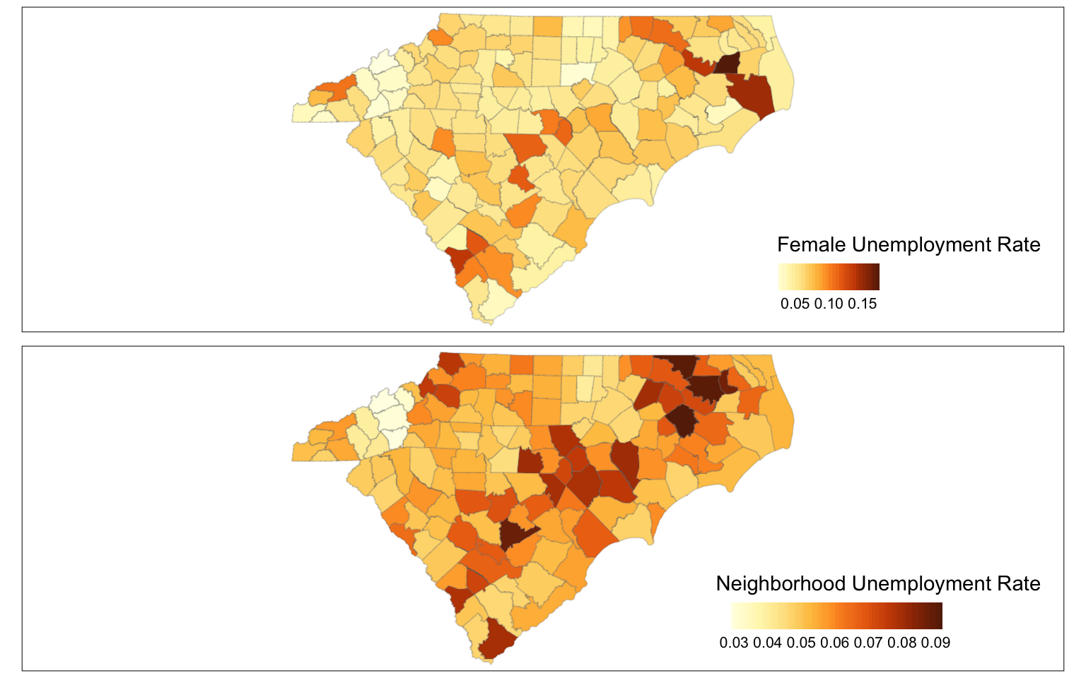
To figure out local outliers, you might consider counties with sufficiently different unemployment rates than their neighbours. In this case, I am employing an arbitrary threshold of 30% .
distressed_cty <- df %>%
                     filter(unemp_rate > 1.3*N_unemp_avg)

distressed_cty_shp <- right_join(ctys, distressed_cty, by='GEOID') %>%
                       st_as_sf()


tmap_mode("view")

m1 <- tm_basemap("CartoDB.Positron")+
      tm_shape(distressed_cty_shp) +
      tm_fill(col='red', alpha=.5)+
      tm_tiles("CartoDB.PositronOnlyLabels")


frameWidget(tmap_leaflet(m1))
Exercise
- Repeat this exercise for poverty rate with appropriate variables.
- Use different neighbourhood relationships and see how it affects the results.
- All the above simply calculates the neighbourhood values without including values from the focal geography. So it is a doughnut with a hole type smoothing operator. If you want to remove the hole, simply change the diagonal elements of the matrix to 1 in the neighbourhood binary matrix. What happens if you do?
Regionalisation
Now that we have identified the distressed areas, we can use any number of clustering techniques to identify clusters of distressed areas. In this case, I will simply identify clusters based on disconnected subgraphs. components function decomposes the graph in subgraphs, i.e. nodes belong to a subgraph, if there is a path between them. If there is not, they belong to different subgraphs.
distress_nb <- poly2nb(distressed_cty_shp,
                       queen=FALSE,
                       row.names = distressed_cty_shp$GEOID) # Construct a neighborhood object

distressed_graph <- distress_nb %>%
  nb2mat(zero.policy=TRUE, style="B") %>% # Create a Binary Adjacency Matrix.
  graph.adjacency(mode='undirected', add.rownames=NULL) # construct an undirected graph from the adjacency matrix.

cl <- components(distressed_graph) # This decomposes the graph into connected subgraphs.

distressed_cty_shp <- distressed_cty_shp %>%
          left_join(as_tibble(cbind(cluster_no = cl$membership,GEOID = names(cl$membership))), by='GEOID')


### Visualisation


pal <- colorRampPalette(brewer.pal(8, "Dark2"))
numColors <- cl$membership %>% unique() %>% length()

m3<-
 distressed_cty_shp %>%
   tm_shape()+
   tm_fill("cluster_no", legend.show = FALSE, palette = pal(numColors))+
   tm_basemap("CartoDB.Positron")+
   tm_tiles("CartoDB.PositronOnlyLabels")


frameWidget(tmap_leaflet(m3))
Now that different counties are assigned to different clusters, we can summarise the poverty rate in different clusters. Within in each component of the graph, we can also identify a community structure if you wish, using techniques from an earlier post. I leave these as exercises.
In some instances, it may be useful to see if the clusters are stringy’ or if they are ‘blobs’. i.e., if the clusters follow linear features (such as roads, valleys, rivers etc.) or if they adjacency is shared among multiple polygons of the same component. To do this, we could rely on diameter of the graph, which is the longest path between any two nodes in graph. If the graph is stringy, it will have a large diameter.
In this instance, we want to compute the diameters of each component separately. (diameter of the graph is $ $, as it is not fully connected. )
diameters_of_graphs <-  map_dfr(decompose(distressed_graph), function(x){c(dia =diameter(x))})
diameters_of_graphs$cluster_no <- 1:(distressed_graph %>% decompose() %>% length()) %>% as.character()


distressed_cty_shp <- left_join(distressed_cty_shp, diameters_of_graphs, by='cluster_no')

# Quickly showing the stringy and blobby (real words) distressed regions
maxdia <- max(distressed_cty_shp$dia,na.rm=T)

m5 <- distressed_cty_shp %>%
      tm_shape()+
      tm_fill(col='dia',
                  style="fixed",
                  breaks = c(0,1,4,maxdia),
                  palette = c('gray', 'blue', 'red'),
                  labels = c("Islands", "Blobby", "Stringy"))+
   tm_basemap("CartoDB.Positron")+
   tm_tiles("CartoDB.PositronOnlyLabels")

frameWidget(tmap_leaflet(m5))
Exercise
- Repeat this exercise for local outliers that include both poverty and female unemployment?
- Limiting your analysis to Metropolitan Areas in Carolinas, what conclusions can you draw about the shape of the clusters?
- Does limiting your analysis to a single state, affect your results? What if you expand to include Virginia and Georgia?
- Does changing the unit of analysis matter? Say e.g. instead of the counties, we use tracts for the poverty and unemployment characteristics, how are the conclusions different?
Further analysis
Instead of categorising the areas of distress by dichotomising, one could use local Moran's I to identify locations high values of a continuous variable (say poverty rate) surrounded by other high values areas (or low value areas) and test their statistical significance. local.moran is a function in spdep and relies on the neighbourhood graph. I leave this as an exercise.
Conclusions
Borrowing some concepts from network analysis, helps us in many analytical tasks with regards to space. Todd BenDor and I argued that in some instances it may be beneficial to think about space as networks for modelling purposes too. Tools from graph theory have been incredibly useful to me in a number of different projects.
Nikhil Kaza
Professor
My research interests include urbanization patterns, local energy policy and equity