Identifying Employment Centers
In this post, I am going to show the techniques behind identifying centers. Centers are defined collections of contiguous high value (e.g. employment, opportunity, activity etc.) locations. This is related to, but different from using autocorrelation statistics such as Local Indicators of Spatial Autocorrelation. The methods described in this post draw from McMillen (2001) and Giuliano & Small (1991).
Requirements
This requires R, and many libraries including igraph,spdep, rgdal, tigris locfit and leaflet. You should install them, as necessary, with install.packages() command.
Most of the methods and results are discussed in Hartley, Kaza & Lester (2016) and Lester, Kaza & McAdam (in review). Please refer to those articles.
Additional resources
I strongly recommend that you read through some of the tutorials on using R for GIS. You should have Applied Spatial Data Analysis in R by Bivand et.al in your library.
Acquire data
The data I will use in this exercise will be downloaded directly from Census. For this work, we will use the Work Area Characteristics files from Local Origin Destination Employment Statistics (LODES). LODES is a synthetic data set that provides, if not spatially accurate, distributionally consistent annual employment information as well as commuting information. We will restrict our attention to the Kentucky. Let’s download and set up the data.
library(data.table)
library(rgdal)
library(spdep)
library(rgeos)
library(igraph)
library(ggplot2)
library(tigris)
library(tidyverse)
library(sf)

state <- "ky"
baseurl <- 'http://lehd.ces.census.gov/data/lodes/LODES7/'
years <- as.character(2015)
wac_file <- NULL
for (year in years){
  filename <- paste(state, "_wac_S000_JT00_", year, ".csv.gz", sep="" ) #State, S000-Total Number of jobs , JT00,- All jobs
  url <- paste(baseurl, state, "/wac/", filename, sep="" )
  if(!file.exists(filename)){download.file(url, filename, mode='wb')}
  wac_file[[year]] <- data.table(read.csv(filename, colClasses = c('character', rep('integer',51), 'character'))) ##based on the documentation of the classes
wac_file <- rbindlist(wac_file, idcol="Year", use.names = TRUE)
}

ky_tr <- tracts("Kentucky", year=2010, progress_bar =FALSE)
read.csv only because I am using a much faster data.table package for illustration purposes. The code can be easily adapted to tibbles using read_csv.
Data preparation & exploration
The data set is at a block level. This level of geography is far too fine (28,996 blocks) for our analyses. Lets aggregate it up to census tracts. Since blocks are nested within the tract, all we need to do is to trim the GEOID and aggregate the data.table to the trimmed GEOID.
wac_file$w_geocode_tr <- substr(wac_file$w_geocode, 1,11) #trim GEOID to 11. Trim it to 12 if Blockgroups are needed
setkey(wac_file, w_geocode_tr, Year)
cols = sapply(wac_file, is.numeric)  #identify the columns where summation can be applied.
cols = names(cols)[cols]
wac_file_tr <- wac_file[,lapply(.SD, sum), .SDcols = cols, by=list(w_geocode_tr, Year)] # Aggregate the columns to tract ids.

#C000 is the column that contains the numbers for total jobs.
summary(wac_file_tr$C000)
#    Min. 1st Qu.  Median    Mean 3rd Qu.    Max.
#     1.0   250.5   763.5  1646.8  1950.5 57291.0
We have now a manageable number of geographic units (1,112 tracts). The summary statistics look pretty skewed. It is useful to visualise the inequality of the distribution. We can use Lorenz curve for this. We need the ineq package for this.
library(ineq)
 plot(Lc(wac_file_tr$C000), xlab="Cumulative % of tracts", ylab="Cumulative % of Jobs")
 abline(v =.5, lty=2, col='blue')
 abline(h=.09, lty=2, col='blue')
 abline(v=.9, lty=2, col='red')
 abline(h=.53, lty=2, col='red')
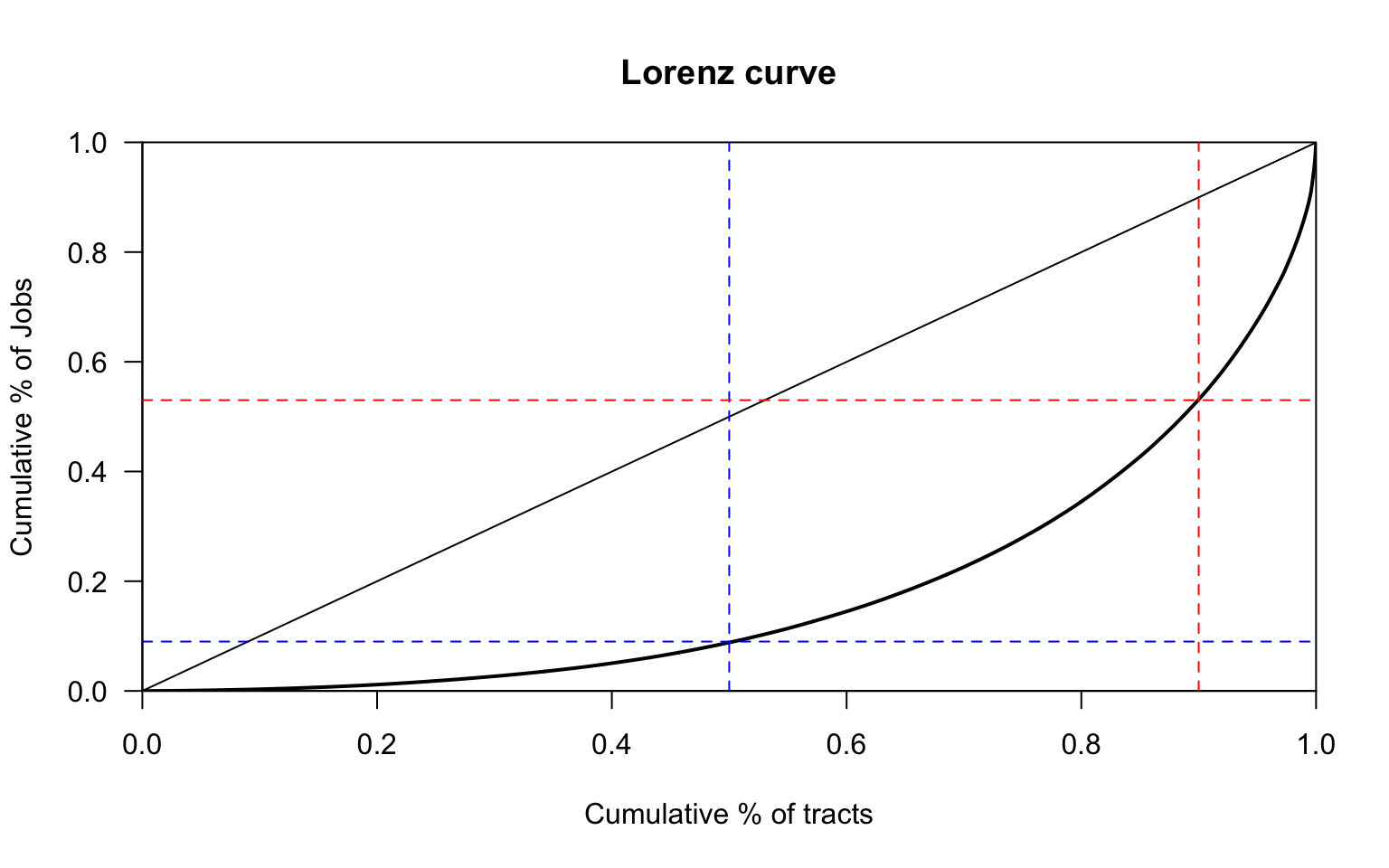 The bottom 50% of the tracts only contribute to less than 10% of the total employment, while the top 10% of the tracts contribute to more than 45% of employment. About 11% of tracts have less than 100 jobs. This shows that jobs are pretty well concentrated in particular centers.
We can visualise the spatial distribution of jobs. We already used tigris to download and load the polygons, and leaflet to visualise the information. Tigris is a convenience package that automatically downloads TIGER files from Census for particular geography. Visualising complicated geography is problematic, so we will use a polygon simplifier Visvasalingam algorithm to simplify the boundaries. As long as the topology is preserved, we don’t loose much for this analysis.
##Simplify shape for display and analysis. As long as the topology is preserved, complicated boundaries are not necessary for this purpose.
library(rmapshaper)
ky_tr_simple <- rmapshaper::ms_simplify(ky_tr)
c(object.size(ky_tr), object.size(ky_tr_simple))
# [1] 20041168  2299040
Merge the spatial polygons with the WAC file.
ky_tr_simple <-  ky_tr_simple %>%
                  left_join(wac_file_tr[Year==year, .(w_geocode_tr, C000),], by = c("GEOID10"="w_geocode_tr"))

ky_tr_simple$C000[is.na(ky_tr_simple$C000)] <- 0 #set NAs to 0. This may not be kosher depending on your application.
ky_tr_simple$empdens <- ky_tr_simple$C000/(ky_tr_simple$ALAND10) * 10^4 #Jobs per ha. ALAND10 is in sq.m
Visualising spatial data
Let us visualise the spatial distribution of employment. Note the use of Quintile colour cuts. There may be other cuts that are more preferable.
library(leaflet)

ky_tr_simple <- ky_tr_simple %>% sf::st_transform(4326)

m <-  leaflet(ky_tr_simple) %>%
  addProviderTiles(providers$Stamen.TonerLines, group = "Basemap",
                   options = providerTileOptions(minZoom = 7, maxZoom = 11)) %>%
   addProviderTiles(providers$Stamen.TonerLite, group = "Basemap",
                    options = providerTileOptions(minZoom = 7, maxZoom = 11))


Qpal <- colorQuantile(
  palette = "BuPu", n = 7,
  domain = ky_tr_simple$C000
)


labels <- sprintf(
  "Tract #: %s <br/> Jobs: <strong>%s</strong>",
  ky_tr_simple$GEOID10, ky_tr_simple$C000
) %>% lapply(htmltools::HTML)


m2 <- m %>%
     addPolygons(color = "#CBC7C6", weight = 1, smoothFactor = 0.5,
              opacity = 1.0, fillOpacity = 0.5,
             fillColor = Qpal(ky_tr_simple$C000),
              highlightOptions = highlightOptions(color = "white", weight = 2, bringToFront = TRUE),
             label = labels,
             labelOptions = labelOptions(
               style = list("font-weight" = "normal", padding = "3px 8px"),
               textsize = "15px",
               direction = "auto"),
             group = "Tracts"
             ) %>%
   addLegend("topleft", pal = Qpal, values = ~C000,
             labFormat = function(type, cuts, p) {
               n = length(cuts)
             paste0(prettyNum(cuts[-n], digits=1, big.mark = ",", scientific=F), " - ", prettyNum(cuts[-1], digits=1, big.mark=",", scientific=F))
             },
             title = "Number of Jobs",
             opacity = 1
   ) %>%
  addLayersControl(
    overlayGroups = c("Tracts", 'Basemap'),
    options = layersControlOptions(collapsed = FALSE)
      )

library(widgetframe)
frameWidget(m2)
The problem with choropleth maps is that large spatial areas visually draw attention and skew the perception of the map. See for example, the small tracts in Louisville compared to rural tracts around Bradstown. One way to deal with this issue, is to intensify the color of smaller tracts by normalising employment with some variable (area or per capita) to visualise the spatial distribution better. Sometimes, it is also better to ignore the boundaries. It does not get solve the problem completely.
Qpal <- colorQuantile(
  palette = "BuPu", n = 5,
  domain = ky_tr_simple$empdens
)


labels <- sprintf(
  "Tract #: %s <br/> Job Density: <strong>%s</strong>",
  ky_tr_simple$GEOID10, prettyNum(ky_tr_simple$empdens, digits=2, big.mark = ",")
) %>% lapply(htmltools::HTML)


m2 <- m %>%
     addPolygons(color = "#CBC7C6", weight = 0, smoothFactor = 0.5,
              opacity = 1.0, fillOpacity = 0.5,
             fillColor = Qpal(ky_tr_simple$empdens),
              highlightOptions = highlightOptions(color = "white", weight = 2, bringToFront = TRUE),
             label = labels,
             labelOptions = labelOptions(
               style = list("font-weight" = "normal", padding = "3px 8px"),
               textsize = "15px",
               direction = "auto"),
             group = "Tracts"
             ) %>%
   addLegend("topleft", pal = Qpal, values = ~empdens,
             labFormat = function(type, cuts, p) {
               n = length(cuts)
             paste0(prettyNum(cuts[-n], digits=2, big.mark = ",", scientific=F), " - ", prettyNum(cuts[-1], digits=2, big.mark=",", scientific=F))
             },
             title = "Employment Density per ha",
             opacity = 1
   ) %>%
  addLayersControl(
    overlayGroups = c("Tracts", 'Basemap'),
    options = layersControlOptions(collapsed = FALSE)
      )

frameWidget(m2)
Employment center definitions
What counts as an employment center depends on what definition you use. Giuliano & Small use a density floor (~25 jobs per ha) and floor on the total jobs ( at least 10,000 jobs). i.e. an employment center is defined as collection of contiguous geographies whose sum total of employment is more than 10,000 and whose density is more than 25 jobs per ha. Notice that these cutoffs are arbitrary and different values give different results. In this post, I am not going to use this definition, though the code is below.
subgs <-function(shpfile,dens,emp,mind=25,totemp=10000, wmat=0) {
  if (identical(wmat,0)) {
    neighbors <- poly2nb(shpfile,queen=TRUE)
    wmat <- nb2mat(neighbors,style="B",zero.policy=TRUE)
  }
  dens <- ifelse(is.na(dens),0,dens)
  obs <- seq(1:length(dens))
  densobs <- obs[dens>mind]
  wmat <- wmat[densobs,densobs]
  n = nrow(wmat)
  amat <- matrix(0,nrow=n,ncol=n)
  amat[row(amat)==col(amat)] <- 1
  bmat <- wmat
  wmat1 <- wmat
  newnum = sum(bmat)
  cnt = 1
  while (newnum>0) {
    amat <- amat+bmat
    wmat2 <- wmat1%*%wmat
    bmat <- ifelse(wmat2>0&amat==0,1,0)
    wmat1 <- wmat2
    newnum = sum(bmat)
    cnt = cnt+1
  }
  emat <- emp[dens>mind]
  tmat <- amat%*%emat
  obsmat <- densobs[tmat>totemp]

  subemp <- array(0,dim=length(dens))
  subemp[obsmat] <- tmat[tmat>totemp]
  subobs <- ifelse(subemp>0,1,0)

  tab <- tabulate(factor(subemp))
  numsub = sum(tab>0)-1

  cat("Number of Subcenters = ",numsub,"\n")
  cat("Total Employment and Number of Tracts in each Subcenter","\n")
  print(table(subemp))

  out <- list(subemp,subobs)
  names(out) <- c("subemp","subobs")
  return(out)
}
McMillen, on the other hand, uses a non-parametric method. He fits a employment density surface based on local neighborhood values and predicts the employment density at a location. If the actual employment density is substanially higher than predicted values then the tract is labelled an employment center. Note the choice of the parameters, window, (observations that are defined as neighborhood) and the pval (statistical significance). They are as arbitrary as Giuliano and Small’s parameters, but are more widely accepted.
In the later part, we will merge such contiguous tracts. For this section we use locfit package
library(locfit)
 #### This is the McMillen's method for determining the tracts that are significantly different from the neighbours.
 subnp <- function(ydens,long,lat,window=.5,pval=.10) {
   data <- data.frame(ydens,long,lat)
   names(data) <- c("ydens","long","lat")
   fit <- locfit(ydens~lp(long,lat,nn=window,deg=1),kern="tcub",ev=dat(cv=FALSE),data=data)
   mat <- predict(fit,se.fit=TRUE,band="pred")
   yhat <- mat$fit
   sehat <- mat$se.fit
   upper <- yhat - qnorm(pval/2)*sehat
   subobs <- ifelse(ydens>upper,1,0)

   cat("Number of tracts identified as part of subcenters:  ",sum(subobs),"\n")
   out <- list(subobs)
   names(out) <- c("subobs")
   return(out)
 }

temp <-  subnp(ky_tr_simple$empdens, ky_tr_simple$INTPTLON10, ky_tr_simple$INTPTLAT10)
# Number of tracts identified as part of subcenters:   23
ky_tr_simple$empcenter <- temp$subobs
Visualise the results
We use the same code as before, except styling the colors using colorFactor instead of colorQuantile to visualise the outputs.
Merge contiguous tracts and aggregate values
One of the neat tricks that spdep package allows us to do is to construct a graph from spatial adjacency matrix. Once a graph is created, it is simply a matter of finding the connected components of the graph and then merging based on the component name.
ky_empc_tr <- ky_tr_simple[ky_tr_simple$empcenter==1,]

g <- ky_empc_tr %>% as("Spatial") %>%
  spdep::poly2nb(queen=T, row.names=ky_empc_tr$GEOID10) %>%
  spdep::nb2mat(zero.policy=TRUE, style="B") %>%
  igraph::graph_from_adjacency_matrix(mode='undirected', add.rownames="NULL")

ky_empc_tr$clustermember <- paste0("C",igraph::components(g)$membership)
Dissolving polygons is a breeze due to sf.
ky_empc_pt <-
    ky_empc_tr %>%
      group_by(clustermember) %>%
      summarise(emp = sum(C000), area = sum(ALAND10)) %>%
      mutate(empdens = emp/area *10^4) %>%
      st_centroid %>%
      st_as_sf()
# Warning in st_centroid.sf(.): st_centroid assumes attributes are constant over
# geometries of x
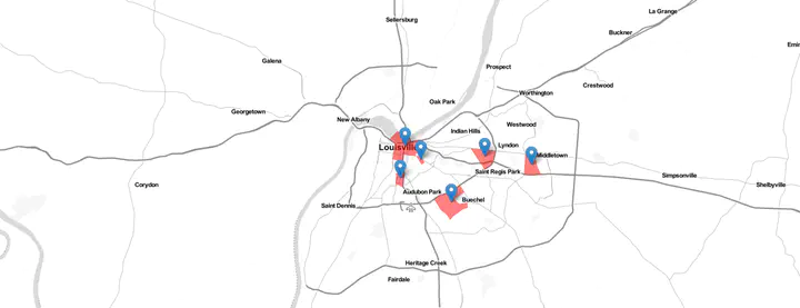
We went from 23 tracts to 14 centers due to this merging. Final visualisation could be done using markers, instead of a choropleth plot. The tracts are used for visualisation, only to show the extent.
labels2 <- sprintf(
  "Employment Cluster #: %s <br/> Jobs: <strong>%s</strong>, Density: <strong>%s per ha</strong>",
  ky_empc_pt$clustermember, prettyNum(ky_empc_pt$emp, big.mark = ",", scientific=F), prettyNum(ky_empc_pt$empdens, digits=2)
) %>% lapply(htmltools::HTML)


m4 <- leaflet(ky_empc_pt) %>%
  addTiles() %>%
  addPolygons(data= ky_empc_tr, weight = 0,fillOpacity = 0.5, fillColor = 'red' ) %>%
  addMarkers(label = ~labels2,
             labelOptions = labelOptions(
               style = list("font-weight" = "normal", padding = "3px 8px"),
               textsize = "15px",
               direction = "auto"))

frameWidget(m4)
Further explorations
Many improvements and extensions are possible. For example,
- In this post, I only used 2015 employment. But the code is set up to download and run for multiple years with suitable modifications. Have the employment center locations and characteristics changed between 2002 and 2015?
- It turns out KY has only 14 employment centers through out the state. How does KY fare compared to rest of the US?
- These centers (23 tracts) only account for 12.95% of the state employment. Yet we saw from the Lorenz cure that that the top 10% (~111 tracts ) have about 45% of employment. So what is happening with the other 88 tracts? Are they dispersed? clustered? Why did not they show up?
- Based on the above, what improvements can we make to McMillen method?
- What are the outcomes if we use Giuliano and Small’s method?
- What are the impacts of different parameters on identification?
- What is the impact of spatial scale? In this analyses we used Census tracts. Are results dramatically different, if we use block groups or blocks?
- Is total employment even a relevant indicator for employment centers? Should we be identifying specialised employment centers by industry or occupation?
- How can be adapt this method to identify other concentrated activities (such as retail etc.)
Accomplishments
- Downloading and reading vector data
- Vector data operations (Union, neighbors)
- Visualising spatial data with leaflet
- Switching between spatial and network conceptual frames
- Local regression with spatial coordinates
- Spatial outlier detection
Nikhil Kaza
Professor
My research interests include urbanization patterns, local energy policy and equity