Do we need to know which way is up?
One of my first jobs in graduate school was building a wayfinding application for a museum, meant to stand in for a docent. I did not do this well (my apologies, Prof. Twidale), but it left me with a lasting interest in how maps do, and mostly do not, convey information. Decades on, I am still working through it.
My opinions about legends are already on record. This time the target is another sacred cow: the north arrow. A small but important minority, John Nelson among them, argues it is optional and often better left off. Visceral reactions ensued.
I side with the minority, partly because most of the maps I make and read are statistical graphics rather than navigational charts. However, I also spend a fair amount of time with cadastral maps, courtesy of a long-running interest in property rights regimes. Furthermore, working in applied computer vision has left me convinced that our mental model of maps needs to stretch past objects to fields (Couclelis’ distinction). So a post that started out being about north, north arrows and ups has ended up being about materiality, practice, and purpose instead.
How are maps used?
Rather than treat a map as an artefact with one fixed job, I want to look at the specific practices maps get used for, since each one asks something different of the reader and the author. A north arrow is one among many such orienteering devices at the disposal of both. It may not be the right one, depending on the specifics. Four practices cover most of the ground:
- Recognise. The map has to make a place or a pattern recognisable. The reader only needs to know where things sit relative to one another. In some senses, this is the Leibnizian conception of space.
- Navigate. The map has to connect what the reader sees to where they go next, matched against the scene in front of them.
- Coordinate. The map has to give several people, in different places, a shared reference they can act on together.
- Retrace. The map has to carry its meaning to someone who was never there, often decades later, and let them find positions on the ground. This is coordination stretched across time rather than space.
Each of these leans on a different frame of reference. Stephen Levinson and his colleagues catalogued three basic kinds across the world’s languages: relative, anchored to the speaker’s own body; intrinsic, anchored to some other object; and absolute, anchored to something that stays put no matter which way the speaker turns. Absolute need not mean compass; it just means fixed. So the table below differentiates absolute frames by what they are actually fixed to, and asks what each frame demands of its reader. I have borrowed and stretched Levinson’s typology:
| Frame | Anchored to | The reader needs | Uses in language | Uses in maps |
|---|---|---|---|---|
| Relative | the reader’s own body | nothing beyond where they stand and face | left and right; in front, behind | heading-up phone maps; the WalkNYC sign; Micronesian navigators’ mental map, in which the islands move past a fixed canoe |
| Intrinsic | a shared object | to see the object | the front and back of a building; a ship’s port and starboard | fireground diagrams with sides A to D |
| Viewpoint | the side the image is viewed from | to know which side, and the display convention | AP/PA in human radiographs; dorsal and ventral for animals | radiographs with markers |
| Topographic | the terrain | to know the place | Tzeltal uphill and downhill; Balinese kaja(toward the mountains) and kelod (toward the sea); Manhattan’s uptown and downtown | New York subway maps, drawn uptown-up |
| Cardinal | fixed axes: true, magnetic or grid | an instrument, and a statement of which north | Relatively common use but mean different things | a survey plat’s “grid north per GPS, NAD 83”; a wildfire map’s grid and datum |
Every frame asks something specific of the reader: a body, an object in view, a known vantage point, familiarity with the place, or, for cardinal directions, an instrument and a stated convention for which north is meant. Which frame a map should use depends entirely on what its readers already share. A navigator shares the scene with the map, so the map can simply face the same way. People coordinating share an object they can all see, such as a building or a fire, and name directions off it. Someone retracing shares nothing but the document itself, so the document has to spell its frame out completely. A statement of north, arrow or grid, is useful when the reader shares no more local frame and can actually go check which way north is.
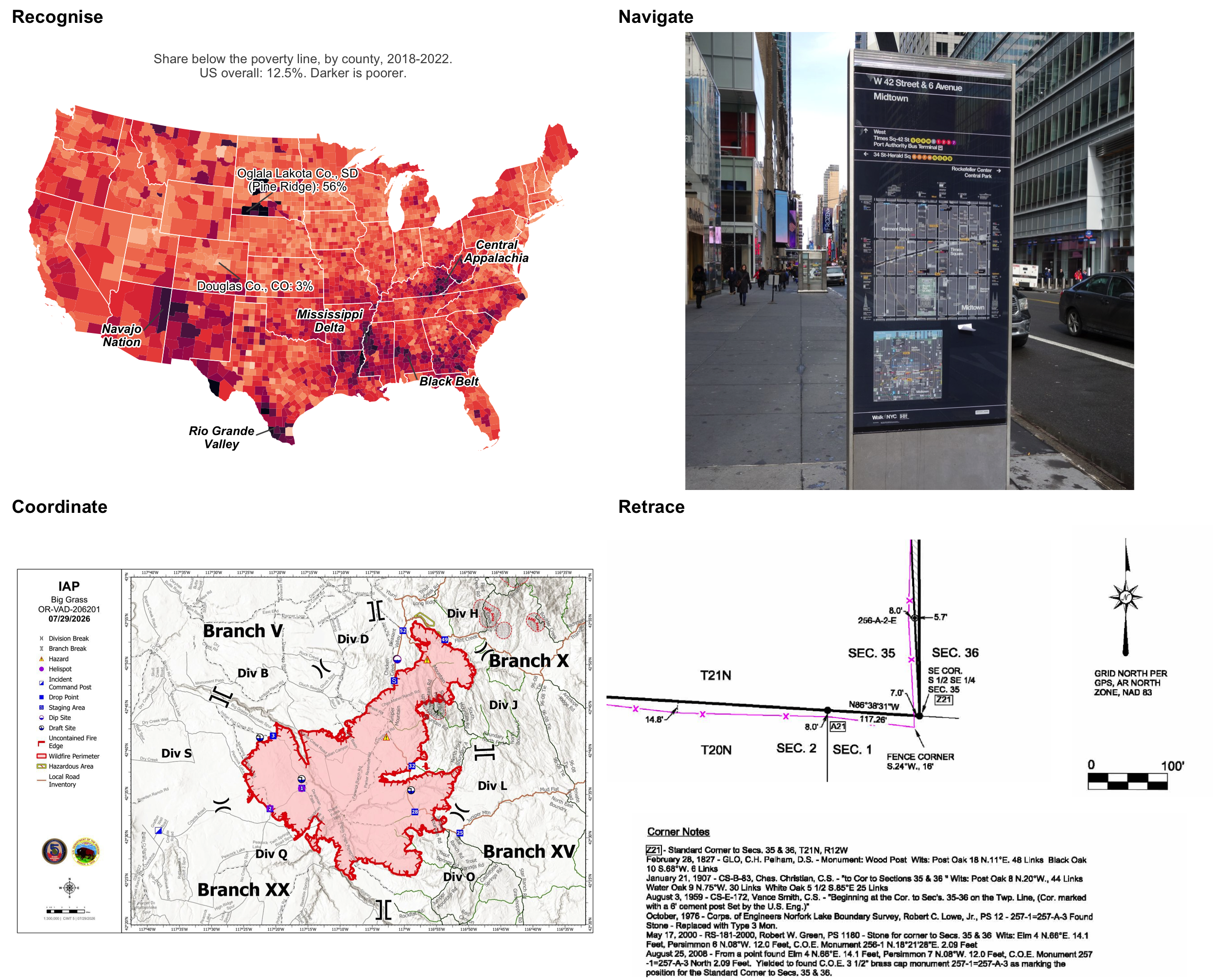
Top left: ACS 2018-2022 5-year estimates, table S1701. Top right: WalkNYC sign, W 42nd Street and 6th Avenue, photo by Tdorante10, CC BY-SA 4.0, via Wikimedia Commons, cropped. Bottom left: IAP map, Big Grass fire (OR-VAD-260201), 07/29/2026, Complex Incident Management Team 5, via the National Interagency Fire Center incident map archive. Bottom right: detail of a survey plat, Section 35, T21N, R12W, Baxter County, Arkansas, Tuck Land Surveying, 2008, U.S. Army Corps of Engineers, Little Rock District, public domain, via Wikimedia Commons.
It’s worth pausing on these four examples and working through what each one is actually doing. The poverty map communicates by leaning on the country’s familiar outline plus a handful of place names. The WalkNYC sign communicates in a relative frame, matching what it shows against what the reader can already see. The wildfire map splits the incident into crew assignments and trusts strangers to orient themselves with map and instruments together. The survey plat states exactly which north its bearings use.
So the question was never whether a map needs a north arrow. The real question is what the map is for, and what orienteering apparatus that purpose actually requires, if at all. The rest of this post works through the four tasks in turn.
Recognise
Critical cartographers, unlike the functionalists, argue that a map’s real job is to privilege one view of the world over the others, cementing some political or epistemological relationship or challenging it. Medieval world maps, photographs of the Earth, and the wall map at the front of a schoolroom are all doing the same thing: telling the reader what place this is, letting them recognise shapes, spot patterns, and read geography as a stand-in for politics.
Since GIS put mapmaking within reach of anyone with a laptop, most maps made today are statistical graphics, meant to describe a pattern and support a point. A choropleth asks the reader to find a familiar shape and see where the pattern falls inside it; the poverty map above is a standard example. The story runs through Central Appalachia in eastern Kentucky and West Virginia, the Mississippi Delta, Alabama’s and the Carolinas’ Black Belt, the Rio Grande Valley, and the reservation counties of the Navajo Nation and the northern Plains: 56 percent of Oglala Lakota County, South Dakota, on the Pine Ridge reservation, is below the poverty line, against 12.5 percent nationally. That is a story about history and policy, and cardinality has nothing to add to it. The map is north-up because that is the orientation in which readers already know the country’s shape, and a handful of region labels do the rest. You should probably also ask yourself why areas such as Alaska, Guam and Puerto Rico have been left out. The immediate answer may be cartographic or statistical convenience; but the structural answer is about neglect, erasure and invisibility. That is a different, and equally compelling, story.
Unfamiliar shapes
This may just be my own parochialism showing, but most readers can pick the United States out of a lineup. Far fewer could do the same for Morocco’s twelve regions, and the country adds a complication of its own: its south sits largely in Western Sahara, a disputed territory that Moroccan statistics fold in and plenty of other maps draw as separate. Even a shape a reader is expected to recognise turns out to depend on who drew the lines and what their political purposes are:
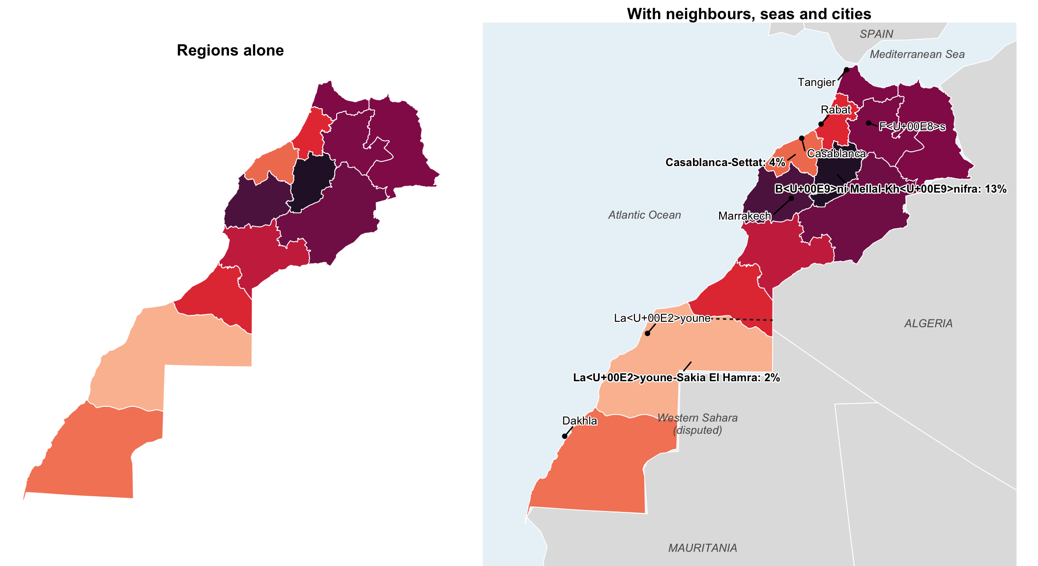
Poverty data: Haut-Commissariat au Plan, multidimensional poverty mapping, 2014, from the 2014 census. Region boundaries: geoBoundaries (gbOpen), ODbL. Neighbouring countries: Natural Earth via the spData package.
What turns the bare shape on the left into an actual place is context (neighbours, coastlines, a few city names), and that is the whole mechanism by which the map communicates. A north arrow would not add a thing to either panel. With the context filled in, the reader can see poverty running highest inland, in Béni Mellal-Khénifra at 13 percent, and lowest around Casablanca and in the south, against a national rate of 8 percent.
Up is a habit
Recognition rests on familiarity, and familiarity rests on convention. And north-up is a surprisingly recent convention at that. Medieval Christian maps put east on top, toward paradise (hence “orient”), with Jerusalem at the centre. Al-Idrisi’s 1154 map for Roger II of Sicily put south on top instead. Jerry Brotton traces the whole history in Four Points of the Compass, including early Chinese compasses that pointed south and the long-standing association of east with sacred beginnings. North, it turns out, had to fight its way to the top of the page.
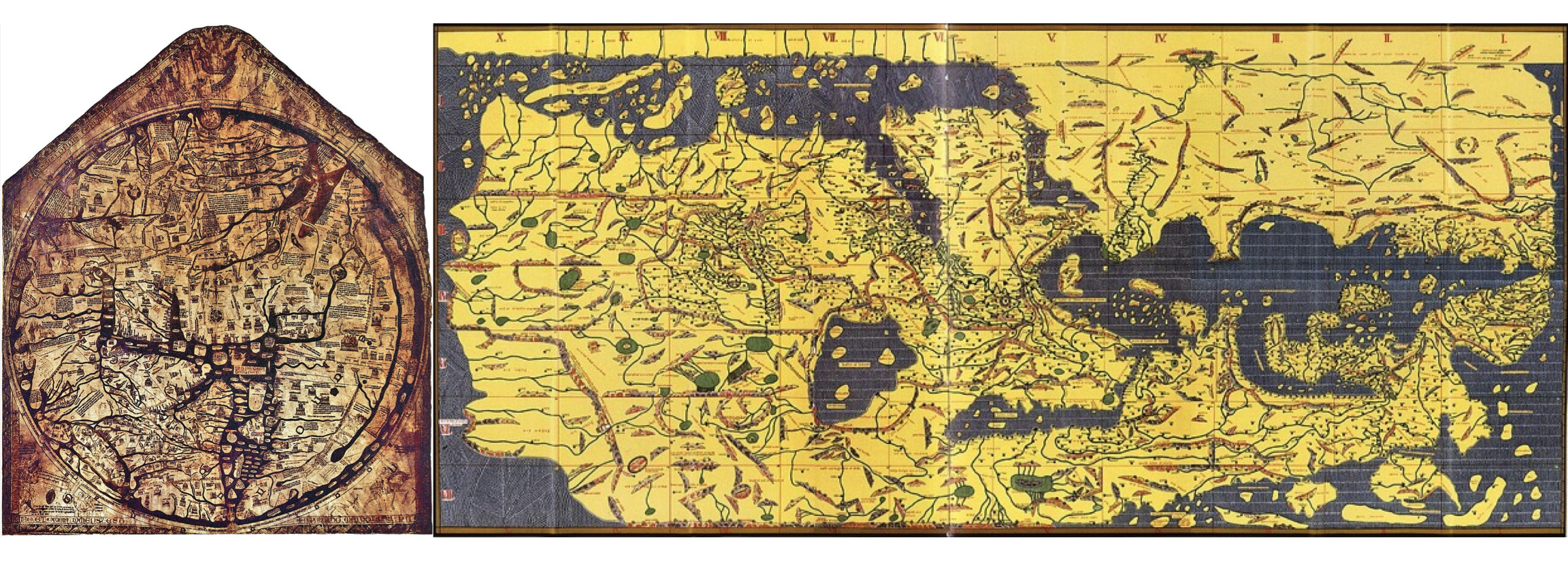
Left: Hereford Mappa Mundi, c. 1300, with east at the top and Jerusalem near the centre. Public domain, via Wikimedia Commons. Right: Tabula Rogeriana, al-Idrisi, 1154; reconstruction by Konrad Miller, 1929, keeping the original’s south-up orientation. Public domain, via Wikimedia Commons.
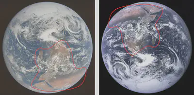
North-up won out with the magnetic compass, the portolan chart, and Mercator’s 1569 projection, over the same centuries as European colonial expansion. The 1884 conference that fixed the prime meridian at Greenwich settled the question of the centre too. These conventions run deep enough that even a photograph taken from space gets turned to obey them: the Apollo 17 crew shot the Blue Marble in 1972 with the South Pole at the top of the frame. The version NASA actually released, and the one almost everyone has since seen, was rotated so north sits on top instead, in part because the shapes of Arabia and Africa were more recognisable with north up.
J.B. Harley and the critical cartographers who followed him made the larger point: whatever sits at the top and the centre of a map carries a hierarchy along with it, intended or not. Which is a good reason to break the habit occasionally, if only to see what falls out.
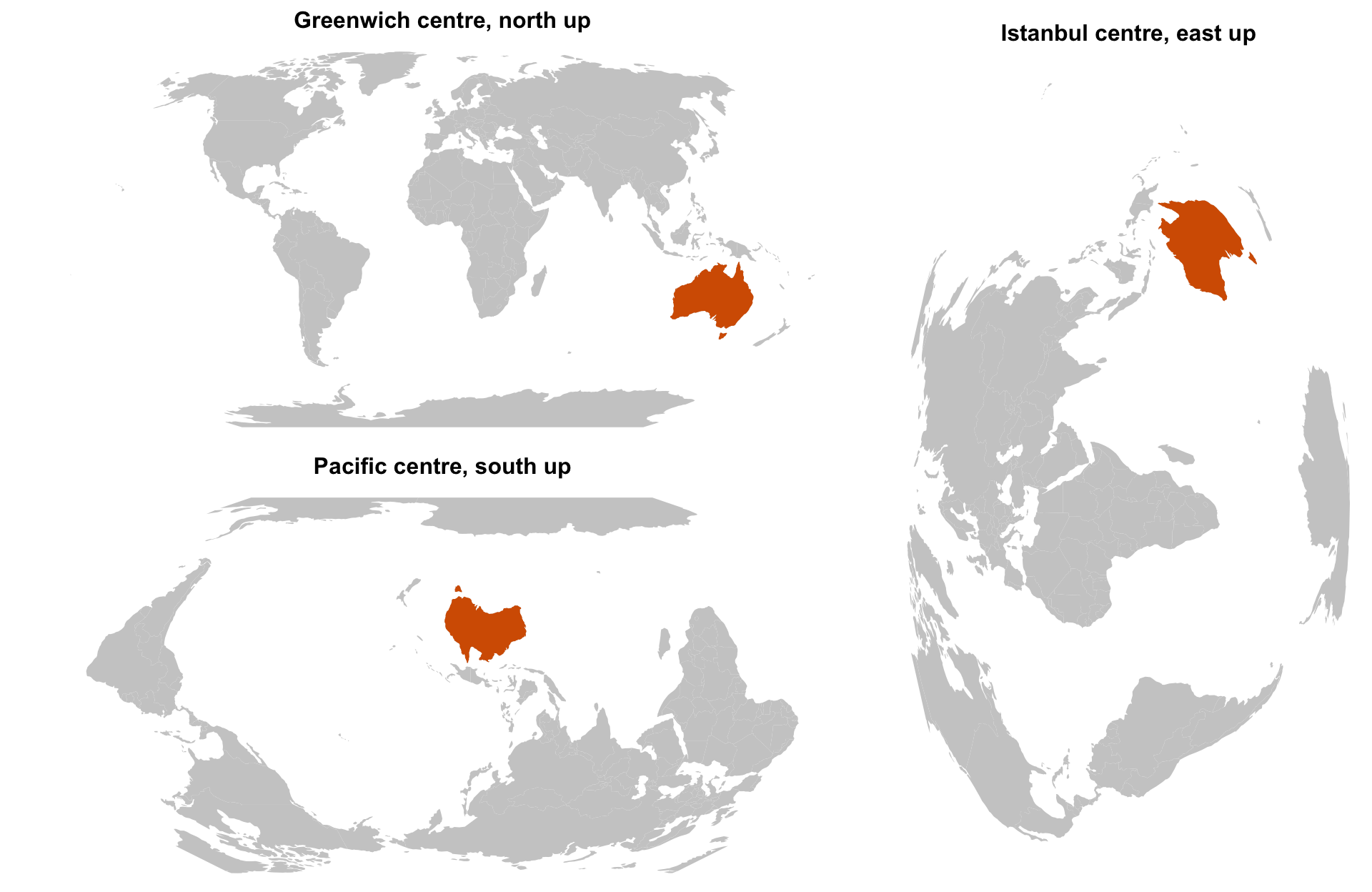
Images are maps too
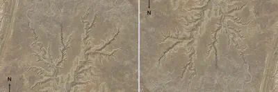
Every map so far in this post has been what Couclelis calls an object view of space: counties, regions, property lines, each one with relatively crisp boundaries. A satellite photograph and an X-ray radiograph are the other view, a field: a continuous surface of measured values, light or radiation or whatever the sensor records, with no boundaries and no names built in, just a projection onto a flat page. Photographs are maps of a field. They can lose exactly what a map of objects loses: which way is up, or down, or north. Sometimes that missing information has to be stated outright, or the picture turned, before a reader can interpret it correctly.
Take the example of relief inversion, where canyons read as ridges, ridges read as canyons, and geology is turned inside out. The fix is simply to turn the map.
Sometimes the reader also needs to know which way was down when the image was taken. Mitchell markers contain small lead beads that roll to the lowest point, alongside the usual left/right letter. This is especially useful for horizontal-beam radiographs. Fluid settles in the lowest (dependent) parts of the body and gas rises to the highest (non-dependent) parts, so knowing the patient’s orientation lets the reader recognize features like fluid lines or free gas. In the radiograph on the right below, the “R” marks the patient’s right side, and the beads have settled downward, confirming it was a horizontal-beam image rather than the usual vertical beam.

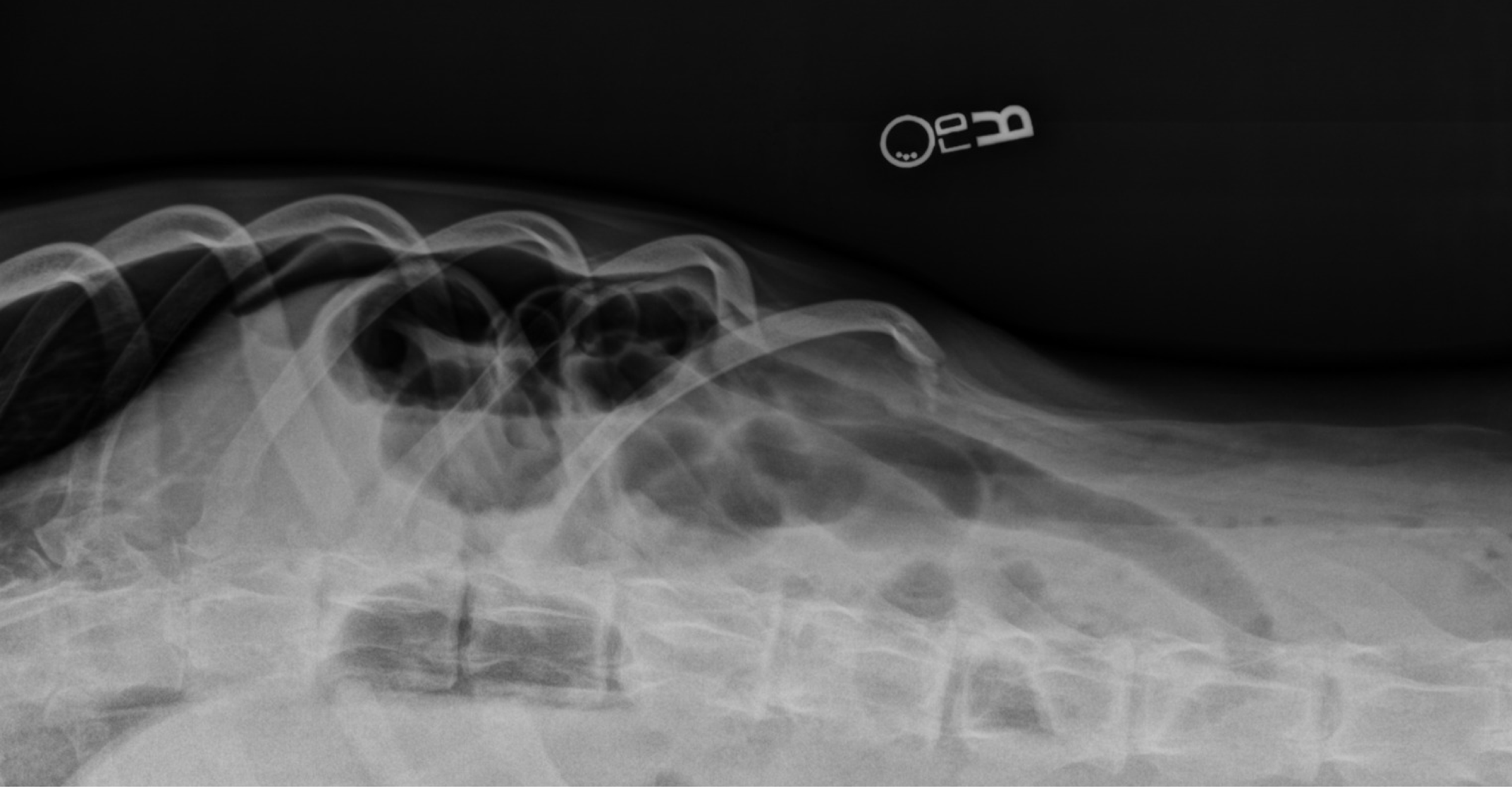
Left: gravity-dependent beads inside a pair of Mitchell markers, both settled toward the low point of the frame. Right: a horizontal-beam radiograph in which the beads have settled toward the bottom of the image.
That need is real, not decorative, which is worth keeping in mind for what comes next: plenty of maps carry a compass for decoration alone.
Invented worlds
Even invented worlds mostly go along with the habit. Edison Yan’s Videogames World Map stitches together locations from dozens of unrelated game franchises onto a single continent with no shared physics, no coherent rotation, and arguably no real planet underneath it at all. It still carries an ornate compass rose in the corner, because apparently that is simply what a map of a world is required to have. Tolkien’s maps of Middle-earth do the same: north at the top, for a world that never needed a magnetic field but definitely relied on Orientalist tropes.
Not every invented world goes along with it, and the holdouts are worth paying attention to. For example, Pratchett’s Discworld is a flat disc riding on the backs of four elephants standing on a giant turtle (a common cosmological framework in Hindu mythology), and cardinal directions genuinely do not describe it. So the books reach for a frame the geometry actually supports: Hubward and Rimward, toward the disc’s centre or its rim, plus Turnwise and Widdershins for the direction the whole disc slowly turns, and against it. Seasoned travellers navigate by feel: warmer means rimwards, colder means hubwards, and dizzy means you have been going widdershins for a while. It is the same topographic move as uptown or kaja, just built for a world that took its own shape seriously enough to need one.
One north arrow is wrong anyway
For anything meant to be recognised, orientation is a tool, not an absolute requirement. An arrow announcing north adds nothing to a shape the reader can already recognise on sight. Fine, you might say, it does no harm either; so what exactly is the complaint?
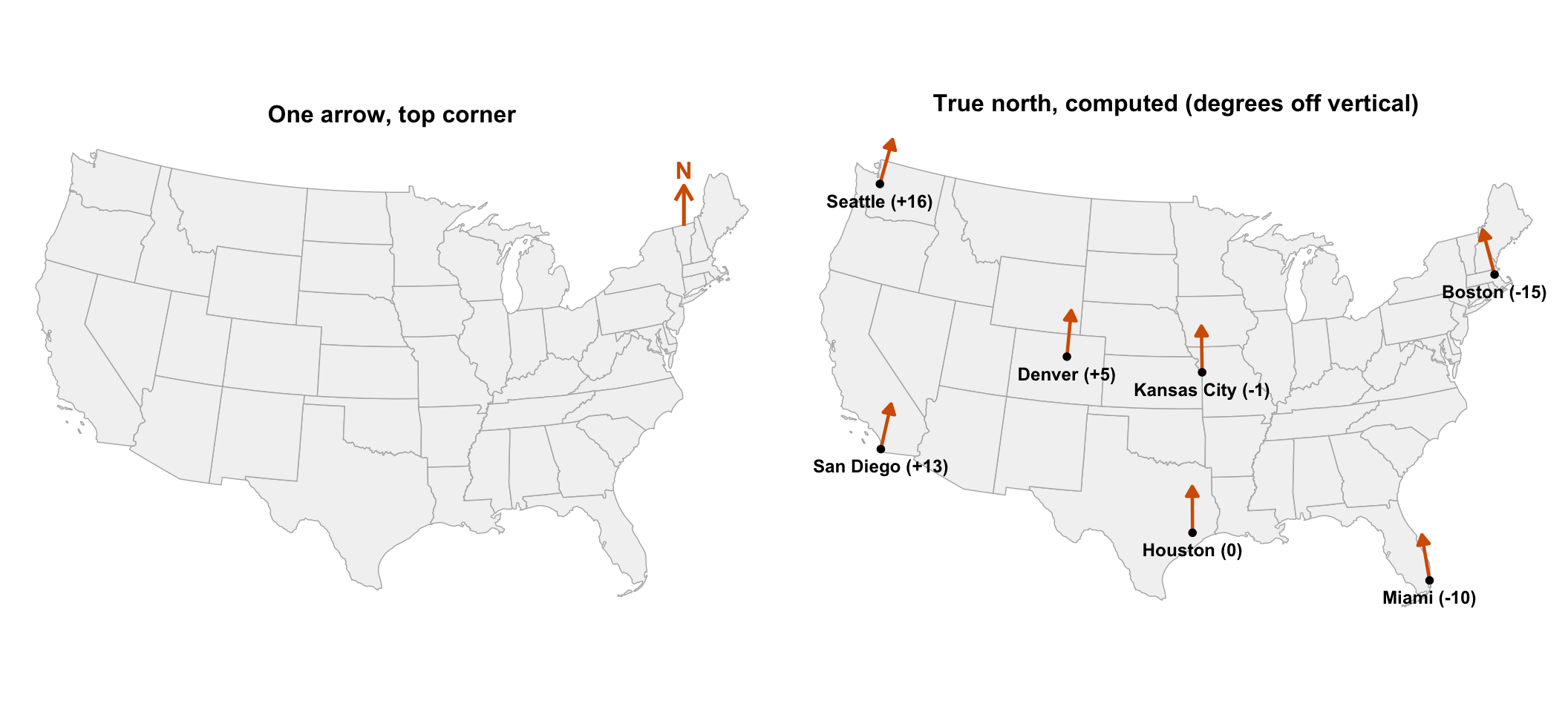
Here is a pedantic reason, but one that masks a larger communicative point. On a small-scale map, a single north arrow is not just unnecessary, it is often outright wrong. The county map that opened this post uses an Albers conic projection, the standard choice for national US maps, and on a conic projection true north tilts steadily as you move away from the central meridian, a point John Nelson had already made. Seattle sits 16 degrees off vertical, Boston 15 degrees the other way, and the one place the arrow is actually correct is somewhere around Kansas (more correctly Houston), which feels appropriate. In practice nobody notices, because the arrow was never doing any of the communicating in the first place.
Navigate
Ordinary people, unlike sailors, hardly ever navigate by compass. They learn a place first as landmarks, then as routes strung between them (left at the bank, straight on past the neem tree), and only later, if at all, as a coherent layout. What they actually steer by is whatever scene is in front of them: a street, a landmark, an exit, the direction they happen to be facing.
A navigation map’s whole job is to connect that scene to the next move, so it works best turned to match it, with the top of the map pointing wherever the reader is actually walking. A turned map then has to say, in terms the reader can check on the spot, which way it has been turned: “West” along the top edge, “Uptown” along the right, a you-are-here arrow pointing the way the reader is facing, as on the WalkNYC sign below. A north arrow is one option among these, and rarely the most useful one.
Outdoors
It is tempting to assume that once cardinal directions are easy to check outdoors, people default to using them. They do not. Different communities keep using whatever frame already works for them, cardinal or otherwise. Take the New York City subway map, an object with an unusually well-documented identity crisis. The original 1904 map lays Manhattan on its side, uptown to the right. Vignelli’s 1972 diagram, Hertz’s geographic 1979 redesign, and the MTA’s 2025 return to form all instead stand Manhattan upright. Partly this is because riders think in uptown and downtown, not north and south. Partly it is because, to a Manhattanite, the world simply revolves around Manhattan, other boroughs be damned. But uptown is not north: measured off the avenue centrelines, the island’s own street grid runs a full 29 degrees east of true north, a fact most New Yorkers have never needed and will be delighted never to need.
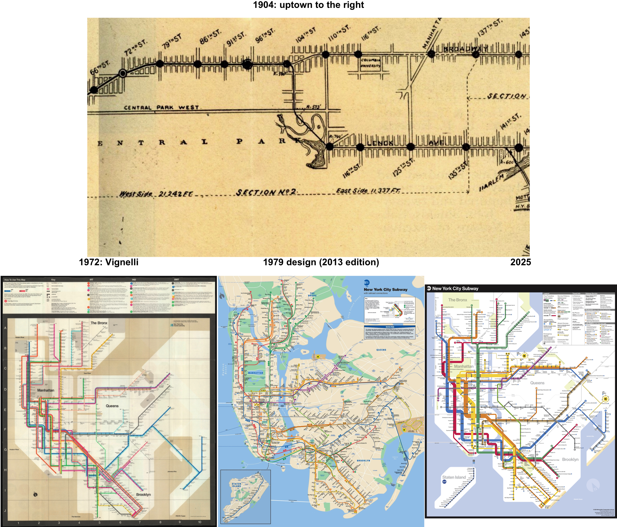
1904: New York Subway Souvenir, Burroughs & Co., public domain, via Wikimedia Commons, excerpt. 1972: New York City Transit Authority, scan via Geographicus. 2013: MTA, CC BY 2.0, via Wikimedia Commons. 2025: photo by Marc A. Hermann / MTA, CC BY 2.0, via Wikimedia Commons, cropped.
Indoors
Step indoors and the outdoor cues vanish along with the reception bars. Walls hide the sun and the landmarks both, GPS degrades, and it takes only a couple of turns to lose track of which way is which. People reliably get lost in libraries, hospitals, and malls, mostly because of how the building is laid out rather than any failure of their own sense of direction. Two kinds of indoor map show up almost everywhere in response.
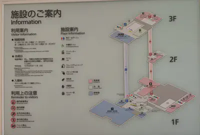
The first is the directory, whose whole purpose is helping people find things once they are already inside. This one, from the Okinawa Prefectural Museum and Art Museum in Naha, draws the building’s three floors stacked on top of one another, connected by the lifts and stairs that actually join them. A red marker on the ground floor announces “You are here,” the galleries are numbered, and each floor is labelled. Cardinal directions never come up; the building is its own frame.
The second kind is the evacuation plan, where the stakes are considerably higher and the rule has been written down accordingly. The international standard ISO 23601 requires that “the orientation of the plan as displayed shall be related to the viewer so that locations on the left of the plan are to the viewer’s left and locations on the right of the plan are to the viewer’s right.” Insisting on cardinal directions here instead (correct, absolute, and useless to someone choking on smoke) is exactly the kind of mistake that gets a standard written against it.
Screens: where pixels matter
On paper, the reader has to turn the map. On a phone or a car’s dashboard, the software turns it for them, and the reader is demoted to a blue arrow fixed at the centre of the screen, much like Micronesian navigators, whose islands sail past. Heading-up display makes the next turn easier to execute; north-up display makes it easier to plan a route and hold a mental picture of the area. Mapping apps offer both and quietly follow the same rule this whole post has been arguing for: a compass icon shows up only once the map has actually been rotated away from north, and tapping it snaps the map back and makes the icon disappear again. A compass permanently on screen would just be eating space that could otherwise be map, in exchange for telling the reader something true and irrelevant most of the time.
Turn-by-turn instructions take this one step further and dispense with the map entirely. “In 200 metres, turn left” is a purely relative frame: no north, no layout, nothing but the next move from wherever the reader currently stands. It is extremely efficient, and it likely costs something in spatial memory that nobody has fully priced in yet. Virtual reality also demonstrates just how little north matters to a body actually moving through a scene: in redirected walking, the system imperceptibly rotates the virtual world around a walking user, who can be made to circle a small physical room while feeling entirely certain they are walking in a straight line. The system is, in effect, gaslighting the user’s inner ear, and we don’t seem to mind.
Coordinate
Maps also help coordinate joint action, and whatever frame the people coordinating on it share has to be one every single one of them actually has. The simplest shared frame is an object everyone is standing on or can all see. Sailors set a course by compass but coordinate their own operations by a local frame instead: port and starboard. A fire crew does much the same: everyone on scene can see the building, so the building becomes the frame. The typical standard designates the “Alpha” side as the front entrance, or failing that, whichever side sits nearest a distinctive landmark, a swimming pool being the standard example, and names every other side relative to it. A firefighter who has spent ten minutes inside a smoke-filled building may have no working idea where north is; a swimming pool, they will remember. Players of team games like Counter-Strike face in every direction simultaneously, so each map gets its own community-agreed callouts, such as “long,” “catwalk,” and “mid,” by which a team can coordinate an entire ambush over voice chat.
A wildfire, by contrast, has no front door and no street address. Crews arrive from a dozen different agencies, sometimes from other states entirely, working the ground, flying overhead, or coordinating from a dispatch room. So wildfire maps standardise on the cardinal frame instead, purely so that everyone involved can agree. But like sailors, these crews also lean on a local frame drawn from the fire itself: the “head” is the fastest-moving edge, and “heel” and “flanks” are defined relative to it, a frame with the inconvenient property of redefining itself continuously as wind and fuel shove the head around.
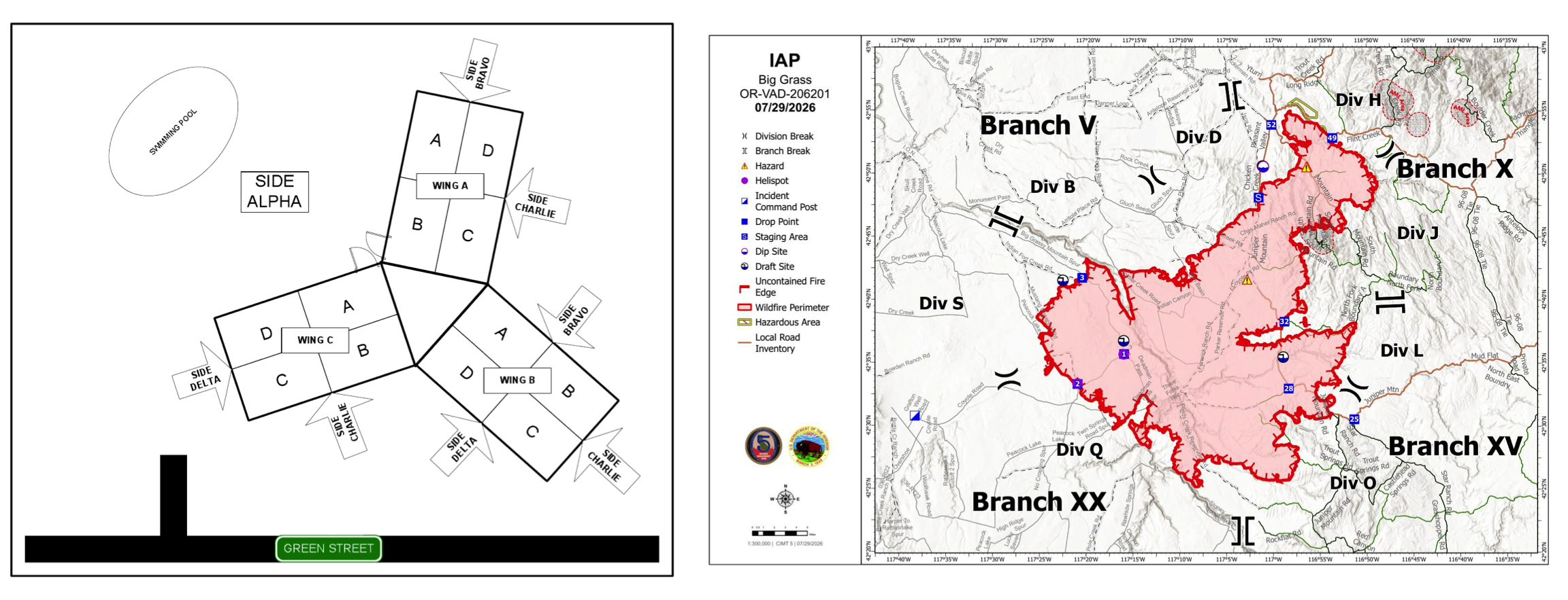
Left: Figure 2, Montgomery County Fire Chiefs’ Association, Recommended Practice 2007-4. Right: IAP map, Big Grass fire (OR-VAD-260201), 07/29/2026, Complex Incident Management Team 5, via the National Interagency Fire Center incident map archive.
Hospitals coordinate on a shared frame for the same reason. The radiologist reading a film and the surgeon later holding a scalpel have to agree on the patient’s own right and left, regardless of which way the image or the operating table happens to be facing. The convention is to hang the film as though the reader is standing face to face with the patient, so the patient’s actual right, marked “Dx” in the corner of a chest film, ends up on the viewer’s left. Veterinary radiographs keep the same rule: “the cranial or right side of the patient should always be on the viewer’s left.” Reports spell the side out in words as a backup, on top of the marker. Even with both safeguards in place, laterality errors in radiology reports remain a recurring, sobering problem.
Other creatures manage this coordination without any concept of absolute frame or a map: watch honeybees dance out directions, a thousand robots assemble themselves into a shape, or a flock of starlings murmurate.
Retrace
Retracing is coordination stretched across time, and it is the hardest version of the problem, because the reader was never there and none of the shared frames that make ordinary coordination easy are available to fall back on. Much like writing, the map has to carry its entire meaning in fixed, precise convention, and the reader still has to do the work of interpreting it correctly, decades or centuries later. That interpretation turns out to be considerably more fraught than it seems.
Plat surveys
A survey plat is a legal record, and its reader (a surveyor, a buyer, a court, potentially a century on) shares nothing with the original surveyor except the document itself and whatever still survives on the ground. American land has been divided up two different ways, and each leans on its own frame.
Metes and bounds, the method used in the original colonies, describes a parcel as a walk: from a point of beginning, so many feet on a stated bearing to a stone, then onward to a tree. The frame is cardinal, and the oldest bearings were read straight off a compass, so they point at whatever magnetic north happened to be on that particular afternoon. To repeat the walk correctly, a later surveyor has to know exactly which north was in use, and when. Arkansas’s own standards of practice for boundary surveys and plats require precisely this: every plat needs a “north arrow with basis of direction,” and if that basis comes from the Arkansas Plane Coordinate System, the plat must name the year of the system’s adjustment and the grid zone; if it instead defers to a deed or an earlier plat’s record bearing, it must cite the document and specify which boundary line controls. None of these candidates for north stay put for long.
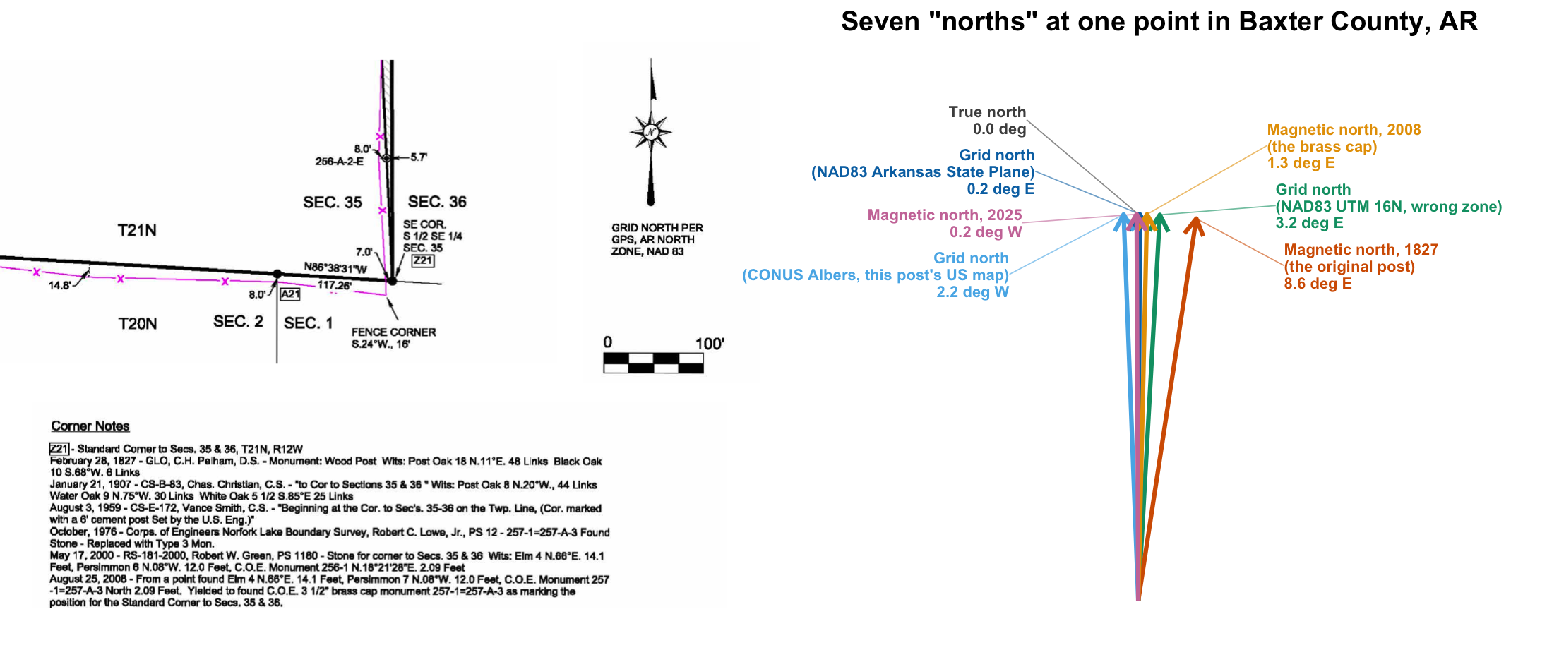
Left: survey plat, Section 35, T21N, R12W, Baxter County, Arkansas, Tuck Land Surveying, 2008, U.S. Army Corps of Engineers, Little Rock District, public domain, via Wikimedia Commons. Right: computed for the same corner.
A magnetic bearing taken at the original 1827 post pointed 8.6 degrees east of true north. By the time the brass cap replaced it in 2008, declination here had drifted to 1.3 degrees; today it sits within a quarter degree of true, purely as an accident of timing. Grid north drifts far more slowly over time, but swap out the grid itself and it moves plenty: the state plane zone actually meant for this county disagrees with its neighbour across the Missouri line by nearly a degree, with the next UTM zone over by just under three, and with the CONUS Albers projection (this post’s own national map, misapplied here as though it were a local grid) by over two. Run the same coordinates through the British National Grid, built around a transverse Mercator centred on Britain, and grid north tips just over 90 degrees: a confident, precisely computed, entirely meaningless answer to a question that was never coherent to begin with.
And the state plane grid itself is due to be redefined again: SPCS2022 will replace the current zones when NAD83 is finally retired in favour of NATRF2022. So on a plat, the north arrow was never there to orient the reader. Its job is to go on the record: which north these bearings were measured against, and on what date, so that whoever comes looking later knows exactly which fiction to reverse-engineer.
The Public Land Survey System, which covers most of the American West, only looks cardinal from a distance. Every parcel is named by it, including the one above: Section 35, Township 21 North, Range 12 West. But the law actually anchors the system to the ground rather than to the compass. Corners “marked in the surveys … shall be established as the proper corners of sections”, wherever the original survey crew happened to set them, errors and all. The shared frame is the monument itself, the same way the building is the frame at a fire, and that is exactly why the Arkansas corner notes read like a chain of custody rather than a set of coordinates: an 1827 wooden post and two witness trees, inherited and re-verified by five different surveyors, down to a brass cap finally set in 2008.
Post-hoc investigations
Once the fire itself is out, the investigation starts: what went wrong, who is liable, what has to change. Those investigation maps are written for readers who were never on scene (investigators, insurers, courts), not for the crews who were. “Side Delta” meant something precise and immediate to the crew standing there; to everyone downstream, it means nothing until someone translates it back into cardinal directions. Police work runs into the identical need. The National Institute of Justice’s crime scene guide instructs investigators to sketch the scene “indicating north on the sketch.” That is the same document doing a completely different job than the one the responding officer needed on arrival.
Conclusion
Four practices, several different answers, and not always the ones you would expect. Recognition mostly needs nothing more than a familiar shape and a couple of labels, no compass required. The exception is images with no built-in up of their own: turn a relief-inverted satellite photo the wrong way and canyons read as ridges; skip the beads on a horizontal-beam X-ray and a fluid line becomes unreadable. Both are the same fix, restoring information the image lost when it was flattened, not so anyone can verify it against the world outside, just so a reader can parse the picture correctly. Navigation, on the other hand, needs the map turned to match the reader’s own body, and a north arrow shows up only as a footnote to that, when the map has been turned some other way instead. Coordination needs a frame everyone present actually shares, and that frame is usually a building, a fire, or a callout on a game map long before it is a compass bearing. Only retracing, matching a document against the actual ground, genuinely needs a stated, dated north, and even then only because true, magnetic, and grid north each drift, disagree, and occasionally lie outright.
None of this makes the north arrow untenable in maps. The trouble starts, as it usually does, in the assumption that a map is a single kind of thing, answerable to a single fixed checklist, regardless of what it happens to be for.

Nikhil Kaza
Professor
My research interests include urbanization patterns, local energy policy and equity