My Screed Against Legends
Introduction
A legend asks something unreasonable of the reader: stop looking at the data, find a small box somewhere else on the page, decode a colour or a symbol against a list of names, hold that mapping in memory, and go back to find the mark you were originally looking at. Do that for every line, every region, every category, on every chart you read.
In most instances, this is unnecessary. A legend is an admission that the design failed to speak for itself.
This is not a new idea. Cleveland was making this argument about graphical perception back in the 1980s, working out how colour and position actually get decoded. Tufte’s case against chart junk amounts to the same argument against legends. Colours and symbols are comparatively poor at carrying categorical information on their own; position and text are much better.
This post works through a series of visualisations, each built twice: legend version next to non-legend version. It’s not a rulebook, just ideas for cutting the cognitive burden on the reader. The point isn’t that legends are never justified; it is that they’re the default far more often than they should be.
The burden of legends
Legends often reflect authorial laziness. They’re easy to reach for because they let the author punt on resolving colour, symbol, text, and data conflicts within the visualisation itself, shoving everything into a white margin where no conflict can exist. That’s fine for quick exploratory work, where the point is just to spot patterns across many visualisations. It’s not fine when the point is to present a compelling case to a reader.
Legends shift the cognitive burden from author to reader: a visual search for the right box in the key, a lookup, a repeated translation back to the mark on the chart. On a chart with three or four categories, that’s mildly annoying. On a chart with a dozen thin, similarly coloured lines, or a continuous colour scale map, the legend becomes the main obstacle to reading the chart at all. What visualisations are often about (the shape of the data, the outliers, and the general trend) gets lost in this translation.
Remedies
If not legends, then what? The remedy is direct visual integration made with deliberate and defensible choices: category names appended directly to the graph, text embedded strategically, colour-coded titles where the typography itself does the work of a key. Facets (small multiples) and tooltips help too. You can also draw the reader’s eye straight to the elements that matter, the way a photographer frames and focuses a shot to carry one message. Thinking explicitly about these choices cuts the cognitive friction. Removing legends doesn’t lower the bar for a visualisation; it raises it, forcing colour and symbol into much more deliberate use.
Direct labels should be default
Often, simply labelling the data is enough. Take median home sale price for five Texas markets, 2000–2015, from ggplot2::txhousing. Legend on the left, direct labels on the right:
Show code
library(ggplot2)
library(dplyr)
library(ggrepel)
library(cowplot)
library(cols4all)

cities <- c("Austin", "Dallas", "Houston", "San Antonio", "Fort Worth")
d <- txhousing %>%
  filter(city %in% cities) %>%
  group_by(city, year) %>%
  summarise(median_price = mean(median, na.rm = TRUE), .groups = "drop")

# One color per city, fixed here and reused wherever else in this post a city
# gets a color.

city_pal <- setNames(c4a("misc.okabe", length(cities)), sort(cities))
text_cols <- setNames(colorspace::darken(city_pal, amount = 0.45), names(city_pal))

base_theme <- theme_cowplot(font_size = 12) +
  background_grid(major = "xy", minor = "none")

p_legend <- ggplot(d, aes(year, median_price, color = city)) +
  geom_line(linewidth = 0.7) +
  scale_color_manual(values = city_pal) +
  scale_y_continuous(labels = scales::dollar_format(scale = 1e-3, suffix = "k")) +
  labs(x = NULL, y = "Median sale price", color = NULL, title = "With a legend") +
  base_theme +
  theme(legend.position = "right")

last_pts <- d %>%
  group_by(city) %>%
  filter(year == max(year)) %>%
  mutate(txt_col = text_cols[city])

p_direct <- ggplot(d, aes(year, median_price, color = city)) +
  geom_line(linewidth = 0.7, show.legend = FALSE) +
  geom_point(data = last_pts, size = 2, show.legend = FALSE) +
  geom_text_repel(
    data = last_pts, aes(label = city), color = last_pts$txt_col,
    hjust = 0, direction = "y", xlim = c(max(d$year), NA),
    force = 1.5, box.padding = 0.3, min.segment.length = 0,
    segment.size = 0.3, segment.color = "grey60", size = 3.2
  ) +
  scale_color_manual(values = city_pal) +
  scale_x_continuous(expand = expansion(mult = c(0.02, 0.22))) +
  scale_y_continuous(labels = scales::dollar_format(scale = 1e-3, suffix = "k")) +
  labs(x = NULL, y = "Median sale price", title = "With direct labels") +
  base_theme

plot_grid(p_legend, p_direct, nrow = 1)
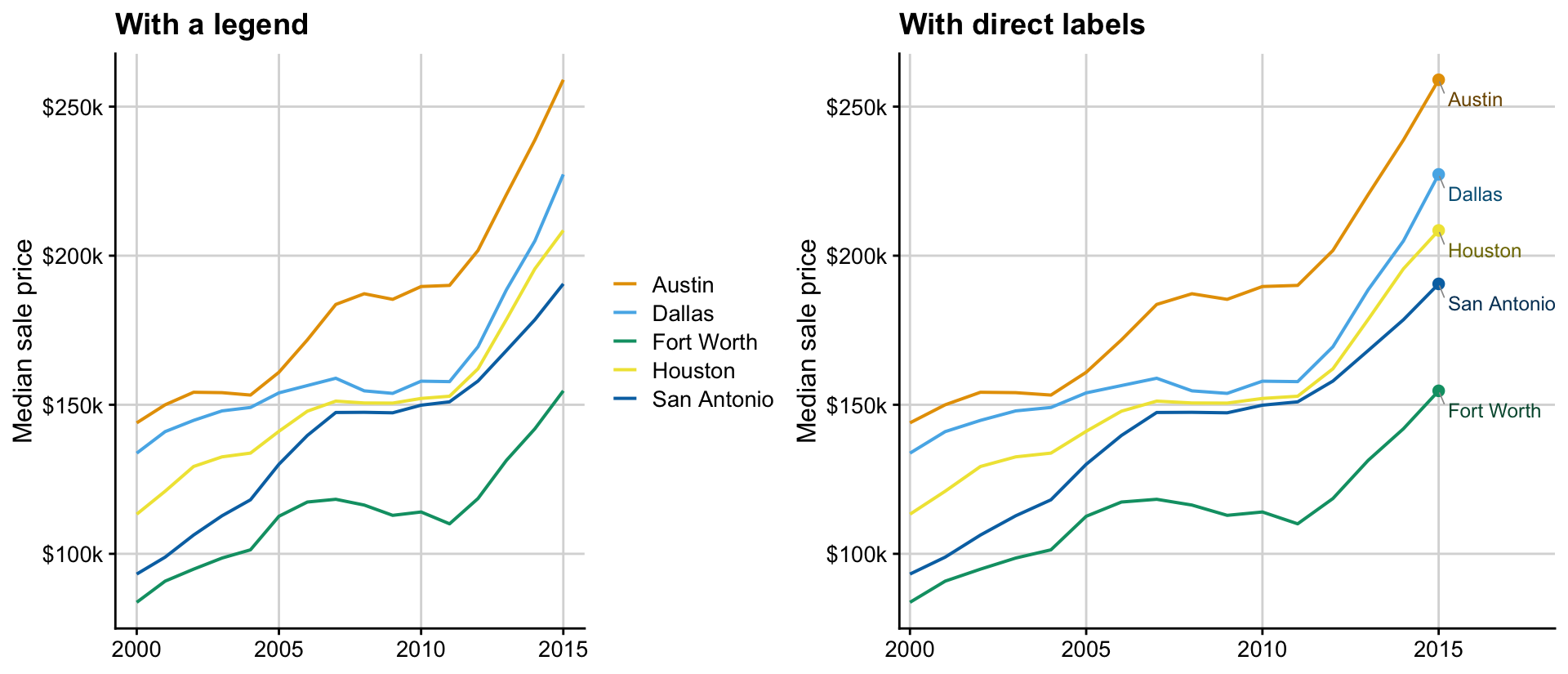
Two details do the work in the right-hand panel. The labels are sorted by where the lines actually end, so they read top-to-bottom in the same order as the lines. Each label is tinted a darkened version of its own city’s colour rather than flat black, dark enough to stay legible, close enough to the line’s own hue that the label and the dot beside it read as one thing, not a caption the reader has to connect to a colour by hand.
Now it’s worth asking: is the colour even needed here? Probably not.
A map is no different
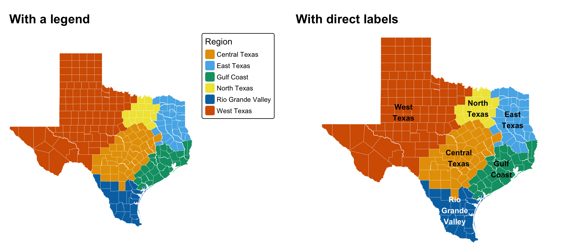
A map is no different than any other 2D statistical graphic, where XY are locations rather than other variables, such as time and prices. Take the seven land-market regions the Texas Real Estate Research Center at Texas A&M uses to track Texas land markets. The categorical map showing where each region sits and how big it is doesn’t really need a legend. tmap defaults reach for one just as readily as ggplot2’s do. And, we must resist it.
We can use the same direct-labelling trick as the charts above. Put the label directly where it matters and the cognitive burden disappears: the right-hand map reads instantly. Nobody has to check which colour means “West Texas”. The map just says so, over the actual West Texas counties.
Colour conflicts, however, do not disappear. Black text is not readily visible on top of dark colours and white text on light colours. So you will need to explicitly figure out how labels are contrasted with background colour categories (see e.g. Panhandle-South Plains.). Furthermore, you will have to worry about line wrapping to make sure that the labels are readable and do not overflow. This is idiosyncratic and distinctive to this dataset with these labels and with this spatial configuration and the author must do the work to make it easy on the reader, rather than rely on general rules.
Show code
library(sf)
library(tigris)
library(tmap)

# label_ink() picks whichever of ink or white clears more WCAG contrast
# against a fill, whenever a label sits
# directly inside a solid-colored region. WCAG relative luminance is exactly
# the CIE XYZ Y channel, which farver already computes

rel_lum <- function(hex) farver::decode_colour(hex, to = "xyz")[, "y"] / 100
contrast_ratio <- function(h1, h2) {
  l <- cbind(rel_lum(h1), rel_lum(h2))
  hi <- pmax(l[, 1], l[, 2]); lo <- pmin(l[, 1], l[, 2])
  (hi + 0.05) / (lo + 0.05)
}
label_ink <- function(fill_hex, ink = "black", white = "white") {
  ifelse(contrast_ratio(fill_hex, ink) >= contrast_ratio(fill_hex, white), ink, white)
}

# The seven land-market regions TRERC (the Texas Real Estate Research Center
# at Texas A&M) tracks Texas land and housing markets by, taken directly from
# the county-to-region lookup behind trerc.tamu.edu/data/rural-land.

trerc_regions <- list(
  "Panhandle-South Plains" = c("Andrews", "Armstrong", "Bailey", "Borden", "Briscoe", "Carson", "Castro", "Cochran", "Crosby", "Dallam",
    "Dawson", "Deaf Smith", "Ector", "Floyd", "Gaines", "Garza", "Gray", "Hale", "Hansford", "Hartley",
    "Hemphill", "Hockley", "Howard", "Hutchinson", "Lamb", "Lipscomb", "Lubbock", "Lynn", "Martin", "Midland",
    "Moore", "Ochiltree", "Oldham", "Parmer", "Potter", "Randall", "Roberts", "Sherman", "Swisher", "Terry", "Yoakum"),
  "Far West Texas" = c("Brewster", "Crane", "Culberson", "El Paso", "Hudspeth", "Jeff Davis", "Loving", "Pecos", "Presidio",
    "Reeves", "Terrell", "Ward", "Winkler"),
  "West Texas" = c("Archer", "Baylor", "Childress", "Clay", "Coke", "Collingsworth", "Concho", "Cottle", "Crockett", "Dickens",
    "Donley", "Edwards", "Fisher", "Foard", "Glasscock", "Hall", "Hardeman", "Haskell", "Irion", "Jack",
    "Jones", "Kent", "King", "Kinney", "Knox", "Mitchell", "Motley", "Nolan", "Reagan", "Runnels",
    "Schleicher", "Scurry", "Shackelford", "Stephens", "Sterling", "Stonewall", "Sutton", "Taylor", "Throckmorton", "Tom Green",
    "Upton", "Val Verde", "Wheeler", "Wichita", "Wilbarger", "Young"),
  "Northeast Texas" = c("Anderson", "Angelina", "Bowie", "Camp", "Cass", "Cherokee", "Collin", "Cooke", "Dallas", "Delta",
    "Denton", "Ellis", "Fannin", "Franklin", "Grayson", "Gregg", "Harrison", "Henderson", "Hood", "Hopkins",
    "Houston", "Hunt", "Jasper", "Johnson", "Kaufman", "Lamar", "Marion", "Montague", "Morris", "Nacogdoches",
    "Newton", "Palo Pinto", "Panola", "Parker", "Polk", "Rains", "Red River", "Rockwall", "Rusk", "Sabine",
    "San Augustine", "Shelby", "Smith", "Somervell", "Tarrant", "Titus", "Trinity", "Tyler", "Upshur", "Van Zandt", "Wise", "Wood"),
  "Gulf Coast-Brazos Bottom" = c("Austin", "Brazoria", "Brazos", "Burleson", "Calhoun", "Chambers", "Colorado", "DeWitt", "Fayette", "Fort Bend",
    "Galveston", "Gonzales", "Grimes", "Hardin", "Harris", "Jackson", "Jefferson", "Lavaca", "Leon", "Liberty",
    "Madison", "Matagorda", "Montgomery", "Orange", "Robertson", "San Jacinto", "Victoria", "Walker", "Waller", "Washington", "Wharton"),
  "South Texas" = c("Aransas", "Atascosa", "Bee", "Bexar", "Brooks", "Cameron", "Comal", "Dimmit", "Duval", "Frio",
    "Goliad", "Guadalupe", "Hidalgo", "Jim Hogg", "Jim Wells", "Karnes", "Kenedy", "Kleberg", "La Salle", "Live Oak",
    "Maverick", "McMullen", "Medina", "Nueces", "Refugio", "San Patricio", "Starr", "Uvalde", "Webb", "Willacy", "Wilson", "Zapata", "Zavala"),
  "Austin-Waco-Hill Country" = c("Bandera", "Bastrop", "Bell", "Blanco", "Bosque", "Brown", "Burnet", "Caldwell", "Callahan", "Coleman",
    "Comanche", "Coryell", "Eastland", "Erath", "Falls", "Freestone", "Gillespie", "Hamilton", "Hays", "Hill",
    "Kendall", "Kerr", "Kimble", "Lampasas", "Lee", "Limestone", "Llano", "Mason", "McCulloch", "McLennan",
    "Menard", "Milam", "Mills", "Navarro", "Real", "San Saba", "Travis", "Williamson")
)
county_region_df <- stack(trerc_regions) %>%
  rename(county = values, region = ind) %>%
  mutate(county = as.character(county), region = as.character(region))

tx_counties <- counties(state = "TX", cb = TRUE, year = 2022, progress_bar = FALSE) %>%
  st_transform(4326)
tx_counties$region <- county_region_df$region[match(tx_counties$NAME, county_region_df$county)]
tx_counties$region_wrapped <- gsub(" ", "\n", tx_counties$region)
# "Panhandle-South Plains" wraps unevenly at its only space (a 15-character
# first line), which is wider than the panhandle itself is tall --- break at
# the hyphen instead for two lines close to the same width
tx_counties$region_wrapped[tx_counties$region == "Panhandle-South Plains"] <- "Panhandle-\nSouth Plains"

# A handful of Texas markets, one to a few per region --- built once here
# and reused throughout the rest of this post wherever a Texas market
# needs a location, a price, or a region
cities <- c("Dallas", "Fort Worth", "Arlington", "Irving", "Garland",
  "Houston", "Galveston", "Beaumont", "Port Arthur", "Victoria",
  "Austin", "San Antonio", "San Marcos", "Waco", "Kerrville",
  "Amarillo", "Lubbock", "Midland", "Odessa", "San Angelo", "Abilene", "El Paso", "Wichita Falls",
  "Laredo", "McAllen", "Harlingen", "Brownsville", "South Padre Island", "Corpus Christi",
  "Tyler", "Lufkin", "Nacogdoches", "Paris", "Texarkana")

tx_places <- places(state = "TX", cb = TRUE, year = 2022, progress_bar = FALSE) %>%
  mutate(base_name = gsub(" city$| CDP$| town$", "", NAME)) %>%
  filter(base_name %in% cities)
pts <- st_centroid(tx_places) %>% st_transform(4326)
pts_coords <- st_coordinates(pts)
pts_df <- pts %>% st_drop_geometry() %>% mutate(lon = pts_coords[, 1], lat = pts_coords[, 2]) %>%
  select(city = base_name, lon, lat)

# each city's region comes from which county polygon actually contains it,
# not from which city happens to be geographically nearest
region_df <- st_join(pts["base_name"], tx_counties["region"]) %>%
  st_drop_geometry() %>%
  rename(city = base_name)

price2015 <- txhousing %>% filter(city %in% cities, year == 2015) %>%
  group_by(city) %>% summarise(price2015 = mean(median, na.rm = TRUE))

core <- region_df %>% left_join(pts_df, by = "city") %>% left_join(price2015, by = "city")

region_order <- sort(unique(tx_counties$region))
region_cols <- setNames(c4a("misc.okabe", length(region_order)), region_order)
region_txt  <- label_ink(region_cols)

m_legend <- tm_shape(tx_counties) +
  tm_polygons(fill = "region", fill.scale = tm_scale_categorical(values = "misc.okabe"),
              col = "white", lwd = 0.2, fill.legend = tm_legend(title = "Region")) +
  tm_layout(frame = FALSE) + tm_title("With a legend", fontface = "bold")

# Fix specific issues with labelling, iteratively.

region_diss <- tx_counties %>% group_by(region, region_wrapped) %>%
  summarise(geometry = st_union(geometry), .groups = "drop") %>% st_centroid()
region_diss$geometry[region_diss$region == "Panhandle-South Plains"] <-
  region_diss$geometry[region_diss$region == "Panhandle-South Plains"] + c(0.2, 0)

m_direct <- tm_shape(tx_counties) +
  tm_polygons(fill = "region", fill.scale = tm_scale_categorical(values = "misc.okabe"),
              col = "white", lwd = 0.2, fill.legend = tm_legend(show = FALSE)) +
  tm_shape(region_diss) +
  tm_text(text = "region_wrapped", size = 0.8, fontface = "bold",
          col = "region", col.scale = tm_scale_categorical(values = region_txt),
          col.legend = tm_legend(show = FALSE)) +
  tm_layout(frame = FALSE) + tm_title("With direct labels", fontface = "bold")

tmap_arrange(m_legend, m_direct, ncol = 2)
Pick the right channel
Stacked bars are a common way to show a composition changing between two points in time. Total height across two bars is trivial to compare; one segment’s height across two bars is not, because every segment except the bottom one sits on a different, shifting baseline. And a legend is needed just to know which colour is which category before any comparison can even start. A slope graph fixes most of these issues.
Show code
cities <- c("Austin", "Dallas", "Houston", "San Antonio", "Fort Worth")
sales2 <- txhousing %>%
  filter(city %in% cities, year %in% c(2000, 2015)) %>%
  group_by(city, year) %>%
  summarise(sales = sum(sales, na.rm = TRUE), .groups = "drop")

# city_pal and its darkened text_cols companion were both defined by the
# first chart; reused as-is here
sales2 <- sales2 %>% mutate(line_col = city_pal[city])

p_legend_bar <- ggplot(sales2, aes(factor(year), sales, fill = city)) +
  geom_col(width = 0.6) +
  scale_fill_manual(values = city_pal) +
  scale_y_continuous(labels = scales::label_number(scale = 1e-3, suffix = "k")) +
  labs(x = NULL, y = "Home sales", fill = NULL, title = "With a legend") +
  base_theme +
  theme(legend.position = "right", legend.text = element_text(size = 8))

lab2 <- sales2 %>%
  mutate(lab = paste0(city, "  ", scales::label_number(scale = 1e-3, accuracy = 0.1, suffix = "k")(sales)),
         txt_col = text_cols[city],
         label_x = if_else(year == 2000, 1998, 2017))

p_slope <- ggplot(sales2, aes(year, sales, color = line_col, group = city)) +
  geom_line(linewidth = 0.7, show.legend = FALSE) +
  geom_point(size = 2, show.legend = FALSE) +
  geom_text_repel(data = filter(lab2, year == 2000), aes(label_x, sales, label = lab, color = txt_col),
                   hjust = 1, direction = "y", xlim = c(NA, 1998),
                   force = 2, box.padding = 0.2, min.segment.length = 0,
                   segment.size = 0.3, segment.color = "grey60", size = 3, show.legend = FALSE) +
  geom_text_repel(data = filter(lab2, year == 2015), aes(label_x, sales, label = lab, color = txt_col),
                   hjust = 0, direction = "y", xlim = c(2017, NA),
                   force = 2, box.padding = 0.2, min.segment.length = 0,
                   segment.size = 0.3, segment.color = "grey60", size = 3, show.legend = FALSE) +
  scale_color_identity() +
  scale_x_continuous(breaks = c(2000, 2015), expand = expansion(mult = c(0.55, 0.55))) +
  scale_y_continuous(labels = scales::label_number(scale = 1e-3, suffix = "k")) +
  labs(x = NULL, y = "Home sales", title = "With direct labels (a slope graph)") +
  base_theme

plot_grid(p_legend_bar, p_slope, nrow = 1)
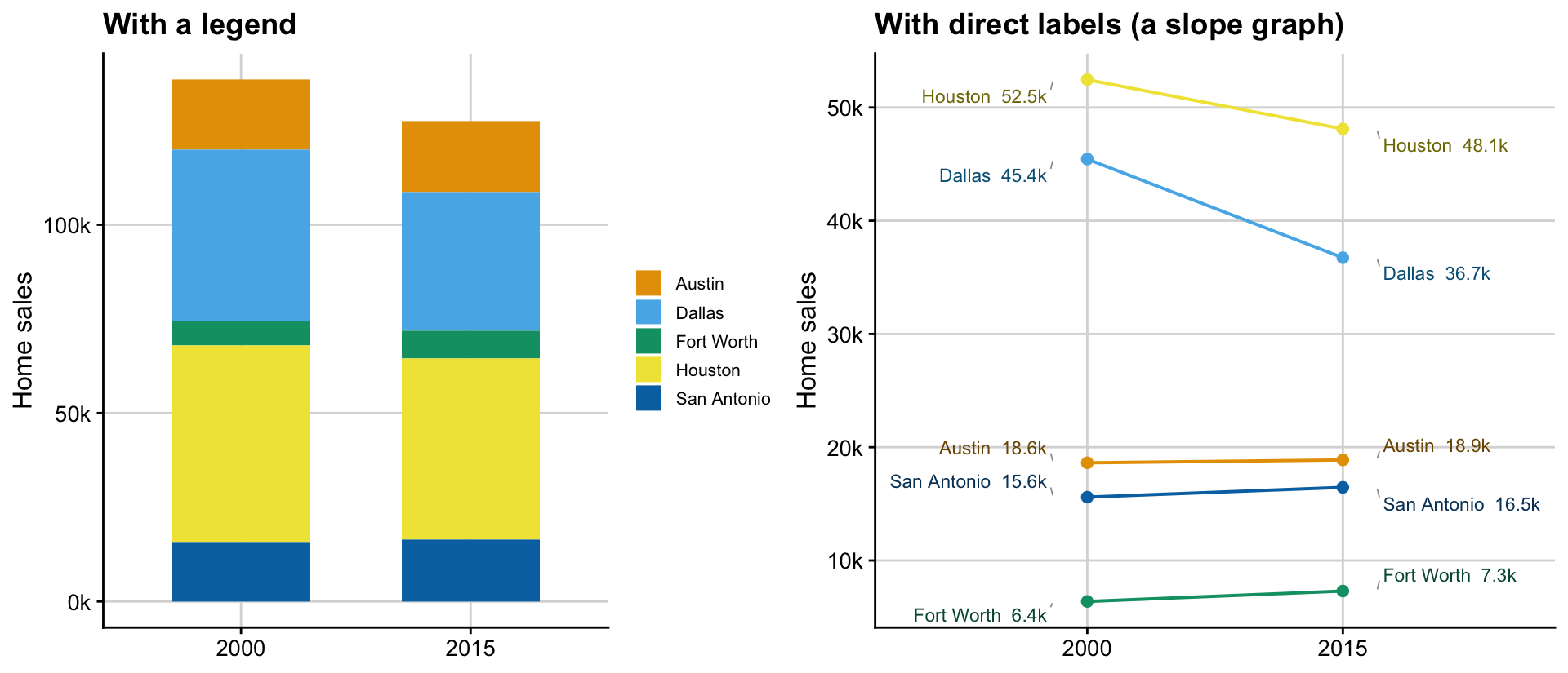
Slope graphs, a Tufte invention, let you focus on how individual components change by leaning on positional shift instead of colour. Because 2000 and 2015 are visually connected by a line, its angle tells the reader both the strength and direction of change directly. Colour becomes largely unnecessary, and so does the legend.
Group with small multiples
Colour breaks down as a grouping device too. Take every Texas market from the region map above with complete price data across the full period, coloured by its region rather than by city: seven colours, and a legend is still needed just to tell which of the seven is which. Small multiples solve this more directly than any legend could: facet by region, and the panel’s own title says the name outright, no colour to decode at all.
Show code
# region_df and region_cols were both built in "A map is no different" above;
# reused as-is here so a region keeps the same colour throughout this post.
# Restricted to cities with zero missing years 2000--2015, so every line runs
# the full length of its panel --- no partial series to explain away
complete_cities_region <- txhousing %>%
  filter(year %in% 2000:2015) %>%
  group_by(city) %>%
  summarise(n_na = sum(is.na(median))) %>%
  filter(n_na == 0) %>%
  pull(city)

d_region <- txhousing %>%
  filter(city %in% region_df$city, city %in% complete_cities_region, year %in% 2000:2015) %>%
  group_by(city, year) %>%
  summarise(median_price = mean(median, na.rm = TRUE), .groups = "drop") %>%
  left_join(region_df, by = "city")

last_region <- d_region %>%
  group_by(city) %>%
  filter(year == max(year)) %>%
  ungroup()

p_legend_region <- ggplot(d_region, aes(year, median_price, color = region, group = city)) +
  geom_line(linewidth = 0.5, alpha = 0.8) +
  geom_text_repel(data = last_region, aes(label = city), size = 2.1,
                   hjust = 0, direction = "y", xlim = c(2015, NA),
                   force = 10, box.padding = 0.15, min.segment.length = 0,
                   segment.size = 0.25, segment.color = "grey60",
                   show.legend = FALSE, max.overlaps = Inf) +
  scale_color_manual(values = region_cols) +
  scale_x_continuous(breaks = c(2000, 2005, 2010, 2015), expand = expansion(mult = c(0.02, 0.3))) +
  scale_y_continuous(labels = scales::dollar_format(scale = 1e-3, suffix = "k")) +
  labs(x = NULL, y = "Median sale price", color = NULL, title = "With a legend, coloured by region") +
  base_theme +
  theme(legend.position = "right")

p_facet_region <- ggplot(d_region, aes(year, median_price, group = city)) +
  geom_line(color = "grey30", linewidth = 0.5, alpha = 0.8) +
  geom_text_repel(data = last_region, aes(label = city), color = "grey20",
                   hjust = 0, direction = "y", xlim = c(2015, NA),
                   force = 10, box.padding = 0.2, min.segment.length = 0,
                   segment.size = 0.25, segment.color = "grey60", size = 2.1,
                   max.overlaps = Inf) +
  facet_wrap(~region, ncol = 4) +
  scale_x_continuous(breaks = c(2000, 2005, 2010, 2015), expand = expansion(mult = c(0.02, 0.42))) +
  scale_y_continuous(labels = scales::dollar_format(scale = 1e-3, suffix = "k")) +
  labs(x = NULL, y = "Median sale price", title = "With small multiples, one panel per region") +
  base_theme +
  theme(strip.text = element_text(face = "bold", hjust = 0, size = 11),
        strip.background = element_blank(),
        panel.spacing = unit(1, "lines"))

plot_grid(p_legend_region, p_facet_region, nrow = 2)
Both panels plot exactly the same data; only the encoding changes. On top, colour needs decoding: the reader has to find the right region in the legend, then carry that mapping back across a page of overlapping lines. Below, faceting skips the decoding step entirely. Each panel’s own title already says which region it is, so position takes over as the identity channel and colour simply isn’t needed. Comparison within a region survives the switch: each panel is really just a smaller version of the very first chart in this post. And because the facets share a y-axis, comparison across regions survives too: Austin-Waco-Hill Country’s markets sit well above West Texas’s for the whole period, not just by 2015.
Ideally the facets are in a single row so that they can share the Y-axis, but we are limited by the figure width. It would be useful for the regions that need to be compared to one another are close to each other. I will leave this as an exercise.
The facets also highlight the regionalisation issue. In many of the regions, there are only 1 market, it is useful to consider if this regionalisation is the right grouping. I will leave that as an exercise too.
Highlight what matters
Faceting solves “too many series” when every series matters roughly equally. Often it doesn’t: the real story is one or two of them, and the rest exist only to give that story a sense of scale. Sometimes a general trend matters; other times a genuine outlier is the star. Either way, most of the data is background to the few that need to shine. Think of it as the f-stop on a camera, separating foreground from background.
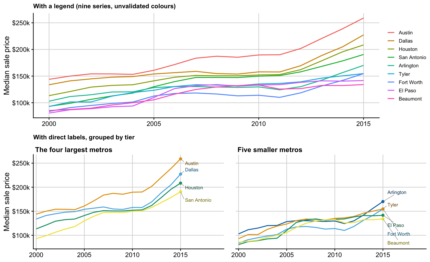
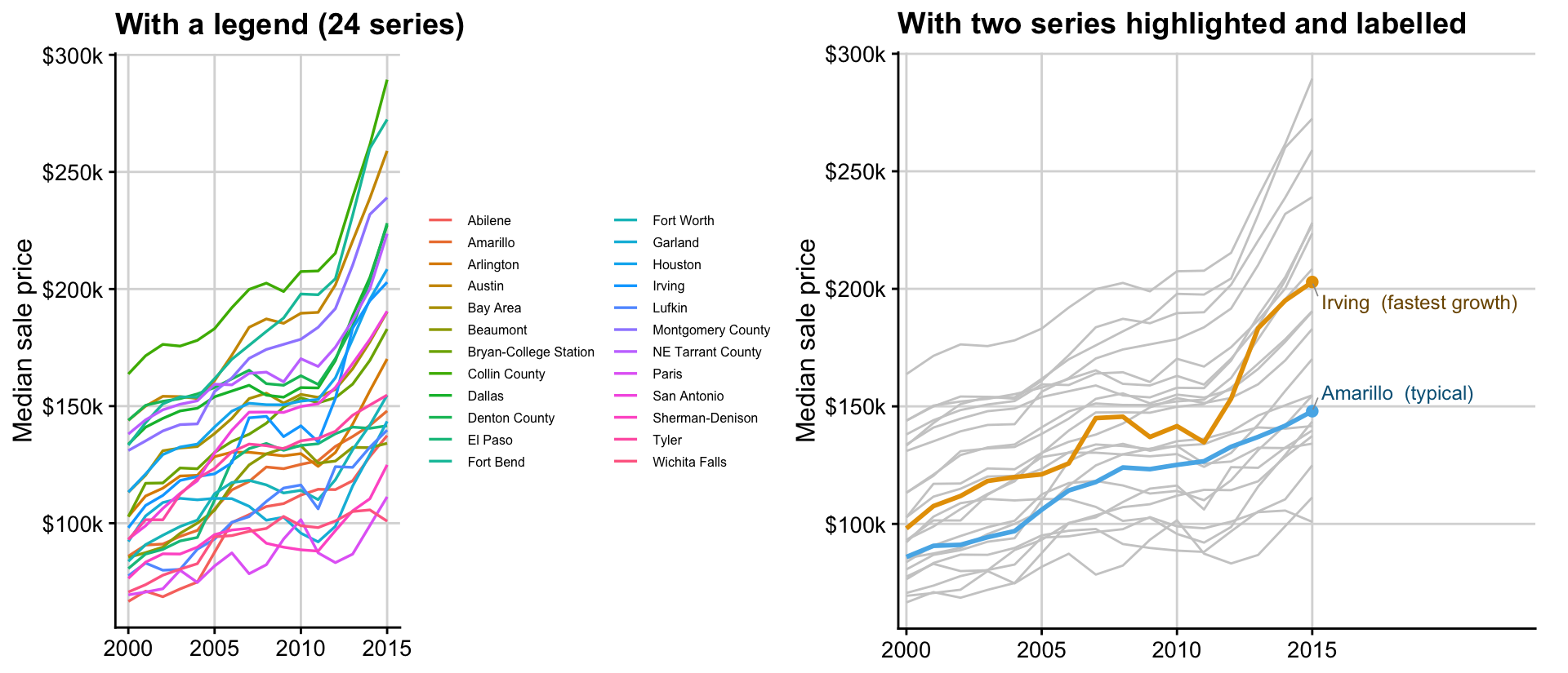
txhousing has 24 Texas cities with complete price data across 2000–2015, too many for a legend to be any use. All 24, distinctly coloured and keyed. A twenty-four-row legend for twenty-four lines is pointless. cols4all refuses outright past eight colours, and even ggplot2’s fallback rainbow just produces a wall of near-identical hues matched to a key nobody’s going to scroll through. Most of those lines aren’t the story anyway: they’re there to show that prices broadly rose across Texas over fifteen years, which the grey backdrop already says perfectly well as a shape. What actually needed an identity was which city rose fastest (Irving) and which one stayed closest to typical (Amarillo). So those are the only two drawn in colour, the only two labelled, and the only two a reader is asked to remember. If your text is about these two, leave the rest in the background.
Show code
complete_cities <- txhousing %>%
  filter(year %in% 2000:2015) %>%
  group_by(city) %>%
  summarise(n_na = sum(is.na(median))) %>%
  filter(n_na == 0) %>%
  pull(city)

d24 <- txhousing %>%
  filter(city %in% complete_cities, year %in% 2000:2015) %>%
  group_by(city, year) %>%
  summarise(median_price = mean(median, na.rm = TRUE), .groups = "drop")

p_legend24 <- ggplot(d24, aes(year, median_price, color = city)) +
  geom_line(linewidth = 0.6) +
  scale_y_continuous(labels = scales::dollar_format(scale = 1e-3, suffix = "k")) +
  labs(x = NULL, y = "Median sale price", color = NULL, title = "With a legend (24 series)") +
  base_theme +
  theme(legend.position = "right", legend.text = element_text(size = 6),
        legend.key.height = unit(0.7, "lines"))

highlight <- c(fastest = "Irving", typical = "Amarillo")
pal2 <- setNames(c4a("misc.okabe", 2), c("fastest", "typical"))
text_cols2 <- colorspace::darken(pal2, amount = 0.45)

d24h <- d24 %>%
  mutate(hl = case_when(city == highlight["fastest"] ~ "fastest",
                         city == highlight["typical"] ~ "typical",
                         TRUE ~ "other"))
last24 <- d24h %>%
  filter(hl != "other", year == max(year)) %>%
  mutate(lab = ifelse(hl == "fastest", paste0(city, "  (fastest growth)"), paste0(city, "  (typical)")),
         txt_col = text_cols2[hl])

p_highlight <- ggplot() +
  geom_line(data = filter(d24h, hl == "other"), aes(year, median_price, group = city),
            color = "grey80", linewidth = 0.5) +
  geom_line(data = filter(d24h, hl != "other"), aes(year, median_price, color = hl, group = city),
            linewidth = 1) +
  geom_point(data = last24, aes(year, median_price, color = hl), size = 2, show.legend = FALSE) +
  geom_text_repel(data = last24, aes(year, median_price, label = lab), color = last24$txt_col,
                   hjust = 0, direction = "y", xlim = c(max(d24$year), NA),
                   force = 2, box.padding = 0.3, min.segment.length = 0,
                   segment.size = 0.3, segment.color = "grey60", size = 3.2) +
  scale_color_manual(values = c(fastest = pal2[["fastest"]], typical = pal2[["typical"]]), guide = "none") +
  scale_x_continuous(breaks = c(2000, 2005, 2010, 2015), expand = expansion(mult = c(0.02, 0.55))) +
  scale_y_continuous(labels = scales::dollar_format(scale = 1e-3, suffix = "k")) +
  labs(x = NULL, y = "Median sale price", title = "With two series highlighted and labelled") +
  base_theme +
  theme(plot.margin = margin(5.5, 15, 5.5, 5.5))

plot_grid(p_legend24, p_highlight, nrow = 1)
.
Label the things that matter
Maps make the case even more directly, because the colour-to-value mapping in a continuous legend is genuinely hard to read precisely. Nobody can look at a shade of blue and report a city’s price from a colour bar.
Show code
tx_outline <- states(cb = TRUE, resolution = "20m", year = 2022, progress_bar = FALSE) %>%
  filter(STUSPS == "TX") %>% st_transform(4326)

seq_blue <- rev(c4a("hcl.blues3", 13))
pal_fn <- scales::gradient_n_pal(seq_blue)
core <- core %>% mutate(fill_hex = pal_fn((price2015 - min(price2015)) / diff(range(price2015))))

p_legend_map <- ggplot() +
  geom_sf(data = tx_outline, fill = "grey96", color = "grey80", linewidth = 0.3) +
  geom_point(data = core, aes(lon, lat, color = price2015), size = 2.6) +
  scale_color_gradientn(colors = seq_blue, labels = scales::dollar_format(scale = 1e-3, suffix = "k"),
                         name = "2015 median\nprice") +
  theme_void(base_size = 12) +
  theme(plot.title = element_text(face = "bold")) +
  labs(title = "With a legend")

top3 <- core %>% slice_max(price2015, n = 3)
bottom3 <- core %>% slice_min(price2015, n = 3)
core <- core %>%
  mutate(is_extreme = city %in% c(top3$city, bottom3$city),
         lab = paste0(city, "  ", scales::dollar(price2015, scale = 1e-3, accuracy = 1, suffix = "k")))

p_direct_map <- ggplot() +
  geom_sf(data = tx_outline, fill = "grey96", color = "grey80", linewidth = 0.3) +
  geom_point(data = core, aes(lon, lat, color = price2015), size = 2.6, show.legend = FALSE) +
  geom_text_repel(data = filter(core, is_extreme), aes(lon, lat, label = lab), color = "black",
                   size = 2.8, fontface = "bold", force = 3, box.padding = 0.4,
                   min.segment.length = 0, segment.size = 0.3, segment.color = "grey60",
                   max.overlaps = Inf) +
  scale_color_gradientn(colors = seq_blue) +
  theme_void(base_size = 12) +
  theme(plot.title = element_text(face = "bold")) +
  labs(title = "With selective direct labels")

plot_grid(p_legend_map, p_direct_map, nrow = 1)
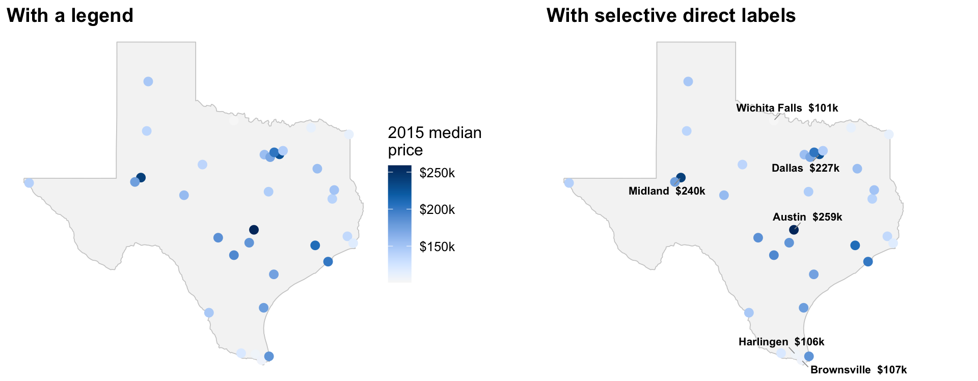
Two things are doing the work in the right-hand panel. One is choosing the six labelled cities ahead of time to show the extremes (highest and lowest median price), so the reader can interpolate the rest. Austin and Midland turn up as the two highest, which is a real result worth pausing on: Midland’s 2015 prices, driven by the Permian Basin oil boom, briefly rivalled Dallas’s. That’s exactly the kind of specific, nameable fact a legend’s colour bar would never surface on its own.
Second, geom_text_repel() pushes a label off its point and onto the plain map background whenever there’s no room on top of it, with a leader line whenever two dots sit close together.
A few more choices worth noting: each market is a point here, not a polygon. In areal choropleths, large areas dominate visual attention regardless of the value they’re actually showing. Often this conveys the wrong point entirely.
Much to the chagrin of my cartographer friends, I also deliberately leave out the north arrow and the scale bar. That is a fight for a different post.
However, we need to ask if this map makes any sense at all in the first instance. Is the point of the map to show broad spatial clusters? If so, no obvious spatial clusters exist, i.e. the famous Tobler first law, after all is not a law. The only discernible pattern is that there is an expensive market surrounded by inexpensive markets around Dallas. That point could be made much more succinctly using a different visualisation. I leave that as an exercise.
Symbols are no different than colours
Everything so far has been about colour, but the same argument applies to the shape channel. A common way to mark a grouping without relying on colour at all is to map to a shape. That still needs a legend, for the same reason a colour legend does. In the markets in Texas, if we want to explore the relationship between sales volume and price, differentiated by region, we can do the following:
Show code
sales2015 <- txhousing %>% filter(city %in% core$city, year == 2015) %>%
  group_by(city) %>% summarise(sales2015 = sum(sales, na.rm = TRUE))
core <- core %>% left_join(sales2015, by = "city") %>% mutate(log_sales = log10(sales2015))
shapes7 <- c(16, 17, 15, 18, 3, 4, 8)

# Far West Texas has only one city (El Paso), so there's no line to fit ---
# min(log_sales) == max(log_sales) would make seq() emit 60 copies of the
# same point, which then breaks slice_max()/slice() downstream into a flood
# of duplicate rows for that one region. A single-city region gets its own
# single point instead.
fit_lines <- lapply(split(core, core$region), function(d) {
  if (nrow(d) < 2) {
    return(data.frame(region = d$region[1], log_sales = d$log_sales, price2015 = d$price2015))
  }
  m <- lm(price2015 ~ log_sales, data = d)
  xs <- seq(min(d$log_sales), max(d$log_sales), length.out = 60)
  data.frame(region = d$region[1], log_sales = xs,
             price2015 = predict(m, newdata = data.frame(log_sales = xs)))
}) %>% bind_rows()

marker_pts <- fit_lines %>% group_by(region) %>%
  slice(unique(round(seq(1, n(), length.out = 4)))) %>% ungroup()

p_legend_sym <- ggplot() +
  geom_point(data = core, aes(log_sales, price2015, shape = region), color = "black", size = 1.6) +
  scale_shape_manual(values = shapes7) +
  scale_x_continuous(breaks = 3:4, labels = function(x) scales::comma(10^x)) +
  scale_y_continuous(labels = scales::dollar_format(scale = 1e-3, suffix = "k")) +
  labs(x = "2015 home sales (log scale)", y = "2015 median price", shape = NULL, title = "With a legend") +
  base_theme +
  theme(legend.position = "right")

line_ends <- fit_lines %>% group_by(region) %>% slice_max(log_sales, n = 1) %>% ungroup()

# Panhandle-South Plains is the one region worth calling out in colour --- see the text
# below; everything else stays black, distinguished only by shape. Red is
# cols4all's misc.okabe vermillion, not base R's harsher "red", so it stays
# consistent with every other colour choice in this post
red <- "#D55E00"
core_hl       <- core       %>% mutate(hl = if_else(region == "Panhandle-South Plains", red, "black"))
fit_lines_hl  <- fit_lines  %>% mutate(hl = if_else(region == "Panhandle-South Plains", red, "black"))
marker_pts_hl <- marker_pts %>% mutate(hl = if_else(region == "Panhandle-South Plains", red, "black"))
line_ends_hl  <- line_ends  %>% mutate(hl = if_else(region == "Panhandle-South Plains", red, "black"))

p_direct_sym <- ggplot() +
  geom_point(data = core_hl, aes(log_sales, price2015, shape = region, color = hl), size = 1.6, show.legend = FALSE) +
  geom_line(data = fit_lines_hl, aes(log_sales, price2015, group = region, color = hl), linewidth = 0.6, alpha = .5, show.legend = FALSE) +
  geom_point(data = marker_pts_hl, aes(log_sales, price2015, shape = region, color = hl), size = 2.6, alpha = .5, show.legend = FALSE) +
  geom_text_repel(data = line_ends_hl, aes(log_sales, price2015, label = region, color = hl),
                   fontface = "italic", size = 3.2, hjust = 0, direction = "y",
                   xlim = c(max(fit_lines$log_sales) + 0.05, NA),
                   force = 2, box.padding = 0.3, min.segment.length = 0,
                   segment.size = 0.3, segment.color = "grey60", show.legend = FALSE) +
  scale_color_identity() +
  scale_shape_manual(values = shapes7) +
  scale_x_continuous(breaks = 3:4, labels = function(x) scales::comma(10^x),
                      expand = expansion(mult = c(0.05, 0.55))) +
  scale_y_continuous(labels = scales::dollar_format(scale = 1e-3, suffix = "k")) +
  labs(x = "2015 home sales (log scale)", y = "2015 median price", title = "With direct labels") +
  base_theme +
  theme(plot.margin = margin(5.5, 12, 5.5, 5.5))

plot_grid(p_legend_sym, p_direct_sym, nrow = 1)
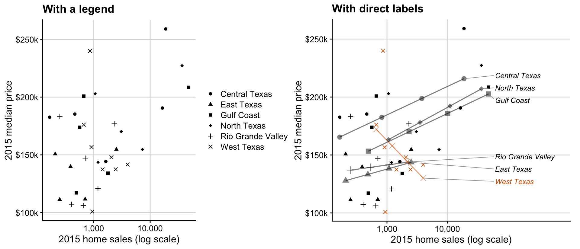
The direct-label version keeps the shapes, so a reader can tell the seven lines apart without a key even before reaching a label. If the focus is each group’s general trend, keeping these fitted lines earns its place. Panhandle-South Plains is the one region where price falls as sales rise, the opposite direction from every other region, and is worth calling out. Showing what each region’s data actually does is far more useful than showing which shape is linked to which region.
In other cases (e.g. clusters that are well separated, or a handful of genuine outliers), calling them out directly using standard ellipses, bounding boxes, explicit tagging, etc., is worth the effort.
Make the legend do some work
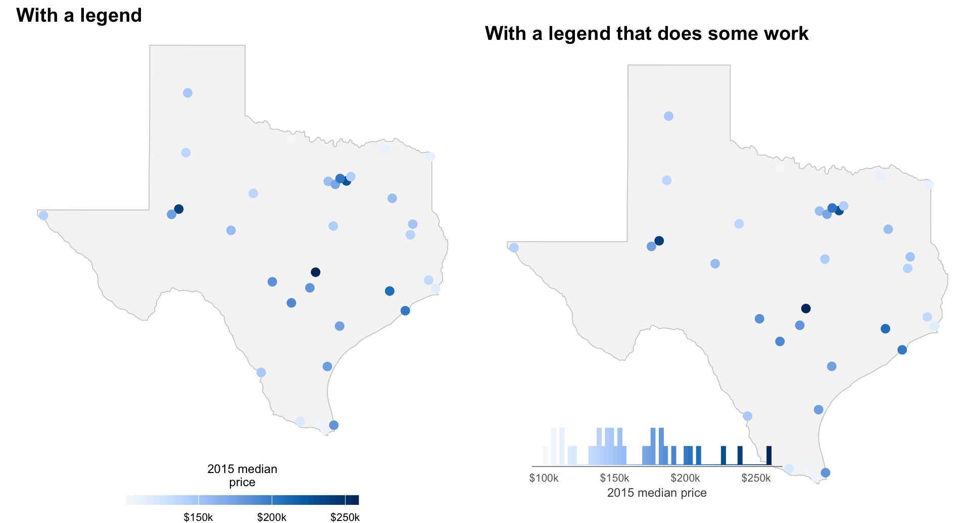
None of this is to say legends are never useful. But if you’re going to keep one, perhaps make it earn its keep. A plain colour bar does the least a legend possibly could: one axis, one relationship, nothing else. Swap the strip for a histogram, coloured with the same scale, and the legend can carry information the map doesn’t provide on its own.
In what follows, reading the dot map hasn’t changed at all. What’s changed is that the legend itself now says something: most Texas markets sit in a $140k–180k band, and a handful (Austin, Dallas, Midland) sit well clear of it by themselves. The same trick works for a categorical legend: add a count to each label, sort them, and a flat list of swatches becomes a ranking. I leave this, as an exercise.
Show code
# core, tx_outline, seq_blue, and p_legend_map were all built in
# "A continuous map" above; reused as-is here
# p_legend_map (built in "A continuous map" above) puts its colour bar on
# the right by default. Moved to the bottom here, at roughly the same width
# and position as the histogram inset below, so the two panels are actually
# comparable side by side rather than differing in layout as well as content
p_legend_map_bottom <- p_legend_map +
  labs(color = "2015 median price") +
  guides(color = guide_colorbar(barwidth = 12, barheight = 0.5, title.position = "top", title.hjust = 0.5)) +
  theme(legend.position = "bottom", legend.title = element_text(size = 9), legend.text = element_text(size = 8))

p_map_bare <- ggplot() +
  geom_sf(data = tx_outline, fill = "grey96", color = "grey80", linewidth = 0.3) +
  geom_point(data = core, aes(lon, lat, color = price2015), size = 2.6, show.legend = FALSE) +
  scale_color_gradientn(colors = seq_blue) +
  theme_void(base_size = 12) +
  theme(plot.title = element_text(face = "bold")) +
  labs(title = "With a legend that does some work")

p_hist_legend <- ggplot(core, aes(price2015)) +
  geom_histogram(aes(fill = after_stat(x), color = after_stat(x)), bins = 55, linewidth = 0.3) +
  scale_fill_gradientn(colors = seq_blue, guide = "none") +
  scale_color_gradientn(colors = seq_blue, guide = "none") +
  scale_x_continuous(labels = scales::dollar_format(scale = 1e-3, suffix = "k")) +
  labs(x = "2015 median price", y = NULL) +
  theme_minimal(base_size = 12) +
  theme(panel.grid = element_blank(),
        axis.title.y = element_blank(),
        axis.text.y = element_blank(),
        axis.ticks.y = element_blank(),
        axis.text.x = element_text(size = 8, color = "grey40"),
        axis.title.x = element_text(size = 9, color = "grey30"),
        axis.line.x = element_line(color = "grey50", linewidth = 0.3),
        plot.background = element_rect(fill = "transparent", color = NA),
        panel.background = element_rect(fill = "transparent", color = NA))

# draw_plot() places the histogram as a small inset rather than a full-width
# panel stacked under the map --- a legend doesn't need to be as wide as the
# thing it's labelling
p_right <- ggdraw(p_map_bare) +
  draw_plot(p_hist_legend, x = 0.08, y = 0.03, width = 0.55, height = 0.17)

plot_grid(p_legend_map_bottom, p_right, nrow = 1)
Conclusions
I was tempted to title this post similar to Kieran Healy’s article, but thought better of it. However, the sentiment carries.
In summary, make it easy for the reader, not for yourself. Label selectively and judiciously, never exhaustively. Pick the right channel — symbol, colour, position, text — for the right message. Stop asking the reader to hold some arbitrary mapping in their head, and put the information where their eyes already are.

Nikhil Kaza
Professor
My research interests include urbanization patterns, local energy policy and equity