Exploratory Data Analysis and Visualisation
Getting started with real data
In this tutorial, we are going to summarise Air Quality Index for about 4,000 stations in the US in 2017. These datasets are downloaded from the EPA website. A local copy of the dataset is here
library(tidyverse)

ozone_airq_df <- here('tutorials_datasets', "aqi", "daily_44201_2017.csv") %>% read_csv() #Change file paths accordingly
dim(ozone_airq_df)
# [1] 402501     29
names(ozone_airq_df)
#  [1] "State Code"          "County Code"         "Site Num"
#  [4] "Parameter Code"      "POC"                 "Latitude"
#  [7] "Longitude"           "Datum"               "Parameter Name"
# [10] "Sample Duration"     "Pollutant Standard"  "Date Local"
# [13] "Units of Measure"    "Event Type"          "Observation Count"
# [16] "Observation Percent" "Arithmetic Mean"     "1st Max Value"
# [19] "1st Max Hour"        "AQI"                 "Method Code"
# [22] "Method Name"         "Local Site Name"     "Address"
# [25] "State Name"          "County Name"         "City Name"
# [28] "CBSA Name"           "Date of Last Change"
If library(.) command returns an error, it is likely that you do not have the package installed on your computer.
Install them by e.g. install.packages(tidyverse). You only need to install pacakges once. But you need to call them into your library in every R session.
Zhu Wang: I am trying to create a library which uses some Fortran source files […]
Douglas Bates: Someone named Martin Maechler will shortly be sending you email regarding the distinction between ‘library’ and ‘package’ :-)
-- Zhu Wang and Douglas Bates: R-help (May 2004)
If read_csv results in an error, it is very likely that you got the path to the file wrong. Make sure that the data file exists at the path specified. File paths are tricky, especially when you want your code to be portable among different operating systems or even different computers. Three rules of thumb will help you with some headaches, later on.
- Use
file.path()function to create platform independent file paths. - Use relative paths
- Assign a variable to the string (e.g. input_file_path) and use it in the functions (such as
read_csv(input_file_path))
Exercise
- Use the above three rules to rewrite the code for reading the input data file.
In the US, State and Counties are uniquely identified by a 2 and 3 digit FIPS (Federal Information Processing System) Code. Lets create it so that we can merge datasets together.
ozone_airq_df$stcofips <- paste(formatC(ozone_airq_df$`State Code`, width=2,flag="0"),formatC(ozone_airq_df$`County Code`, width=3,flag="0"), sep="" )

head(ozone_airq_df$stcofips) #Inspect the outcome
# [1] "01003" "01003" "01003" "01003" "01003" "01003"
tail(ozone_airq_df$stcofips)
# [1] "80026" "80026" "80026" "80026" "80026" "80026"
unique(nchar(ozone_airq_df$stcofips)) #Making sure all fips codes are of length 5 characters
# [1] 5
What we really need is a few columns. So we extract them
ozone_airq_df2 <- ozone_airq_df[,c('stcofips', 'Site Num', 'Latitude', 'Longitude', 'Date Local', 'State Name', 'County Name', 'CBSA Name', 'AQI')]
summary(ozone_airq_df2)
#    stcofips           Site Num            Latitude       Longitude
#  Length:402501      Length:402501      Min.   :18.18   Min.   :-158.09
#  Class :character   Class :character   1st Qu.:34.10   1st Qu.:-110.10
#  Mode  :character   Mode  :character   Median :38.34   Median : -91.53
#                                        Mean   :37.64   Mean   : -95.33
#                                        3rd Qu.:41.06   3rd Qu.: -82.17
#                                        Max.   :64.85   Max.   : -65.92
#    Date Local          State Name        County Name         CBSA Name
#  Min.   :2017-01-01   Length:402501      Length:402501      Length:402501
#  1st Qu.:2017-04-12   Class :character   Class :character   Class :character
#  Median :2017-06-30   Mode  :character   Mode  :character   Mode  :character
#  Mean   :2017-06-30
#  3rd Qu.:2017-09-19
#  Max.   :2017-12-31
#       AQI
#  Min.   :  0.00
#  1st Qu.: 31.00
#  Median : 38.00
#  Mean   : 40.13
#  3rd Qu.: 45.00
#  Max.   :233.00
nrow(unique(ozone_airq_df2[,c('Latitude', 'Longitude')]))
# [1] 1265
length(unique(ozone_airq_df2$stcofips))
# [1] 786
i.e. There are 1,265 unique monitoring station locations in 786 counties. Roughly, on average 1.61 per county. However, there are about ~3100 counties in the US, suggesting that large parts of the US are not covered by the monitoring stations.
It is useful to rewrite the last command as following, using a pipe operator %>%
ozone_airq_df2$stcofips %>%
  unique() %>%
  length()
# [1] 786
Following this pipe operator mode helps avoid a lot of headaches associated with orphan brackets and make the code cleaner and easier to read.
You can also follow the tidyverse syntax.
ozone_airq_df3 <- select(ozone_airq_df, `stcofips`, `Site Num`, `Latitude`, `Longitude`, `Date Local`, `State Name`, `County Name`, `CBSA Name`, `AQI`) #We only needed `` because of spaces in column names.
all.equal(ozone_airq_df2, ozone_airq_df3)
# [1] TRUE
rm(ozone_airq_df3)
select is more powerful than [ because it has helper functions that will select columns based on pattern matching for example select(ozone_airq_df , ends_with(Name)) would select County Name, State Name and CBSA Name columns.
The space in the column names are problematic, so lets rename columns
ozone_airq_df2 <- rename(ozone_airq_df2,
                 County_Name = `County Name` ,  State_Name = `State Name` ,  CBSA_Name = `CBSA Name`, dateL = `Date Local`, Site_Num = `Site Num`
                 )
Work horses of data manipulation
Order
This dataset has repeated observations per monitoring station. It would be nice if they were rearranged in a nested fashion, i.e. states | counties | Monitoring Station | Date
select(arrange(ozone_airq_df2, stcofips, desc(dateL)), stcofips, dateL, AQI) #select is only to demonstrate
# # A tibble: 402,501 x 3
#    stcofips dateL        AQI
#    <chr>    <date>     <dbl>
#  1 01003    2017-10-31    45
#  2 01003    2017-10-30    38
#  3 01003    2017-10-28    24
#  4 01003    2017-10-27    32
#  5 01003    2017-10-26    43
#  6 01003    2017-10-25    35
#  7 01003    2017-10-24    36
#  8 01003    2017-10-23    31
#  9 01003    2017-10-22    27
# 10 01003    2017-10-21    29
# # ... with 402,491 more rows
We take advantage of the fact that FIPS are arranged in a natural order. Otherwise we could also do
select(arrange(ozone_airq_df2, State_Name, County_Name, desc(dateL)), stcofips, dateL, AQI) #select is only to demonstrate
# # A tibble: 402,501 x 3
#    stcofips dateL        AQI
#    <chr>    <date>     <dbl>
#  1 01003    2017-10-31    45
#  2 01003    2017-10-30    38
#  3 01003    2017-10-28    24
#  4 01003    2017-10-27    32
#  5 01003    2017-10-26    43
#  6 01003    2017-10-25    35
#  7 01003    2017-10-24    36
#  8 01003    2017-10-23    31
#  9 01003    2017-10-22    27
# 10 01003    2017-10-21    29
# # ... with 402,491 more rows
Exercise
- Use the
%>%operator to rewrite the above commands. Note that you can use the pipe operator even when a function has multiple arguments. Use the help resources to understand how to write code using the pipe operator in multiple situations. (e.g. passing the argument in the second position of the function.) - Print the top 10 AQI values and their corresponding sites and dates.
Mutate
Mutate creates new variables out of old ones. The key functions are mutate and mutate_*. mutate_* will let us apply the same function to multiple columns that are seleted. You’ll want to use mutate just about any time you want to create a new variable in your data frame or alter and overwrite an existing variable.
# Convert Longitude and Latitude to radians
mutate(ozone_airq_df2,
                Latitude_rad = pi * Latitude / 180,
                Longitude_rad = pi * Longitude / 180) %>%
  select(contains('tude'))
# # A tibble: 402,501 x 4
#    Latitude Longitude Latitude_rad Longitude_rad
#       <dbl>     <dbl>        <dbl>         <dbl>
#  1     30.5     -87.9        0.532         -1.53
#  2     30.5     -87.9        0.532         -1.53
#  3     30.5     -87.9        0.532         -1.53
#  4     30.5     -87.9        0.532         -1.53
#  5     30.5     -87.9        0.532         -1.53
#  6     30.5     -87.9        0.532         -1.53
#  7     30.5     -87.9        0.532         -1.53
#  8     30.5     -87.9        0.532         -1.53
#  9     30.5     -87.9        0.532         -1.53
# 10     30.5     -87.9        0.532         -1.53
# # ... with 402,491 more rows


# or do this.

mutate_at(ozone_airq_df2, vars(contains("tude")), list(rad = ~(. /180 * pi))) %>% select(contains('tude'))
# # A tibble: 402,501 x 4
#    Latitude Longitude Latitude_rad Longitude_rad
#       <dbl>     <dbl>        <dbl>         <dbl>
#  1     30.5     -87.9        0.532         -1.53
#  2     30.5     -87.9        0.532         -1.53
#  3     30.5     -87.9        0.532         -1.53
#  4     30.5     -87.9        0.532         -1.53
#  5     30.5     -87.9        0.532         -1.53
#  6     30.5     -87.9        0.532         -1.53
#  7     30.5     -87.9        0.532         -1.53
#  8     30.5     -87.9        0.532         -1.53
#  9     30.5     -87.9        0.532         -1.53
# 10     30.5     -87.9        0.532         -1.53
# # ... with 402,491 more rows
A useful thing to do is to create a unique id for each monitoring station. We can accomplish it using mutate.
ozone_airq_df2 <- mutate(ozone_airq_df2, SiteID = paste(stcofips, Site_Num, sep="_"))
Exercise
- Calculate the distance to the Center of the US (39.8333333,-98.585522 (in Kansas)) from each site. Vincenty formula for great circle distances in by multiplying 6371 (radius of earth in km) with the following quantity
$$atan(\frac{((cos(lat_2).sin(lon_2-lon_1))^2) + (cos(lat_1).sin(lat_2)-sin(lat_1).cos(lat_2).cos(lon_2-lon_1))^2)^{0.5}}{sin(lat_1).sin(lat_2) + cos(lat_1).cos(lat_2).cos(lon_2-lon_1)}) $$
Mind the issue of radians and degrees to the trigonometric functions and the parenthesis
Filter
Sometimes instead of subsetting columns, you want to subset rows. Filter is an useful command for these.
filter(ozone_airq_df2, stcofips == "06037") #Los Angeles County
# # A tibble: 4,574 x 10
#    stcofips Site_Num Latitude Longitude dateL      State_Name County_Name
#    <chr>    <chr>       <dbl>     <dbl> <date>     <chr>      <chr>
#  1 06037    0002         34.1     -118. 2017-01-01 California Los Angeles
#  2 06037    0002         34.1     -118. 2017-01-02 California Los Angeles
#  3 06037    0002         34.1     -118. 2017-01-03 California Los Angeles
#  4 06037    0002         34.1     -118. 2017-01-04 California Los Angeles
#  5 06037    0002         34.1     -118. 2017-01-05 California Los Angeles
#  6 06037    0002         34.1     -118. 2017-01-06 California Los Angeles
#  7 06037    0002         34.1     -118. 2017-01-07 California Los Angeles
#  8 06037    0002         34.1     -118. 2017-01-08 California Los Angeles
#  9 06037    0002         34.1     -118. 2017-01-09 California Los Angeles
# 10 06037    0002         34.1     -118. 2017-01-10 California Los Angeles
# # ... with 4,564 more rows, and 3 more variables: CBSA_Name <chr>, AQI <dbl>,
# #   SiteID <chr>
Group By
Even though we rearranged the data, we did not yet split it to calculate group summaries. For example if you wanted to find out which monitoring stations had readings for less than 30 days you could do the following.
group_by(ozone_airq_df2, SiteID) %>%
  filter(n() < 30)
# # A tibble: 43 x 10
# # Groups:   SiteID [4]
#    stcofips Site_Num Latitude Longitude dateL      State_Name County_Name
#    <chr>    <chr>       <dbl>     <dbl> <date>     <chr>      <chr>
#  1 17083    0117         39.1     -90.3 2017-10-03 Illinois   Jersey
#  2 17083    0117         39.1     -90.3 2017-10-04 Illinois   Jersey
#  3 17083    0117         39.1     -90.3 2017-10-05 Illinois   Jersey
#  4 17083    0117         39.1     -90.3 2017-10-06 Illinois   Jersey
#  5 17083    0117         39.1     -90.3 2017-10-07 Illinois   Jersey
#  6 17083    0117         39.1     -90.3 2017-10-08 Illinois   Jersey
#  7 17083    0117         39.1     -90.3 2017-10-09 Illinois   Jersey
#  8 17083    0117         39.1     -90.3 2017-10-10 Illinois   Jersey
#  9 17083    0117         39.1     -90.3 2017-10-11 Illinois   Jersey
# 10 17083    0117         39.1     -90.3 2017-10-12 Illinois   Jersey
# # ... with 33 more rows, and 3 more variables: CBSA_Name <chr>, AQI <dbl>,
# #   SiteID <chr>
Group_by is quite powerful to calculate within subgroup summaries and use it with mutate to change each row. For example, we can calculate max AQI of all the monitors in a county for the day
group_by(ozone_airq_df2, stcofips, dateL) %>%
  summarize(maxAQI=max(AQI))
# # A tibble: 242,122 x 3
# # Groups:   stcofips [786]
#    stcofips dateL      maxAQI
#    <chr>    <date>      <dbl>
#  1 01003    2017-02-28     19
#  2 01003    2017-03-01     36
#  3 01003    2017-03-02     42
#  4 01003    2017-03-03     48
#  5 01003    2017-03-04     49
#  6 01003    2017-03-05     48
#  7 01003    2017-03-06     45
#  8 01003    2017-03-07     44
#  9 01003    2017-03-08     44
# 10 01003    2017-03-09     44
# # ... with 242,112 more rows
This represents the worst AQI recorded in the county for that day. The higher the AQI value, the greater the level of air pollution and the greater the health concern. For example, an AQI value of 50 represents good air quality with little potential to affect public health, while an AQI value over 300 represents hazardous air quality.
An AQI value of 100 generally corresponds to the national air quality standard for the pollutant (in our case Ozone), which is the level EPA has set to protect public health. AQI values below 100 are generally thought of as satisfactory. When AQI values are above 100, air quality is considered to be unhealthy-at first for certain sensitive groups of people, then for everyone as AQI values get higher.
county_summary_df <- group_by(ozone_airq_df2, stcofips, dateL) %>%
  summarize(maxAQI=max(AQI),
            State_Name=first(State_Name), # We can do this because we know that there is only one state corresponding to a stcofips, i.e. counties are embedded in the state.
            County_Name=first(County_Name), # We also need these variables to carry over to the next step.
            CBSA_Name=first(CBSA_Name)) %>%
  group_by(stcofips) %>%
  summarize(AQIgt100 = sum(maxAQI>=100),
            numDays= n(),
            percAQIgt100 = AQIgt100/numDays,
            State_Name=first(State_Name),
            County_Name=first(County_Name),
            CBSA_Name=first(CBSA_Name)
            )

county_summary_df
# # A tibble: 786 x 7
#    stcofips AQIgt100 numDays percAQIgt100 State_Name County_Name CBSA_Name
#    <chr>       <int>   <int>        <dbl> <chr>      <chr>       <chr>
#  1 01003           2     235      0.00851 Alabama    Baldwin     Daphne-Fairhop~
#  2 01033           0     246      0       Alabama    Colbert     Florence-Muscl~
#  3 01049           0     359      0       Alabama    DeKalb      Fort Payne, AL
#  4 01051           0     230      0       Alabama    Elmore      Montgomery, AL
#  5 01055           0     245      0       Alabama    Etowah      Gadsden, AL
#  6 01069           0     245      0       Alabama    Houston     Dothan, AL
#  7 01073           2     360      0.00556 Alabama    Jefferson   Birmingham-Hoo~
#  8 01089           1     246      0.00407 Alabama    Madison     Huntsville, AL
#  9 01097           3     241      0.0124  Alabama    Mobile      Mobile, AL
# 10 01101           0     242      0       Alabama    Montgomery  Montgomery, AL
# # ... with 776 more rows
Exercise
- Create similar summary by state and CBSA separately.
- By state and CBSA create monthly summaries of percentage of days with AQI greater than 100.
Exploratory data visualisation
The first thing to do with any data is to explore it and identify some issues, edge cases, outliers and interesting correlations. Exploratory visualisation is indispensable part of data analysis and is often overlooked. I cannot stress the importance of it enough.
“The simple graph has brought more information to the data analyst’s mind than any other device.”—John Tukey
We will use ggplot graphics to explore the datasets. See Hadley’s tutorial
Basic plotting
First, you need to tell ggplot what dataset to use. This is done using the ggplot(df) function, where df is a dataframe that contains all features needed to make the plot.
You can add whatever aesthetics you want to apply to your ggplot (inside aes() argument) - such as X and Y axis by specifying the respective variables from the dataset. The variable based on which the color, size, shape and stroke should change can also be specified here itself. The aesthetics specified here will be inherited by all the geom layers you will add subsequently. Or you can specify the aesthetics for individual layers. I prefer the latter method, even though it is repetitive.
Finally, you can add labels to axes and other features.
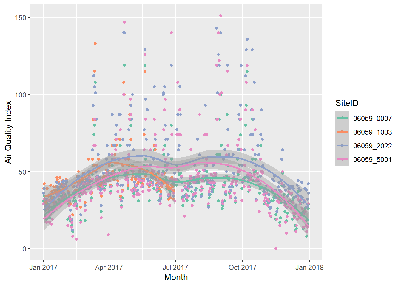
g1 <- ozone_airq_df2 %>%
  filter(stcofips == "06059") %>% # Orange County
  ggplot() +
  geom_point(aes(x=dateL, y=AQI, color=SiteID)) +
  geom_smooth(aes(x=dateL, y=AQI, color=SiteID), method="loess")+
  scale_colour_brewer(palette = "Set2") +
  labs(x = "Month", y = "Air Quality Index")

g1
If you have a HTML file, you can use javascript based visualisations that provide some interactivity to statistical graphics. For this we need a package called ploltly.
ggplotly without losing much in the tutorial.
library(plotly)
ggplotly(g1)
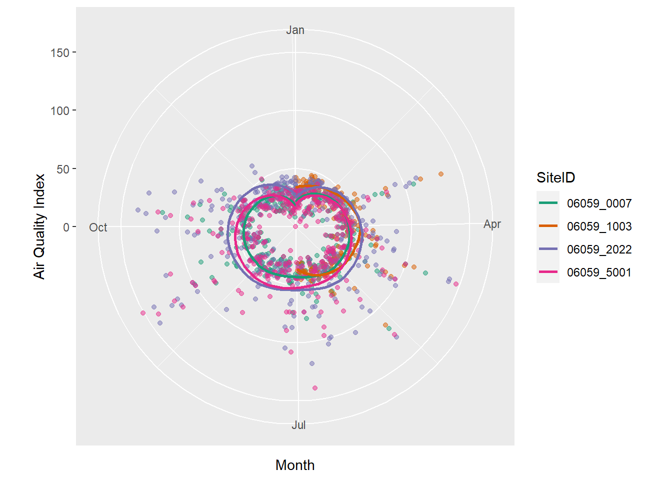
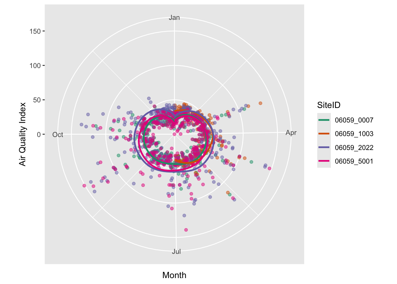
There is also no reason to use a cartesian coordinate system for axes. Polar coordinates work just as well, especially when we have cycles. Though of not much use here, the following will demonstrate coord_polar’s effect.
ozone_airq_df2 %>%
  filter(stcofips == "06059") %>% # Orange County
  ggplot() +
  coord_polar(theta = "x")+
  geom_point(aes(x=dateL, y=AQI, color=SiteID), alpha=.5, show.legend = FALSE) +
  geom_smooth(aes(x=dateL, y=AQI, color=SiteID), se=FALSE)+
  scale_colour_brewer(palette = "Dark2") +
  labs(x = "Month", y = "Air Quality Index")
Facetting
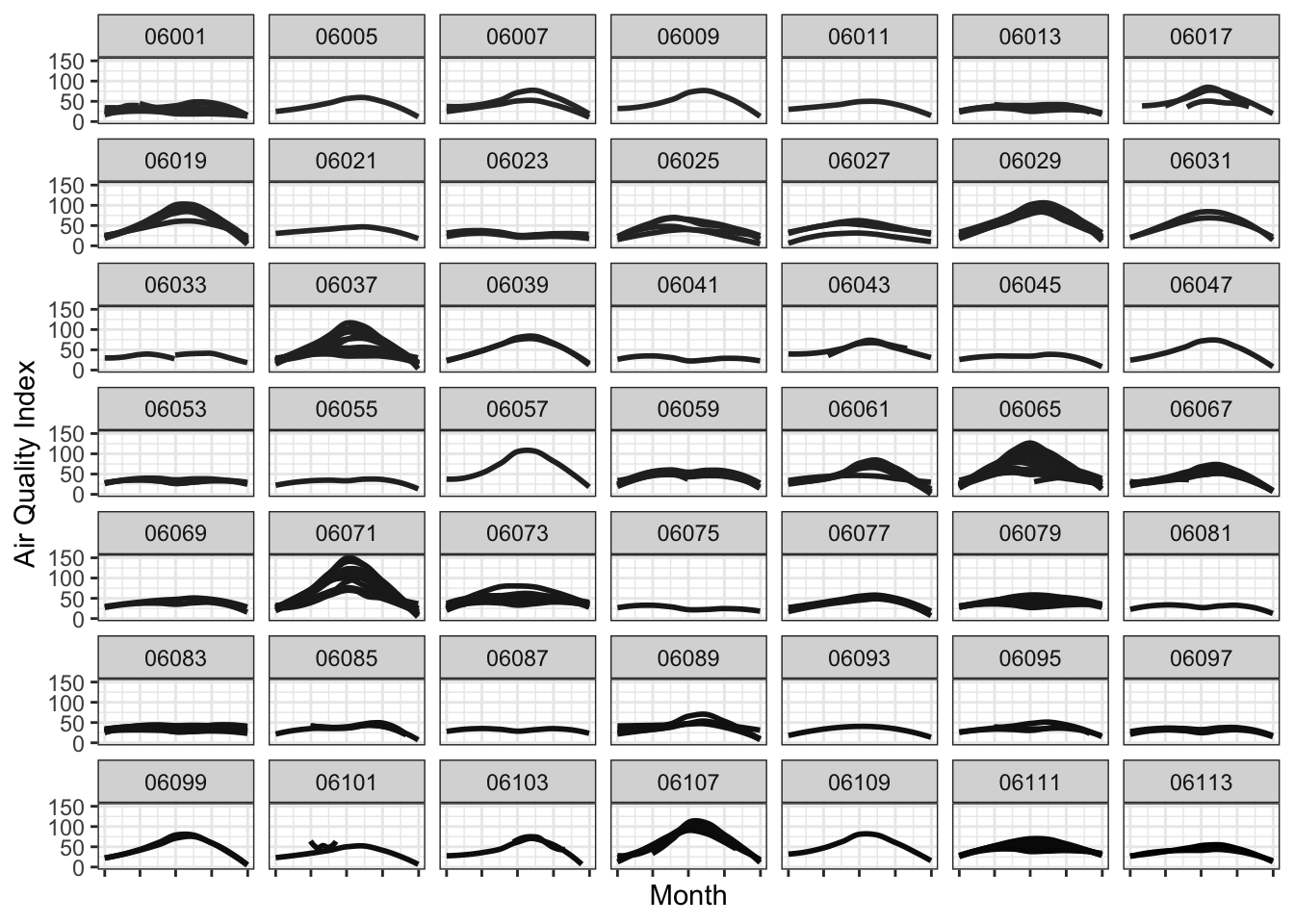
Facetting allows to plot subsets of data together and place them next to one another. This is inspired by Edward Tufte’s small multiples. It allows us to see patterns in the data more clearly than otherwise. Normally, the axis scales on each graph are fixed, which means that they have the same size and range across the facets.
Let’s facet the data for various counties in California, while showing all the monitors within a county in a single graph.
 g1 <- ozone_airq_df2 %>%
  filter(State_Name == "California") %>%
  ggplot() +
  geom_smooth(aes(x=dateL, y=AQI, color=SiteID), method="loess",  se=FALSE)+
  scale_colour_grey(end = 0)+
  facet_wrap(~stcofips)+
  labs(x = "Month", y = "Air Quality Index") +
  theme_bw() +
  theme(axis.text.x=element_blank(),
        legend.position="none")

g1
Exercise
- Facet CA counties by CBSA (i.e CBSA in rows and Counties in Columns) and produce the same graph as above.
- Using facetting as above, limit the x-axis to summer months.
If we were to show this in a single graph, we could do something as below. This graph shows how Ozone is worse during the summer months than the rest of the year.
g1 <- ozone_airq_df2 %>%
  filter(State_Name == "California")  %>%
  ggplot() +
  geom_smooth(aes(x=dateL, y=AQI, group=SiteID, color=stcofips), method="loess", se=FALSE)+
  labs(x = "Month", y = "Air Quality Index") +
  theme_bw()

ggplotly(g1)
The display is non-inutitive. Colors are a terrible way to convey information, even though we use it all the time. Especially colors that are on a gradient to represent categorical data such as County. I much prefer the facetted plot.
Statitical summaries by group
g1 <- ozone_airq_df2 %>%
  filter(stcofips == "06037") %>%
  ggplot() +
  geom_point(aes(x=Site_Num, y=AQI), show.legend = F)+
  stat_summary(aes(x=Site_Num, y=AQI), fun='median', colour = "red", size = 1)+
  stat_summary(aes(x=Site_Num, y=AQI),fun='mean', colour = "green", size = 1, shape=3)+
  labs(x = "Site", y = "Air Quality Index", title="Los Angeles County") +
  theme_bw()

g1
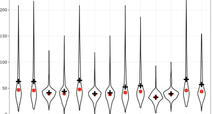
A violin or box plot is better.
g1 <- ozone_airq_df2 %>%
  filter(stcofips == "06037") %>%
  ggplot() +
  geom_violin(aes(x=Site_Num, y=AQI), show.legend = F)+
  stat_summary(aes(x=Site_Num, y=AQI), fun='median', colour = "red", size = 1)+
  stat_summary(aes(x=Site_Num, y=AQI),fun='mean', size = 1, shape=3)+
  labs(x = "Site", y = "Air Quality Index", title="Los Angeles County") +
  theme_bw()

#ggplotly(g1)
g1
Exercise
- Add 0.25 and 0.75 quantiles as points to the above plot.
It would be useful which counties have the worst pollution. We can define worse pollution by percent of days where AQI from Ozone is \(\ge\) 100. We can accomplish this with a bar plot and plot only the top 25 worst polluted counties.
g2 <- county_summary_df %>%
  top_n(25, percAQIgt100) %>%
  ggplot()+
  geom_col(aes(x=reorder(paste(County_Name, State_Name, sep=","), percAQIgt100), y=percAQIgt100, fill=State_Name)) +
  scale_fill_brewer(palette = "Dark2", name="State") +
  coord_flip()+
  labs(y="Proportion of days with Ozone AQI greater than 100", x="County", Title="Top 25 polluted counties")+
  theme_minimal()

ggplotly(g2, tooltip = c("y"))
Exercise
- Use a different color palette than Dark2 in the above plot. Which one works better? Why?
Geographic mapping
To see exactly where these stations are, let us visualise the station locations. To do this we use the leaflet library. One disadvantage with leaflet is that coordinate system projections are not fully supported. Spatial data should ideally be in WGS84 lat long coordinate system. You can use Proj4Leaflet plugin to display alternate projection. But that requires the basemap tiles to work with your projection. Fortunately, our dataset is already in WGS84 lat long coordinate system.
library(leaflet)

monitorlocations_df <- unique(ozone_airq_df[,c('Longitude', 'Latitude')])

#Note the reversal of traditional Lat/Long paradigm. Longitude is usually on the X-axis. While it is not relevant here, as leaflet understands and parses them correctly, you might as well develop good habits. Many visualisation issues arise from messing these up.

m <-  leaflet(monitorlocations_df) %>%
  addProviderTiles(providers$Stamen.TonerLines, group = "Basemap") %>%
   addProviderTiles(providers$Stamen.TonerLite, group = "Basemap") %>%
  addCircles(group = "Monitors")%>%
  addLayersControl(
    overlayGroups = c("Monitors", 'Basemap'),
    options = layersControlOptions(collapsed = FALSE)
      )

library(widgetframe)
widgetframe::frameWidget(m, height = 350, width = '95%')
HTML widgets such as plotly and leaflet etc. are little finicky. They may not work well in many instances in a html file. Certainly won’t work when you knit to a docx or pdf. In many instances, it may be beneficial to stick to static images provided by ggplot or other frameworks.
In particular, for the moment, do not continue the code chunk after you call the htmlwidget, instead create a new one.
 # Update the map showing the number of points at different zoom levels.

m %>%
    addMarkers(clusterOptions = markerClusterOptions(), group = "Monitors") %>%
   frameWidget(height = 350, width = '95%')
Choropleth map
Let’s make a choropleth map. For this we need polygonal boundaries and attach data to the boundaries and color it by a value.
First off, some warnings that are worth repeating. Colors are terrible communicators. Sizes are worse. Choropleth maps combine both these bad characteristics (coloring areas). Avoid them if you can. But they are useful for some types of communication. They are also pretty widespread.
To download the county boundary file let’s use a convenience package for US called tigris.
library(sf)
library(tigris)
library(rgdal)
options(tigris_use_cache = TRUE)

ctys_shp <- counties(cb=TRUE, progress_bar = FALSE) #Only generalised boundaries are required

names(ctys_shp)
#  [1] "STATEFP"  "COUNTYFP" "COUNTYNS" "AFFGEOID" "GEOID"    "NAME"
#  [7] "LSAD"     "ALAND"    "AWATER"   "geometry"
nrow(ctys_shp)
# [1] 3233


ctys_shp <- inner_join(ctys_shp, county_summary_df, by =c("GEOID"='stcofips'))
#This would be a good time to learn about joins, including left, inner, outer and full join

nrow(ctys_shp)
# [1] 785
It turns out to using basemaps from Stamen or other sources, we need the geographic objects to be in WGS coordinate system. It turns out our ctys_shp is not in that system. So convert it first using st_transform. This would be a good time to learn about coordinate systems and projections.
st_crs(ctys_shp)
# Coordinate Reference System:
#   User input: NAD83
#   wkt:
# GEOGCRS["NAD83",
#     DATUM["North American Datum 1983",
#         ELLIPSOID["GRS 1980",6378137,298.257222101,
#             LENGTHUNIT["metre",1]]],
#     PRIMEM["Greenwich",0,
#         ANGLEUNIT["degree",0.0174532925199433]],
#     CS[ellipsoidal,2],
#         AXIS["latitude",north,
#             ORDER[1],
#             ANGLEUNIT["degree",0.0174532925199433]],
#         AXIS["longitude",east,
#             ORDER[2],
#             ANGLEUNIT["degree",0.0174532925199433]],
#     ID["EPSG",4269]]

ctys_shp <- st_transform(ctys_shp, crs =4326)

#4326 is the European Petroleum Survey Group's (EPSG) code for longitude and latitude coordinate system with WGS 84 datum
Now let’s get on with colouring the map and visualising it.
# Because the presence of 0's create a problem for quantiles (some of the quantiles are the same) let's separate them out while calculating breaks.

Qpal <- colorQuantile(
  palette = "Reds", n = 5,
  domain = ctys_shp$percAQIgt100[ctys_shp$percAQIgt100>0]
)


labels <- sprintf(
  "County: %s <br/> AQI>100 days: <strong>%s</strong> %%",
  paste(ctys_shp$County_Name, ctys_shp$State_Name, sep=","),prettyNum(ctys_shp$percAQIgt100*100, digits=2)
) %>% lapply(htmltools::HTML)

m <-  leaflet(ctys_shp) %>%
  addProviderTiles(providers$Stamen.TonerLines, group = "Basemap") %>%
   addProviderTiles(providers$Stamen.TonerLite, group = "Basemap") %>%
       addPolygons(color = "#CBC7C6", weight = 1, smoothFactor = 0.5,
              opacity = 1.0, fillOpacity = 0.5,
             fillColor = Qpal(ctys_shp$percAQIgt100),
              highlightOptions = highlightOptions(color = "green", weight = 2, bringToFront = TRUE),
             label = labels,
             labelOptions = labelOptions(
               style = list("font-weight" = "normal", padding = "3px 8px"),
               textsize = "15px",
               direction = "auto"),
             group = "Counties"
             )%>%
  addLayersControl(
    overlayGroups = c("Counties", 'Basemap'),
    options = layersControlOptions(collapsed = FALSE)
      )

frameWidget(m, height = 350, width = '95%')
Exercise
- Add markers to the choropleth map.
- Change the color scheme of the polygonal fills.
- Change the line weight of the polygonal borders.
Conclusions
We covered a lot of ground in this tutorial. I do not expect all of this to make sense right away and you will be proficient by the end of this tutorial. I constantly refer to old code to reuse, make mistakes, correct them, solve small problems.
The main point is not to use analysis for its own sake, but to illustrate a story. Exploratory data anlysis will get you a long way in telling the story. You should spend a lot of time cleaning the data, understanding it and figuring out the best way to communicate your insights.
Additional references
Always use the help commands. One of the strengths of R is its effective doucumentation, which includes examples and usage. Help on a particular command can be accessed with ? e.g. ?group_by.
The following books are useful for reference.
-
Grolemund, Garrett and Hadley Wickham (2017). R for Data Science: Import, Tidy, Transform, Visualize, and Model Data. Sebastopol, CA: O’ Reilly media,. http://r4ds.had.co.nz/.
-
Venables, W.N. and Ripley, B.D. (2003). Modern Applied Statistics with S. New York, NY: Springer
In particular, Grolemund and Wickham is excellent for data munging operations. This usually takes up large portion of the analytical work.
Nikhil Kaza
Professor
My research interests include urbanization patterns, local energy policy and equity