Using TidyCensus package to explore Census Data
Getting Started
Application Programming Interface (API) is a software intermediary that allows two applications to talk to each other. For example, when you use an app on your phone, it connects to the internet, queries a server in a specific way. The server responds to the query, by retrieving the data, aggregating/interpreting/managing it and sending it back to the phone. The application then interprets that data and presents you with the information you wanted in a readable way. While API are not solely based on internet based queries, these are becoming increasingly important. In this tutorial, we are going to use API to query and process US Census data via http protocol on the fly, instead of downloading them as csv files.
To get started you need a US census API key. Signup for one and store it in a secure place. Whenever “YOUR_API_KEY” appears in the code below, you should substitute this key.
Querying Census Servers
Different APIs have different requirements, so you will have to use the documentation specific to the endpoint. To illustrate, let’s use the American Community Survey API. For example, paste the following into your web browser after suitably editing for the “YOUR_API_KEY”
https://api.census.gov/data/2017/acs/acs5?key=YOUR_API_KEY&get=B01003_001E&for=zip%20code%20tabulation%20area:27514,27510&in=state:37
The output should look like the following in the JSON format (Different browsers may format it slightly differently)

The results tell you that there are 15,397 people in ZCTA 27510 and 31,659 people in ZCTA 27514. Also, this would be a good time to refresh your understanding of the differences between Zipcodes and ZCTA
If you get this result, from your R script (instead of the browser), it is relatively straightforward to convert them into data structures you are familiar with, such as tables, tibbles and data.frames. See this post.
It is useful to understand the structure of the query
-
https://api.census.gov/data/2017/acs/acs5?is the base url. It tells the census servers that it is looking for 5 year ACS data that ends in 2017 i.e ACS 2012-2017. -
key=[YOUR_API_KEY]is the key to identify the client (i.e your browser/script) who is making the request. -
get=B01003_001Eis the variable name (Total population). For a full list, see here -
for=zip%20code%20tabulation%20area:27514,27510for the census geography ZCTA for Chapel Hill(27514) and Carrboro (27510). The%20is a hexademical representation of “unsafe” space character. There are many such special characters that need to be properly encoded, if they need to be passed to the server. -
in=state:37refers to the FIPS code for North Carolina. -
Note that the all the arguments are concatenated using
&.
This structure is unique to Census APIs and endpoints. For other APIs you will have to refer to their documentation. And it is also likely that these structures will change over time, which may explain why your code may stop working after a while.
Exercise
Practise the following in the web browser by constructing the right URL.
- Use the endpoint for the decennial census and get the population for all the zipcodes in Durham, NC.
- Use the ACS 2016 endpoint and get the population for all the census tracts in Orange County, NC.
- Use the ACS 2013-2018 and get the households under poverty in each census tracts in Orange County, NC
TidyCensus
While the above is a generic way of constructing the query and getting the results using APIs, tidycensus is a package that wraps this all in different convenience functions such as get_decennial and get_acs. Note that, this package is tailored only towards US Census and not for any other Census agencies or for that matter other US government data.
In the rest of the tutorial, I am going to demonstrate how to download, construct and visualise unemployment rates and poverty rates at a Census tract level. We are going to use the 5 year ACS 2012-2017 data.
Poverty Rates using TidyCensus
library(tidyverse)
library(sf)
library(tidycensus)
census_api_key("YOUR_KEY_HERE", install=TRUE)
To get the poverty level, you can use B17001_01 (persons for whom poverty level is tracked) and B17001_002 (persons whose income in the last 12 months was below poverty level). Use the get_acs function for ACS.
povrate23 <-
    get_acs(geography = "tract", variables = "B17001_002",  summary_var = 'B17001_001',state = "NC", geometry = TRUE, year = 2023, progress_bar = FALSE) %>%
        rename(population = summary_est) %>%
  filter(population>0)%>%
  mutate(pov_rate = estimate/population) %>%
  select(GEOID, NAME, population, pov_rate)

povrate23
# Simple feature collection with 2643 features and 4 fields
# Geometry type: MULTIPOLYGON
# Dimension:     XY
# Bounding box:  xmin: -84.32187 ymin: 33.84232 xmax: -75.46062 ymax: 36.58812
# Geodetic CRS:  NAD83
# First 10 features:
#          GEOID                                                 NAME population
# 1  37037020600     Census Tract 206; Chatham County; North Carolina       4364
# 2  37105030102      Census Tract 301.02; Lee County; North Carolina       6147
# 3  37165010300    Census Tract 103; Scotland County; North Carolina       3737
# 4  37133000800        Census Tract 8; Onslow County; North Carolina        995
# 5  37133002500       Census Tract 25; Onslow County; North Carolina       3367
# 6  37013930200   Census Tract 9302; Beaufort County; North Carolina       5214
# 7  37001020100    Census Tract 201; Alamance County; North Carolina       4374
# 8  37063001706    Census Tract 17.06; Durham County; North Carolina       5222
# 9  37065020400   Census Tract 204; Edgecombe County; North Carolina       4809
# 10 37129011200 Census Tract 112; New Hanover County; North Carolina       1776
#      pov_rate                       geometry
# 1  0.07080660 MULTIPOLYGON (((-79.40216 3...
# 2  0.03090939 MULTIPOLYGON (((-79.23063 3...
# 3  0.42895371 MULTIPOLYGON (((-79.48963 3...
# 4  0.09447236 MULTIPOLYGON (((-77.35379 3...
# 5  0.13632314 MULTIPOLYGON (((-77.30802 3...
# 6  0.21212121 MULTIPOLYGON (((-77.19577 3...
# 7  0.25674440 MULTIPOLYGON (((-79.45802 3...
# 8  0.07027959 MULTIPOLYGON (((-78.98735 3...
# 9  0.31108339 MULTIPOLYGON (((-77.79452 3...
# 10 0.11936937 MULTIPOLYGON (((-77.94605 3...
The above code downloads and constructs the poverty rate for census tracts. Note the omission of tracts that have zero population. Also note the blithe use of estimates as true values.
To visualise this, we can use the tmap package. Notice above that census returns the geographies in “NAD 83” coordinate system. We should transform this to “WGS 84” to be consistent with other basemaps.
library(tmap)

tmap_mode('view')


povrate23 <-
  povrate23 %>%
  mutate(pov_rate = pov_rate*100) %>%
  st_transform(crs=4326)  # EPSG Code for WGS84

m1 <- povrate23 %>%
  tm_shape() +
  tm_polygons(fill = "pov_rate", # Variable to use for filling
              fill.scale = tm_scale_intervals(breaks = seq(0,100, 20), # Breaks for the legend
                                              values = 'brewer.yl_gn', # Color scheme. see cols4all package
                                              label.format = tm_label_format(suffix = "%")
              ),
              col = 'gray90' , # Border color
              col.alpha = .3, # Border transparency
              lwd  = .1, # Border line width
              fill.legend = tm_legend(title = "Poverty Rate",
                                      position = c("right", "top"),
                                      text.size = 0.5)
  ) +
  tm_tiles('CartoDB.PositronOnlyLabels')  # Use for labels, becasue the basemap is useless for context


library(widgetframe)
frameWidget(tmap_leaflet(m1))
frameWidget. Widgetframe and frameWidget are needed to embed the interactive maps in blogdown on a webserver. If you are using Rmarkdown, you can simply just print the map.
It should be apparent by now that choices of colors, cuts and linewidths etc. dramatically alter the visual evidence produced by the map. See for example,
m1 <- povrate23 %>%
  tm_shape() +
  tm_polygons(fill = "pov_rate", # Variable to use for filling
              fill.scale = tm_scale_continuous(values = 'matplotlib.seismic', midpoint = 20),
              col = 'black' , # Border color
              col_alpha = .5, # Border transparency
              lwd  = .2, # Border line width
              fill.legend = tm_legend(title = "Poverty Rate %",
                                      position = c("right", "top"),
                                      text.size = 0.5)
  ) +
  tm_tiles('CartoDB.PositronOnlyLabels')  # Use for labels, becasue the basemap is useless for context

frameWidget(tmap_leaflet(m1))
Exercise
-
Experiment with different options in the above maps for breaks, border widths etc and note the differences in visual evidence it produces.
-
Use cols4all package to choose different color schemes. See here for more details.
-
Use tmap_mode(‘plot’) to create static maps instead of interactive maps. Change the projections and see how the visual evidence changes.
-
Instead of the point estimates, create a map of the Margins of Errors to understand the geographic distribution of the uncertainty in the poverty rate estimates. See Kyle Walker’s page on this topic
-
Some Census tracts have poverty rate above 90%. Are these real? How much do you trust these numbers?
Unfortunately ACS data at the tract level can be downloaded at most for each state. If we want to download it for the entire US, we need to automate the calls for each state and assemble the dataset. Fortunately, this is quite straightforward in R. I am going to demonstrate this for 10 states, for the sake of simplicity.
data("fips_codes") # This is a dataset inside tidycensus package

unique(fips_codes$state_code)[1:10] %>%  # We extract unique state FIPS codes and subset the first 10
   map(function(x){get_acs(geography = "tract", variables = "B17001_002",  summary_var = 'B17001_001',
            state = x, geometry = TRUE, year = 2023)}) %>% #Note the use of argument x. We are simply applying the custom built function for each of the 10 states
  reduce(rbind) %>% # The list of 10 elements is reduced using 'row binding' to create one single tibble. read up on these map and reduce functions in purrr. They are key to functional programming paradigm
  rename(population = summary_est) %>%
  filter(population>0)%>%
  mutate(pov_rate = estimate/population) %>%
  select(GEOID, NAME, population, pov_rate) %>%
  dim
Exercise
-
Do the above for all states in the US and map the poverty rate. Troubleshoot when this fails. Hint: There are 57 unique state_codes, only 50 states in the United States.
-
Instead of tm_polygons use tm_bubbles and create a map of poverty across the United States.
Unemployment Rates using TidyCensus
Unemployment rate is trickier, because it needs to track both the labour force as well as unemployed persons. In general, we consider people of the ages between 16 and 64 to be in the labour force. It turns out that ACS only provides labour force and unemployment for males and females separately and by different age categories. So we need to assemble them and combine them. We return to NC for the sake of simplicity.
 # Variable names

#Labour Force
lf_m <- paste("B23001_", formatC(seq(4,67,7), width=3, flag="0"), "E", sep="") # Males. Check to make sure these are indeed the variables representing the labour force for men in different age categories
lf_f <- paste("B23001_", formatC(seq(90,153,7), width=3, flag="0"), "E", sep="") # Females

lf_t <-
  get_acs(geography='tract', variables = c(lf_m, lf_f), state="NC", year=2023)%>%
  group_by(GEOID) %>%
  summarize(lf_est = sum(estimate, na.rm=T))


#Unemployed
unemp_m <- paste("B23001_", formatC(seq(8,71,7), width=3, flag="0"), "E", sep="")
unemp_f <- paste("B23001_", formatC(seq(94,157,7), width=3, flag="0"), "E", sep="")

unemp_t <-
  get_acs(geography='tract', variables = c(unemp_m, unemp_f), state="NC", year=2023)%>%
  group_by(GEOID) %>%
  summarize(unemp_est = sum(estimate, na.rm=T))


unemprate23 <-
  left_join(lf_t, unemp_t, by=c('GEOID'='GEOID')) %>%  #Look up joining tables. It is incredibly useful to merge data
  filter(lf_est >0) %>%
  mutate(unemp_rate = unemp_est/lf_est * 100)
Exercise
-
Compute unemployment rate for more meaningful classes (Women, Youth etc.) and visualise it. Are there differences in the spatial distribution?
-
What about the unemployment rate of gender queer groups?
-
Plot the distribution of the unemployment rate. What can you say about the right tail of the distribution?
Is the spatial distribution of unemployment rate, same as the spatial distribution of poverty rate? On some occasions it may be useful to put those maps side by side (small multiples in Tufte parlance) and compare them. Fortunately, tmap does it automatically, when you supply multiple variables.
However, notice that there are 2,645 observations in Unemployment Rate data and 2,643 in poverty rate data. Let’s see what the issue might be
 unemprate23 %>%
     left_join(povrate23 , by=c("GEOID"="GEOID")) %>%
      filter(is.na(pov_rate)|is.na(unemp_rate))
# # A tibble: 4 × 8
#   GEOID       lf_est unemp_est unemp_rate NAME  population pov_rate
#   <chr>        <dbl>     <dbl>      <dbl> <chr>      <dbl>    <dbl>
# 1 37051003404   3560         0       0    <NA>          NA       NA
# 2 37051980100    149         0       0    <NA>          NA       NA
# 3 37051980200    737         0       0    <NA>          NA       NA
# 4 37063001503    431        32       7.42 <NA>          NA       NA
# # ℹ 1 more variable: geometry <MULTIPOLYGON [°]>
Exercise
- There are empty polygons. So it might be useful to think about why these areas exist without poverty data attached to them. Why do they have unemployment or labour force data?
For the moment, I am going to ignore these polygons by throwing them out using inner_join. This only keep the records where both GEOIDs match.
tmap_mode('plot')

unemprate23 %>%
  inner_join(povrate23 , by=c("GEOID"="GEOID")) %>%
  st_as_sf() %>%
  st_transform(crs=4326) %>%
  tm_shape() +
    tm_polygons(c("pov_rate", "unemp_rate"),
                fill.legend = tm_legend(""), # Remove legend titles
                fill.scale = tm_scale_continuous(values = rev('viridis')),
                col = NULL #remove borders
                ) +
  tm_tiles('CartoDB.PositronOnlyLabels') +
  tm_layout(frame = FALSE,
            panel.labels = c("Poverty Rate", "Unemployment Rate"))
#
|---------|---------|---------|---------|
=========================================
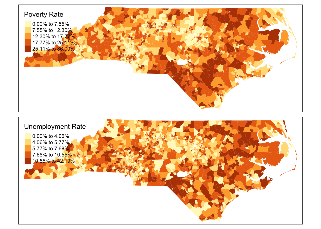
It should be relatively obvious that this visualisation does not tell us much about the correlation between poverty and unemployment rates. It is better to visualise them as a scatter plot
unemprate23 %>%
       inner_join(povrate23 , by=c("GEOID"="GEOID")) %>%
      ggplot() +
      geom_point(aes(x=unemp_rate, y=pov_rate), alpha=.3) +
      geom_smooth(aes(x=unemp_rate, y=pov_rate), method='lm') +  # Linear trend
      ylab('Poverty Rate') + xlab('Unemployment Rate')
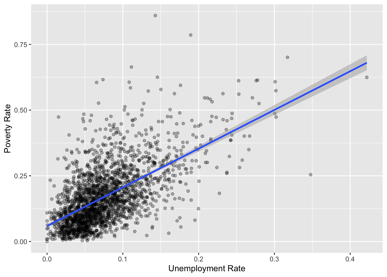
As you can see, there is strong linear relationship between poverty rate and unemployment rate. Notice the range of values on the axes. While unemployment rate ranges from 0 to 40%, poverty rate ranges from 0 to 100%, suggesting that poverty may be more acute than unemployment. Furthermore, if you just focus on the average relationship, you will miss the substantial variance around the relationship. It may be useful to identify, some of the outliers and focus on them in the map.
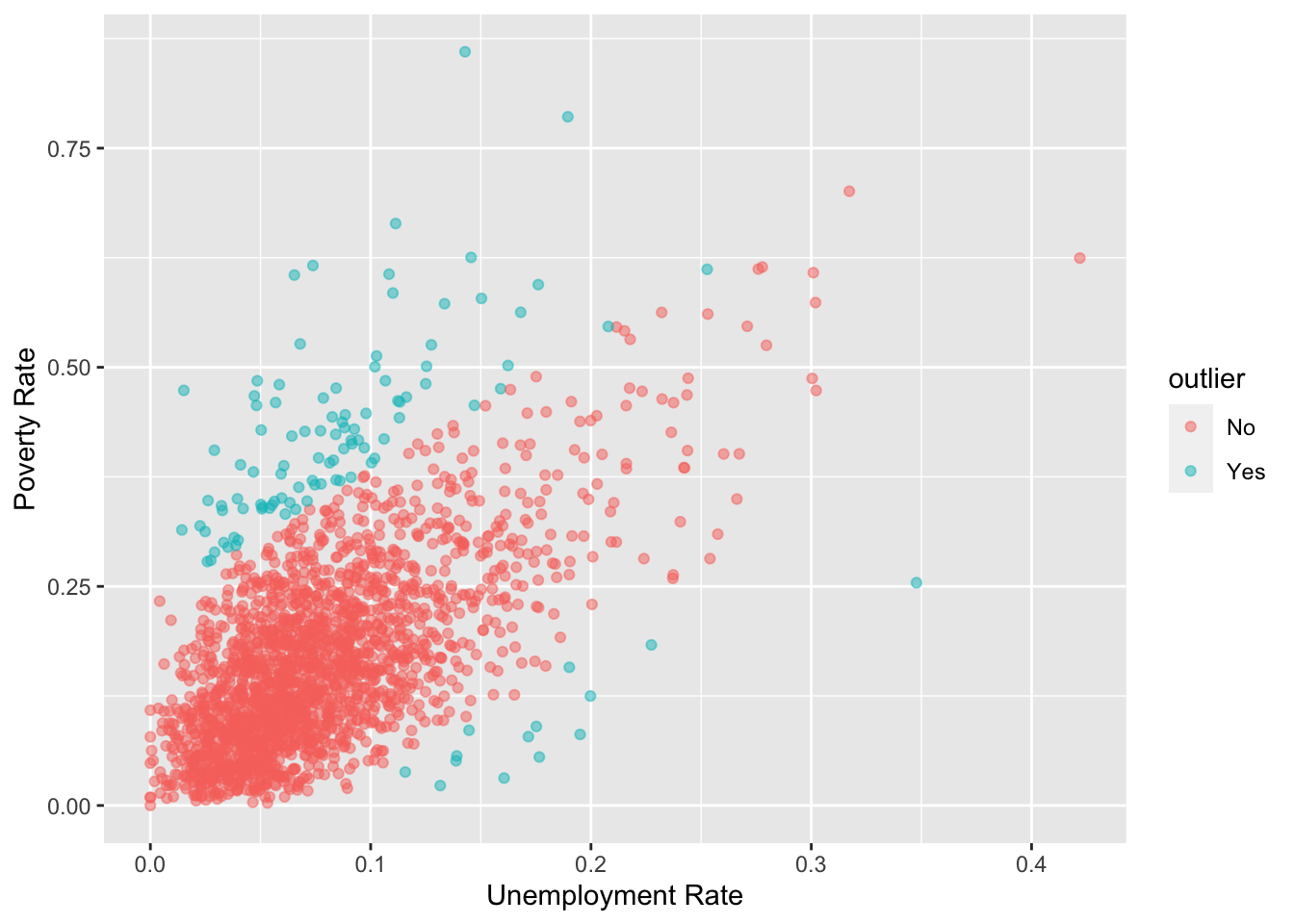
One way to identify them is perhaps to look at the predictions made by the regression line and if the actual value is higher or lower than the prediction interval, we can call them outliers.
dat23 <-
  unemprate23 %>%
  inner_join(povrate23 , by=c("GEOID"="GEOID"))

mod1 <- lm(pov_rate ~ unemp_rate , data=dat23)
dat23 <- cbind(dat23, predict(mod1, interval = 'prediction'))

library(ggthemes)

dat23 %>%
  mutate(outlier = ifelse(pov_rate >= upr | pov_rate <= lwr, "Yes", "No") %>% as_factor) %>%
  ggplot() +
  geom_point(aes(x=unemp_rate, y=pov_rate, color = outlier), alpha=.5) +
  scale_color_manual(values = c("No"='gray90', "Yes"='red')) +
  ylab('Poverty Rate') + xlab('Unemployment Rate') +
  theme_tufte()
tmap_mode('view')

m1 <-
dat23 %>%
  mutate(outlier = ifelse(pov_rate >= upr | pov_rate <= lwr, "Yes", "No") %>% as_factor) %>%
  st_as_sf() %>%
  st_transform(4326)%>%
    tm_shape() +
    tm_polygons("outlier",
                fill.scale = tm_scale_categorical(values = c("No"='gray90', "Yes"='red')),
                fill.legend = tm_legend(title = "Outlier", position = c("right", "top"), text.size = 0.5),
                fill_alpha = .5,
                col = 'brown',
                col_alpha = .1,
                lwd =.1

                ) +
  tm_tiles("CartoDB.PositronOnlyLabels")


frameWidget(tmap_leaflet(m1))
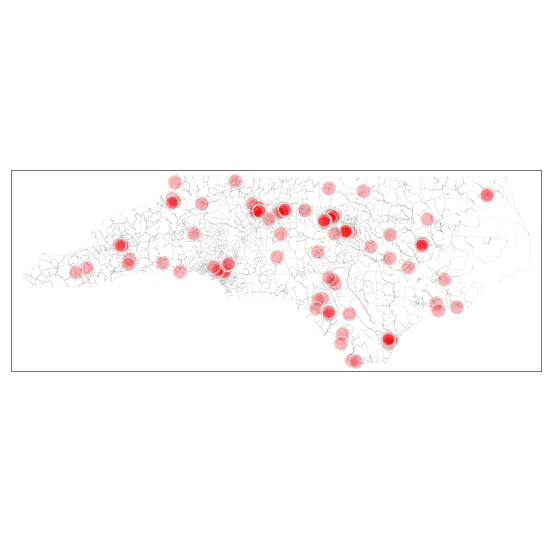
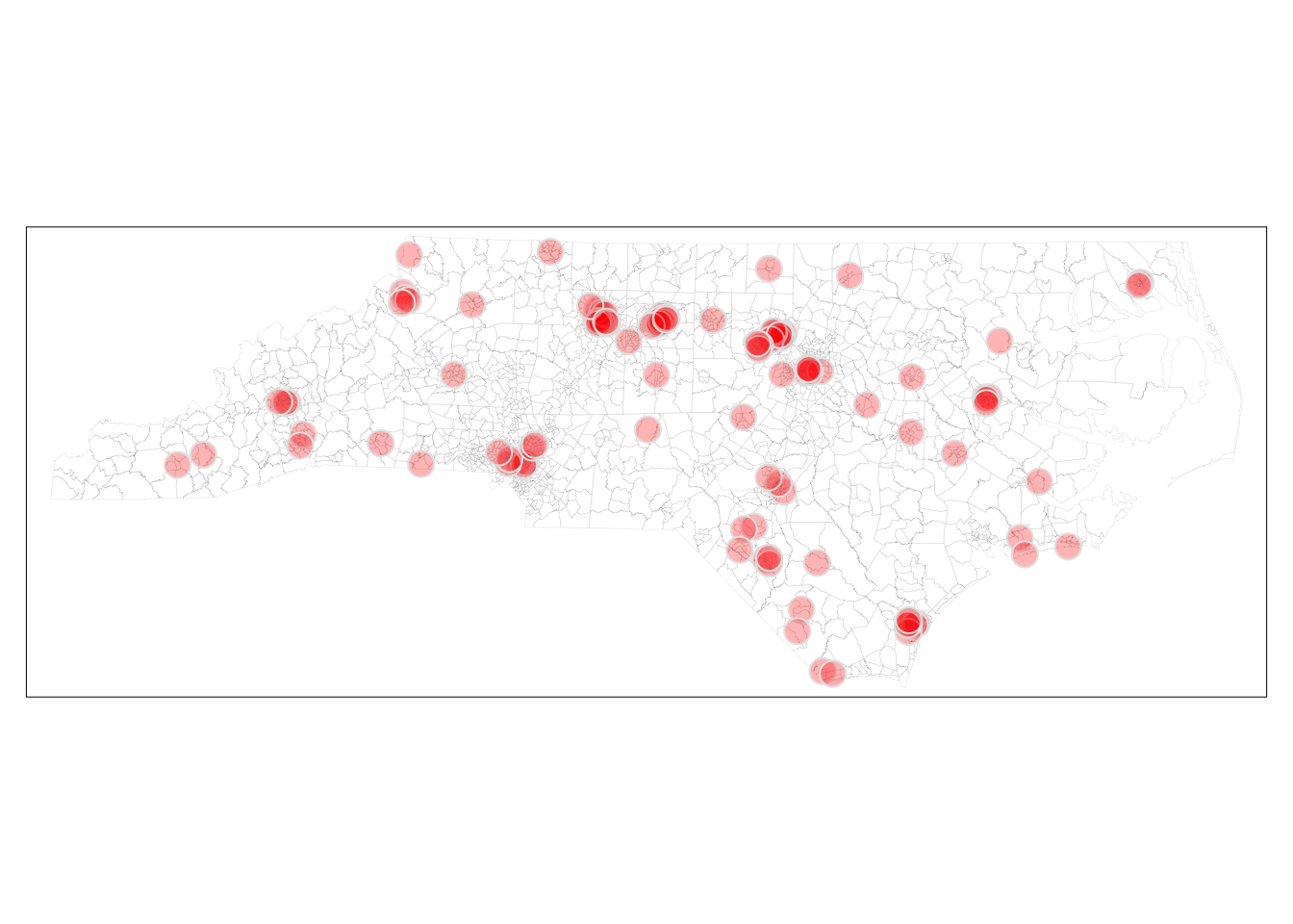
Note that this representation provides some insight, but is in fact not particularly helpful. Many small census tracts within the metropolitan areas are in the outliers but are not visible because of small area that is obfuscated by the borders. The large tracts draw attention to the eye even when they are probably not most important from a policy perspective.
dat23 <-
  dat23 %>%  st_as_sf()

outliers<- dat23 %>%
    filter(pov_rate >= upr | pov_rate <= lwr)

tmap_mode('plot')

tm_shape( dat23) +
    tm_borders(col_alpha=.1) +
    tm_shape(outliers)+
    tm_bubbles(col = NULL,
               size=.7,
               fill = 'red',
               fill_alpha=.3) +
  tm_tiles('CartoDB.PositronOnlyLabels')+
  tm_layout(frame = FALSE)+
  tm_title("Outliers in Poverty Rate vs Unemployment Rate") +
  tm_compass() +
  tm_scale_bar()+
  tm_credits("Source: ACS 2019-2023", position = c("right", "bottom"))
Exercise
-
Perhaps the focus should be on left and right outliers separately. Visualise them and see if they tell a different story.
-
Do we need the boundaries of Census tracts in these viusalisations? What purpose do they serve? Can we use other contextual boundaries that might help with the story?
-
Why do locations of the census tracts matter for the story? Why not counts in a county or other regions? Justify.
-
The above map may not be even the right story to tell. It could very well be that the focus should be on outliers that have high poverty and high unemployment rates, perhaps also places that have at least some threshold of population levels. Make some judgement about these and create a different visualisation.
Conclusions
This tutorial is about how to use APIs to access US Census data. Becoming quite familiar with the quirks of the Census data is quite useful for planners. But the ease with which these data can be queried does not obviate the need for careful consideration of what kinds of analysis and visualisations are needed and what kinds of compelling stories that need to be told.
Nikhil Kaza
Professor
My research interests include urbanization patterns, local energy policy and equity