Geospatial Data in R
 Bike Share Trips in NYC
Introduction
In this post, I am going to show how one might go about analysing the Bikeshare use in New York city. The purpose of this post is to demonstrate how to do some standard exploratory analysis and visualisation of a data set that has some spatial attributes, in open source software primarily in R.
One of the fundamental data structures in R is colloquially a table. A table is collection of loosely related observations (rows), where the attributes of these observations are in columns. In general, each column has values of same type, e.g. text, date, number, but different columns could be of different types. One of these columns could be a geometry, another could be a time stamp. This is the philosophy behind some of the newer R packages that are using ISO standards for spatial data. Traditional GIS, such as ArcGIS or QGIS put geometry/location as the fundamental and attach attributes to locations. This requires that all geometries to be the same, which is limiting in many cases. Whereas spatial databases such as POSTGIS/POSTGRESQL, GeoJSON etc. make observations fundamental and attach geometry as one of the columns (could have missing values). This also allows for mixing different geometry types. In this tutorial, we will use the sf package that implements the simple features access (like POSTGIS) to load, analyse and visualise spatial data. The advantage with sf is that it fits with the tidyverse computation frameworks, including visualisation with ggplot.
As we will see in this analyses, many of the interesting questions lurk in the relationships and summarisation of the variables of the observations rather than in the spatial relationships. In many instances, spatial attributes are used for visualisation and exploration rather taking advantage of the inherent topolgical relationships. However, even when topological relationships are important, many packages in R allow us to work with them.
Additional resources
In this post, I am assuming that the users have some familarity with spatial datasets and this includes coordinate systems, projections, basic spatial operations such as buffering, distance etc. in other contexts such as QGIS. If not, please refer other resources, including this one. Graphical User Interfaces of some software such as QGIS and ArcGIS allow for quick learning, visualisation. Using R or Python should be considered an advanced skills when point and click becomes tedious and/or overhead for constant visualisation is not essential to the task at hand.
Other resources include
- Robert Hijmans. www.rspatial.org
- Edzer Pebesma. www.r-spatial.org
- Robin Lovelace, Jakub Nowosad, Jannes Muenchow. Geocompuation with R
- Oscar Perpiñán Lamigueiro. Displaying time series, spatial and space-time data with R
Acquire data
- Bikeshare use in New York city. Download the June 2018 dataset.
- 2010 Census Blocks for New York city
- Blockgroup demographic data from American Community Survey 2012-2016
You can also download the local copy of the above datasets.
Analyse bike stations
library(tidyverse)


tripdata <- here("tutorials_datasets","nycbikeshare", "201806-citibike-tripdata.csv") %>% read_csv()#Change the file path to suit your situation.
tripdata <- rename(tripdata,                         #rename column names to get rid of the space
                   Slat = `start station latitude`,
                   Slon = `start station longitude`,
                   Elat = `end station latitude`,
                   Elon = `end station longitude`,
                   Sstid = `start station id`,
                   Estid = `end station id`,
                   Estname = `end station name`,
                   Sstname = `start station name`

)

tripdata
# # A tibble: 1,953,052 × 16
#    tripduration starttime           stoptime            Sstid Sstname       Slat
#           <dbl> <dttm>              <dttm>              <dbl> <chr>        <dbl>
#  1          569 2018-06-01 01:57:20 2018-06-01 02:06:50    72 W 52 St & 1…  40.8
#  2          480 2018-06-01 02:02:42 2018-06-01 02:10:43    72 W 52 St & 1…  40.8
#  3          692 2018-06-01 02:04:23 2018-06-01 02:15:55    72 W 52 St & 1…  40.8
#  4          664 2018-06-01 03:00:55 2018-06-01 03:11:59    72 W 52 St & 1…  40.8
#  5          818 2018-06-01 06:04:54 2018-06-01 06:18:32    72 W 52 St & 1…  40.8
#  6          753 2018-06-01 06:11:52 2018-06-01 06:24:26    72 W 52 St & 1…  40.8
#  7          687 2018-06-01 07:15:15 2018-06-01 07:26:42    72 W 52 St & 1…  40.8
#  8          619 2018-06-01 07:40:02 2018-06-01 07:50:22    72 W 52 St & 1…  40.8
#  9          819 2018-06-01 07:43:01 2018-06-01 07:56:41    72 W 52 St & 1…  40.8
# 10          335 2018-06-01 07:49:47 2018-06-01 07:55:23    72 W 52 St & 1…  40.8
# # ℹ 1,953,042 more rows
# # ℹ 10 more variables: Slon <dbl>, Estid <dbl>, Estname <chr>, Elat <dbl>,
# #   Elon <dbl>, bikeid <dbl>, name_localizedValue0 <chr>, usertype <chr>,
# #   `birth year` <dbl>, gender <dbl>

#Convert gender  and usertype to factor
tripdata$gender <- factor(tripdata$gender, labels=c('Unknown', 'Male', 'Female'))
tripdata$usertype<- factor(tripdata$usertype)
summary(tripdata)
#   tripduration       starttime
#  Min.   :     61   Min.   :2018-06-01 00:00:02.46
#  1st Qu.:    386   1st Qu.:2018-06-08 16:40:28.67
#  Median :    660   Median :2018-06-15 21:30:12.34
#  Mean   :   1109   Mean   :2018-06-16 03:57:52.06
#  3rd Qu.:   1157   3rd Qu.:2018-06-23 12:00:37.06
#  Max.   :3204053   Max.   :2018-06-30 23:59:54.35
#     stoptime                          Sstid        Sstname
#  Min.   :2018-06-01 00:03:32.71   Min.   :  72   Length:1953052
#  1st Qu.:2018-06-08 16:57:42.36   1st Qu.: 379   Class :character
#  Median :2018-06-15 21:51:26.93   Median : 504   Mode  :character
#  Mean   :2018-06-16 04:16:22.00   Mean   :1588
#  3rd Qu.:2018-06-23 12:18:07.26   3rd Qu.:3236
#  Max.   :2018-07-16 01:52:40.25   Max.   :3692
#       Slat            Slon            Estid        Estname
#  Min.   :40.66   Min.   :-74.03   Min.   :  72   Length:1953052
#  1st Qu.:40.72   1st Qu.:-74.00   1st Qu.: 379   Class :character
#  Median :40.74   Median :-73.99   Median : 503   Mode  :character
#  Mean   :40.74   Mean   :-73.98   Mean   :1580
#  3rd Qu.:40.76   3rd Qu.:-73.97   3rd Qu.:3236
#  Max.   :45.51   Max.   :-73.57   Max.   :3692
#       Elat            Elon            bikeid      name_localizedValue0
#  Min.   :40.66   Min.   :-74.06   Min.   :14529   Length:1953052
#  1st Qu.:40.72   1st Qu.:-74.00   1st Qu.:20205   Class :character
#  Median :40.74   Median :-73.99   Median :27662   Mode  :character
#  Mean   :40.74   Mean   :-73.98   Mean   :25998
#  3rd Qu.:40.76   3rd Qu.:-73.97   3rd Qu.:31007
#  Max.   :45.51   Max.   :-73.57   Max.   :33699
#        usertype         birth year       gender
#  Customer  : 258275   Min.   :1885   Unknown: 201636
#  Subscriber:1694777   1st Qu.:1969   Male   :1281884
#                       Median :1981   Female : 469532
#                       Mean   :1979
#                       3rd Qu.:1989
#                       Max.   :2002
Few things jump out just by looking at the summary statistics.
- The dataset is large. Just one month has close to 2 million trips.
- We know from the documentation that trips that are less than a minute are not included in the dataset. So minimum of trip duration is 61 seems correct. This also gives a clue about the units of the tripduration column (s). Another way to verify the column is to do date arithmetic over start and stop times
- Some trips durations are extrodinarily large. One took 37 days! But substantial portion of them (90%) took less than 30 min and 95% of the trips were below 45 min. To see this use
quantile(tripdata$tripduration, .9). So clearly, there are some issues with trips that are outliers. - Some trips did not end till mid-July, even though this is a dataset for June. So clearly, the dataset is created based on start of the trip. It is unclear from the documentation and from the summary, what happens to the rare trips that did start in June and did not end till the dataset was created.
- While the longitudes (both start and end) are tightly clustered around -73.9, there seem to be few observations with latitudes around 45.5, while the rest are around 40.7. A localised study such as this one, is unlikely to span 5° latitude difference (~350 miles or 563 km). Clearly there are some outliers w.r.t stations.
- There are at least a few riders who are older than 100 years. Centenarians are unlikely to use the bikeshare. This may simply be a data quality issue for that particular column rather than one that poses a problem for the analysis.
- 87% of the riders are subscribers. This is a surprise to me. Presumably one is subscriber if they lived in New York and not likely to be subscriber if they are visiting. I would have guessed that New Yorkers might want to own a bike that fitted to them, rather than renting an ill-fitted bike. Perhaps for rides with duration less half an hour, perhaps fitting of the bike does not matter. Only 13% of the trips were by customers, suggesting that there are either significant barriers to using bikeshare as a one-off customer. Or alternative modes are much more acessible with fewer transaction frictions.
- The bikeshare is used predominantly by men (65%). Less than a quarter of the bikeshare users are women.
prop.table(table(tripdata$usertype))
#
#   Customer Subscriber
#  0.1322417  0.8677583
prop.table(table(tripdata$gender))
#
#   Unknown      Male    Female
# 0.1032415 0.6563491 0.2404094
prop.table(xtabs(~usertype+gender, data=tripdata), margin=2)
#             gender
# usertype        Unknown       Male     Female
#   Customer   0.83272828 0.04340252 0.07396727
#   Subscriber 0.16727172 0.95659748 0.92603273
- Of the unknown gender, 83% are customers rather than subscribers. Since I am not aware of the registration (and therefore data collection process about the users) to access these bikeshare, I do not know what information is collected from customers and subscribers. It is unlikely that non-binary gendered persons are responsible for 10% of the trips. It is more likely to be truly missing information in the data collection process, rather than an interesting and understudied subgroup that we can address with this dataset.
Clean dataset
A significant part of analysis is cleaning and massaging data to get it into a shape that is analysable. It is important to note that this process is iterative and it is important to document all the steps for the purposes of reproducibility. In this example, I am going to demonstrate some the choices and documentation, so that I can revisit them later on to modify or to justify the analytical choices.
Let’s plot all the bike stations
start_loc <- unique(tripdata[,c('Slon', 'Slat', "Sstid", 'Sstname')]) %>% rename(Longitude = Slon, Latitude = Slat, Stid = Sstid, Stname=Sstname)
end_loc <- unique(tripdata[,c('Elon', 'Elat', 'Estid', 'Estname')]) %>% rename(Longitude = Elon, Latitude = Elat, Stid = Estid, Stname=Estname)
station_loc <- unique(rbind(start_loc, end_loc))
rm(start_loc, end_loc)

library(leaflet)

m1 <-
leaflet(station_loc) %>%
  addProviderTiles(providers$CartoDB.Positron, group = "Basemap") %>%
  addMarkers(label = paste(station_loc$Stid, station_loc$Longitude, station_loc$Latitude, station_loc$Stname, sep=",")
  )

library(widgetframe)
widgetframe::frameWidget(m1)
As noted above, there seems to be two stations in Montreal for a NYC Bikeshare system. Zooming in, reveals that these stations are 8D stations. 8D is a company that provides technology for bikeshares around the world. Clearly, these stations are not particularly useful for trip analysis purposes. I will collect their ids into a vector.
(eightDstations <- station_loc[grep(glob2rx("8D*"), station_loc$Stname),]$Stid)
# [1] 3036 3488 3650
Let’s look at the trip that seems to have taken quite long (~37 days).
tripdata[which.max(tripdata$tripduration),c('Sstname', 'Estname','tripduration')]
# # A tibble: 1 × 3
#   Sstname               Estname           tripduration
#   <chr>                 <chr>                    <dbl>
# 1 E 53 St & Madison Ave NYCBS Depot - GOW      3204053
This seems to be a trip with bikes returned to depot. This also means that there are depots in the system that might have no real trips attached to them. Let’s collect them to target for eliminiation.
 (Bikedepots <- station_loc[grep(glob2rx("*CBS*"), station_loc$Stname),]$Stid)
# [1] 3240 3432 3468 3485 3245
Let’s examine some other longer trips (say more than 2 hrs)
tripdata %>%
  select(Sstid, Estid, tripduration) %>%
  filter(tripduration >= 60*60*2) %>%
  group_by(Sstid, Estid) %>%
  summarise(triptots = n(),
            averagetripdur = mean(tripduration)
            ) %>%
  arrange(desc(triptots))
# # A tibble: 5,260 × 4
# # Groups:   Sstid [726]
#    Sstid Estid triptots averagetripdur
#    <dbl> <dbl>    <int>          <dbl>
#  1   281   281       59         10406.
#  2  2006  2006       40          9541.
#  3   281  2006       31          9561
#  4  3529  3529       29         45906.
#  5  3254  3254       26         13924.
#  6  3423  3423       22         22284.
#  7   281   499       20          8052.
#  8  3182  3182       18         20166
#  9   514   514       16         10276.
# 10   387   387       15          9569
# # ℹ 5,250 more rows
There are ~5100 such unique Origin-Destination (OD) pairs. The displayed tibble points to a few things.
- The trip totals of these OD pairs, are relatively inconsequential in a trip database of 2 million.
- There seems to be no apparent pattern in the start station ids or end station ids.
- More consequentially, there are some trips that start and end at the same location, even when they took longer than a minute. Because, we do not have information about the actual path these bicyclists took, we cannot compute reliable paths when origin and destinations are the same. So we will have to ignore such trips.
station_loc <- station_loc[!(station_loc$Stid %in% Bikedepots |  station_loc$Stid %in% eightDstations), ]
tripdata <- tripdata[tripdata$Estid %in% station_loc$Stid & tripdata$Sstid %in% station_loc$Stid, ]
diffdesttrips <- tripdata[tripdata$Estid != tripdata$Sstid, ]
c(nrow(tripdata), nrow(diffdesttrips))
# [1] 1952575 1909400
nrow(station_loc)
# [1] 768

summary(diffdesttrips)
#   tripduration       starttime
#  Min.   :     61   Min.   :2018-06-01 00:00:03.78
#  1st Qu.:    386   1st Qu.:2018-06-08 16:32:48.44
#  Median :    656   Median :2018-06-15 21:02:18.70
#  Mean   :   1016   Mean   :2018-06-16 03:52:16.05
#  3rd Qu.:   1141   3rd Qu.:2018-06-23 11:49:02.98
#  Max.   :2797919   Max.   :2018-06-30 23:59:54.35
#     stoptime                          Sstid        Sstname
#  Min.   :2018-06-01 00:03:32.71   Min.   :  72   Length:1909400
#  1st Qu.:2018-06-08 16:48:59.32   1st Qu.: 379   Class :character
#  Median :2018-06-15 21:20:18.77   Median : 503   Mode  :character
#  Mean   :2018-06-16 04:09:12.92   Mean   :1580
#  3rd Qu.:2018-06-23 12:04:38.01   3rd Qu.:3235
#  Max.   :2018-07-16 01:52:40.25   Max.   :3692
#       Slat            Slon            Estid        Estname
#  Min.   :40.66   Min.   :-74.03   Min.   :  72   Length:1909400
#  1st Qu.:40.72   1st Qu.:-74.00   1st Qu.: 379   Class :character
#  Median :40.74   Median :-73.99   Median : 502   Mode  :character
#  Mean   :40.74   Mean   :-73.98   Mean   :1572
#  3rd Qu.:40.76   3rd Qu.:-73.97   3rd Qu.:3235
#  Max.   :40.81   Max.   :-73.91   Max.   :3692
#       Elat            Elon            bikeid      name_localizedValue0
#  Min.   :40.66   Min.   :-74.06   Min.   :14529   Length:1909400
#  1st Qu.:40.72   1st Qu.:-74.00   1st Qu.:20211   Class :character
#  Median :40.74   Median :-73.99   Median :27670   Mode  :character
#  Mean   :40.74   Mean   :-73.98   Mean   :26005
#  3rd Qu.:40.76   3rd Qu.:-73.97   3rd Qu.:31010
#  Max.   :40.81   Max.   :-73.91   Max.   :33699
#        usertype         birth year       gender
#  Customer  : 241789   Min.   :1885   Unknown: 189528
#  Subscriber:1667611   1st Qu.:1969   Male   :1259646
#                       Median :1981   Female : 460226
#                       Mean   :1979
#                       3rd Qu.:1989
#                       Max.   :2002
Exercise
- The trip duration still seems to have some extremly high values. Explore the dataset more and see if there are patterns in the outliers that might pose problems for the analysis.
- What other data attributes can be used to explore anamolous data?
- While exploring the anamolous data, what other interesting patterns emerge from the dataset?
Visualising data with point location attribute
It might be useful to think about which station locations are popular to start the trips. We will apply the data summarisation techniques discussed in earlier posts and relatively easily compute and visualise the dataset.
library(lubridate)  #useful for date time functions

numtrips_start_station <- diffdesttrips %>%
  mutate(day_of_week = wday(starttime, label=TRUE, week_start=1)) %>% #create weekday variable from start time
  group_by(Sstid, day_of_week, usertype) %>%
  summarise(Slon = first(Slon),
            Slat = first(Slat),
            totaltrips = n()
            )

numtrips_start_station %>%
  arrange(desc(totaltrips))
# # A tibble: 10,516 × 6
# # Groups:   Sstid, day_of_week [5,282]
#    Sstid day_of_week usertype    Slon  Slat totaltrips
#    <dbl> <ord>       <fct>      <dbl> <dbl>      <int>
#  1   519 Fri         Subscriber -74.0  40.8       2726
#  2   519 Mon         Subscriber -74.0  40.8       2703
#  3   519 Tue         Subscriber -74.0  40.8       2452
#  4   497 Fri         Subscriber -74.0  40.7       2059
#  5   435 Fri         Subscriber -74.0  40.7       1964
#  6   519 Wed         Subscriber -74.0  40.8       1953
#  7   402 Fri         Subscriber -74.0  40.7       1940
#  8   492 Fri         Subscriber -74.0  40.8       1938
#  9   426 Fri         Subscriber -74.0  40.7       1925
# 10   402 Tue         Subscriber -74.0  40.7       1872
# # ℹ 10,506 more rows

g1 <- ggplot(numtrips_start_station) +
  geom_point(aes(x=Slon, y=Slat, size=totaltrips), alpha=.5) +  # We use the  size of the point to denote its attraction
   scale_size_continuous(range= c(.1,2))+
  facet_grid(usertype ~ day_of_week) +  # Compare subscribers and customers
   scale_x_continuous("", breaks=NULL)+
   scale_y_continuous("", breaks=NULL)+
   theme(panel.background = element_rect(fill='white',colour='white'), legend.position = "none")  + coord_fixed()

library(plotly)

ggplotly(g1) # Only if you want interactivity
Exercise
- Interpret this visualisation. What does it tell you? Is there a way to make it better?
- How about visualsing the popularity of the station by time of day. Clearly using every single hour is problematic. Create a new variable that partitions the data into day and night and see if there are any interesting patterns.
For publication quality plots, ggplots are sufficient and more granular control over what appears in the image is useful. However for exploratory purposes, plotly graphs are great because of the ability to zoom and select. Especially with faceted plots, brushing and linking is enabled, which allow for useful explorations.
One of the significant problems with point plots is the overplotting, points on top of another. There are a number of ways to correct this, none of them are useful in all cases. For example, one way to visualise it is using a contour plot.
ggplot(diffdesttrips, aes(Slon, Slat)) +
    stat_density2d(aes(alpha=..level.., fill=..level..), size=2,
        bins=10, geom="polygon") +
    scale_fill_gradient(low = "blue", high = "red") +
    scale_alpha(range = c(0.00, 0.5), guide = FALSE) +
    geom_density2d(colour="black", bins=10)
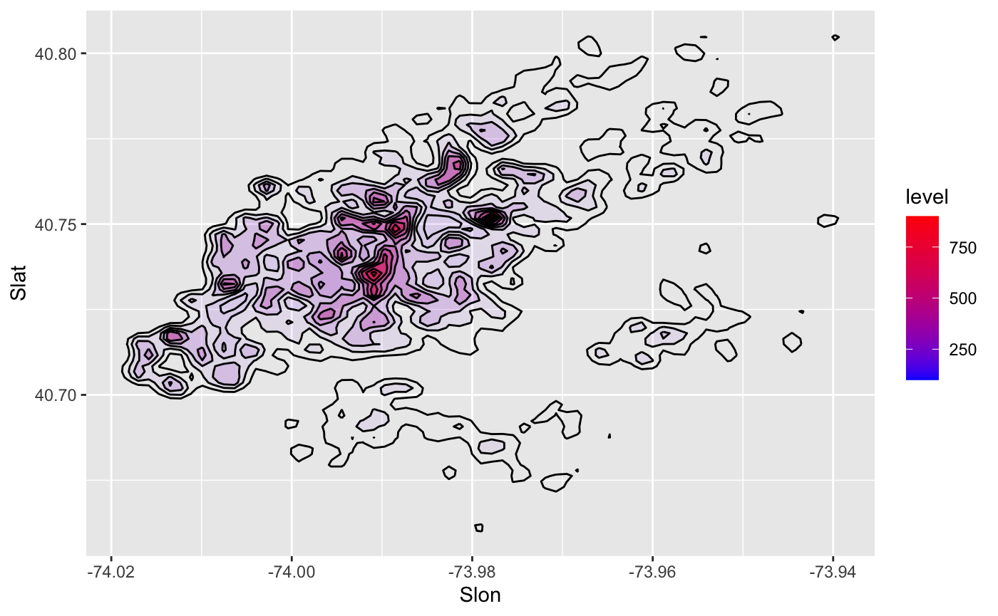
To understand this code better, see this StackOverflow post.
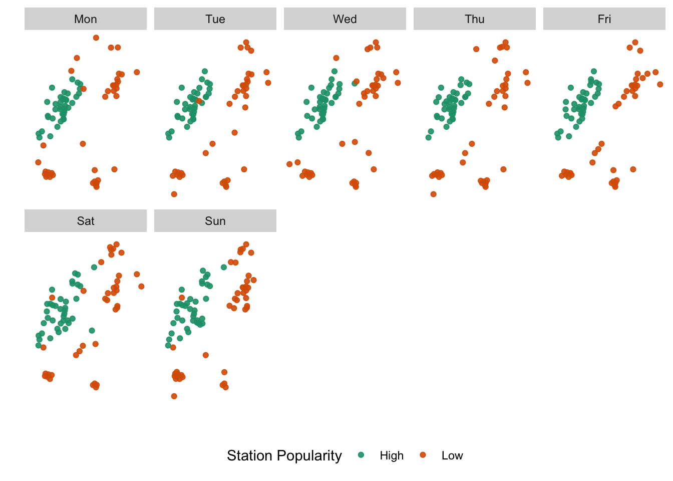
Notice that until now, we got significant mileage out of our explorations, even without invoking any geospatial predicates or topological relations. More often than not, the x-y location of point is largely unimportant. They may be useful for visualisation and geographic context, but they don’t provide any information during the analysis phase. For example, it might be more useful to explore which stations are popular at different days of the week and then plot them to see if there are patterns.
numtrips_start_station <- diffdesttrips %>%
  mutate(day_of_week = wday(starttime, label=TRUE, week_start=1)) %>%
  group_by(Sstid, day_of_week) %>%
  summarise(Slon = first(Slon),
            Slat = first(Slat),
            totaltrips = n()
            ) %>%
  group_by(day_of_week) %>%
   mutate(
     outlier_def = case_when(
       totaltrips <= quantile(totaltrips,.05) ~ "Low",
       totaltrips >= quantile(totaltrips, .95) ~ "High",
       TRUE ~ "Normal"
     )
   )


tmpfi <- numtrips_start_station %>%
 filter(outlier_def!="Normal")

  ggplot()+
  geom_point(aes(x=Slon, y=Slat, color=factor(outlier_def)), alpha=.9, data=tmpfi)+
  scale_color_brewer(palette="Dark2") +
  facet_wrap(~day_of_week, ncol=5)+
     scale_x_continuous("", breaks=NULL)+
   scale_y_continuous("", breaks=NULL)+
   theme(panel.background = element_rect(fill='white',colour='white'), legend.position = "bottom") +
  labs(colour = "Station Popularity")
Exercise
- Are there different stations that are popular at different times of the day?
- Instead of the start of the trip as a measure of popularity, what about the destinations?
Finally some spatial objects
While much can be accomplished on a table which has some geometry columns, it should come as no suprise that spatial objects are incredibly useful. For example, selecting all points that fall within 1km of each observation is more complicated than filtering on values.
It is straightfoward to convert a dataframe into a sf object using st_as_sf function It is also straightforward and faster to read an external geospatial file into sf object using st_read. We will see examples of that later on.
library(sf)

 numtrips_start_station <- st_as_sf(numtrips_start_station, coords = c('Slon', 'Slat'), crs = 4326) # WGS84 coordinate system

 numtrips_start_station
# Simple feature collection with 5282 features and 4 fields
# Geometry type: POINT
# Dimension:     XY
# Bounding box:  xmin: -74.02535 ymin: 40.6554 xmax: -73.90774 ymax: 40.81439
# Geodetic CRS:  WGS 84
# # A tibble: 5,282 × 5
# # Groups:   day_of_week [7]
#    Sstid day_of_week totaltrips outlier_def             geometry
#  * <dbl> <ord>            <int> <chr>                <POINT [°]>
#  1    72 Mon                623 Normal      (-73.99393 40.76727)
#  2    72 Tue                672 Normal      (-73.99393 40.76727)
#  3    72 Wed                584 Normal      (-73.99393 40.76727)
#  4    72 Thu                563 Normal      (-73.99393 40.76727)
#  5    72 Fri                791 Normal      (-73.99393 40.76727)
#  6    72 Sat                738 Normal      (-73.99393 40.76727)
#  7    72 Sun                486 Normal      (-73.99393 40.76727)
#  8    79 Mon                410 Normal      (-74.00667 40.71912)
#  9    79 Tue                495 Normal      (-74.00667 40.71912)
# 10    79 Wed                509 Normal      (-74.00667 40.71912)
# # ℹ 5,272 more rows
Just as filtering a tibble returns another tibble, filtering a sf object returns another sf object. While we can still use leaflet, I prefer to use tmap to do quick visualisations.
#install.packages('tmap')
library(tmap)

daytrips <-   numtrips_start_station[numtrips_start_station$day_of_week=="Tue",]

tmap_mode('view')

m1 <-
  daytrips %>%
  mutate(displayvar = paste("Station ID ", Sstid, "- Total trips: ", totaltrips )) %>%
  tm_shape() +
    tm_symbols(size = "totaltrips",
             alpha = .5,
             col = "totaltrips",
             scale =.8,
             palette = "OrRd",
             id = "displayvar")

tmap_leaflet(m1) %>% widgetframe::frameWidget() # This is only necessary for websites. Ignore this if you are just creating a html file
Exercise
- Explore the choices of different Palettes and Sizes. What do they tell you? Do you need them both to make your point?
- What if you want to only display the outliers like in
ggplotabove but want to do it intmap. How would you style it? - What happens when you set the
tmap_modetoplotinstead ofview.
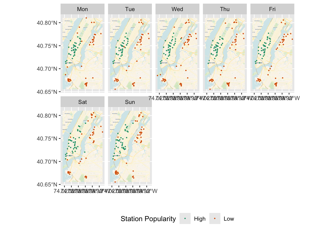
In an earlier ggplot that looked at the outliers, if you want to include some base maps for context, you can use basemaps package. But for this basemap to work download the relevant extent, You should also need to derive bounding box extents.
(ext <- st_bbox(numtrips_start_station))
#      xmin      ymin      xmax      ymax
# -74.02535  40.65540 -73.90774  40.81439
library(basemaps)

tmpfi_sf <- st_as_sf(tmpfi, coords = c("Slon", 'Slat'), crs = st_crs(4326))

ext <- st_bbox(tmpfi_sf)

tmpfi_sf <- tmpfi_sf %>% mutate(outlier_def = factor(outlier_def))

  ggplot()+
      basemap_gglayer(ext)+
      scale_fill_identity() +
      geom_sf(data=tmpfi_sf %>% st_transform(st_crs(3857)),
              aes(colour = outlier_def), size = .3) +
      scale_color_brewer(palette="Dark2") +
     xlab("") + ylab("")+
      facet_wrap(~day_of_week, ncol=5)+
      theme(legend.position = "bottom") +
      labs(colour = "Station Popularity")
# Loading basemap 'voyager' from map service 'carto'...
# Using geom_raster() with maxpixels = 795588.
The advantage of spatial objects is clear, when we want to use spatial relationships such as distance, enclosure, intersection etc.
See some examples below.
st_distance(daytrips)[1:4,1:4]
# Units: [m]
#          [,1]     [,2]     [,3]     [,4]
# [1,]    0.000 5461.250 6259.914 9396.658
# [2,] 5461.250    0.000 1039.224 4684.103
# [3,] 6259.914 1039.224    0.000 3645.216
# [4,] 9396.658 4684.103 3645.216    0.000

st_buffer(st_transform(daytrips, crs=26917), dist=500)
# Simple feature collection with 754 features and 4 fields
# Geometry type: POLYGON
# Dimension:     XY
# Bounding box:  xmin: 1089080 ymin: 4523556 xmax: 1099251 ymax: 4542615
# Projected CRS: NAD83 / UTM zone 17N
# # A tibble: 754 × 5
# # Groups:   day_of_week [1]
#    Sstid day_of_week totaltrips outlier_def                             geometry
#  * <dbl> <ord>            <int> <chr>                              <POLYGON [m]>
#  1    72 Tue                672 Normal      ((1092006 4536601, 1092006 4536575,…
#  2    79 Tue                495 Normal      ((1091359 4531164, 1091358 4531137,…
#  3    82 Tue                162 Normal      ((1091979 4530325, 1091978 4530299,…
#  4    83 Tue                251 Normal      ((1094239 4527448, 1094238 4527422,…
#  5   119 Tue                 39 Low         ((1093985 4528799, 1093984 4528773,…
#  6   120 Tue                182 Normal      ((1095655 4527891, 1095654 4527864,…
#  7   127 Tue               1220 High        ((1091240 4532564, 1091239 4532538,…
#  8   128 Tue               1035 Normal      ((1091600 4532076, 1091599 4532050,…
#  9   143 Tue                392 Normal      ((1092720 4528284, 1092719 4528258,…
# 10   144 Tue                111 Normal      ((1093740 4529038, 1093739 4529011,…
# # ℹ 744 more rows

daytrips %>% st_union() %>% st_centroid()
# Geometry set for 1 feature
# Geometry type: POINT
# Dimension:     XY
# Bounding box:  xmin: -73.97139 ymin: 40.73311 xmax: -73.97139 ymax: 40.73311
# Geodetic CRS:  WGS 84

daytrips %>% st_union() %>% st_convex_hull() %>% plot()

Exploring Lines
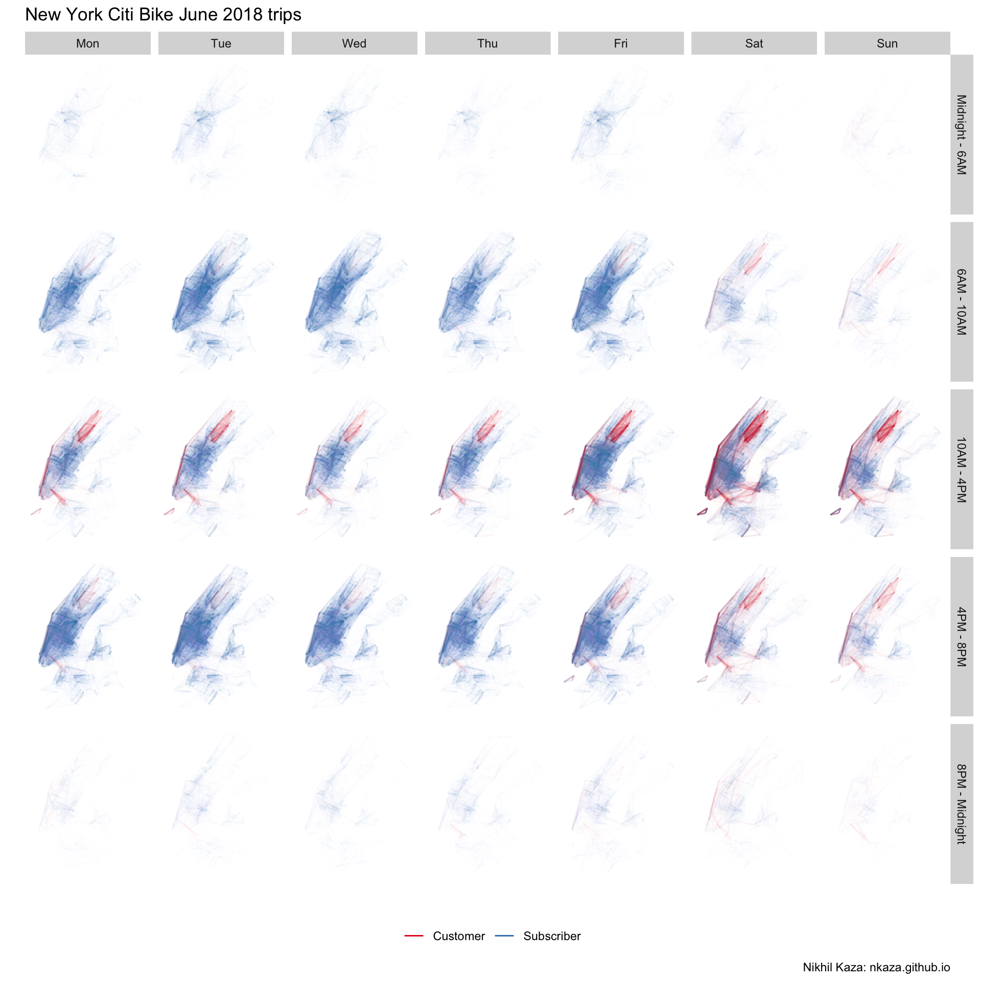
Lines are simply collections of points that are arranged in a particular sequence. A simplest line is defined by its end points. Conveniently, our data set has these kinds of lines defined by start and end stations for each trip. Let’s explore the distribution of these trips. We can easily plot these kinds of lines with geom_segment of ggplot2.
numtrips <- diffdesttrips %>%
  mutate(day_of_week = wday(starttime, label=TRUE, week_start=1),
         hr = hour(starttime),
         time_of_day = hr %>% cut(breaks=c(0,6,10,16,20,24), include.lowest = TRUE, labels=c("Midnight - 6AM", "6AM - 10AM", "10AM - 4PM", "4PM - 8PM", "8PM - Midnight"))
         ) %>%
  group_by(Sstid, Estid, day_of_week, time_of_day, gender) %>%
  summarise(Slon = first(Slon),
            Slat = first(Slat),
            Elon = first(Elon),
            Elat = first(Elat),
            totaltrips = n(),
            aveduration = mean(tripduration)
            )

numtrips %>% filter(totaltrips >2) %>%
 ggplot()+
  #The "alpha=" is degree of transparency conditioned by totaltrips and used below to make the lines transparent
  geom_segment(aes(x=Slon, y=Slat,xend=Elon, yend=Elat, alpha=totaltrips, colour=gender))+
  #Here is the magic bit that sets line transparency - essential to make the plot readable
  scale_alpha_continuous(range = c(0.005, 0.5), guide='none')+
  #scale_color_manual(values=c('purple', 'white','green'), labels=c('Neither/Unknown', 'Male', "Female"), guide='legend')+
  scale_color_brewer(palette="Set1", guide='legend')+
  facet_grid(time_of_day~day_of_week)+
  #Set black background, ditch axes
  scale_x_continuous("", breaks=NULL)+
  scale_y_continuous("", breaks=NULL)+
  theme(panel.background = element_rect(fill='white',colour='white'), legend.position = "bottom")+
        #legend.key=element_rect(fill='black', color='black')) +
  labs(title = 'New York Citi Bike June 2018 trips', colour="",caption="Nikhil Kaza: nkaza.github.io")
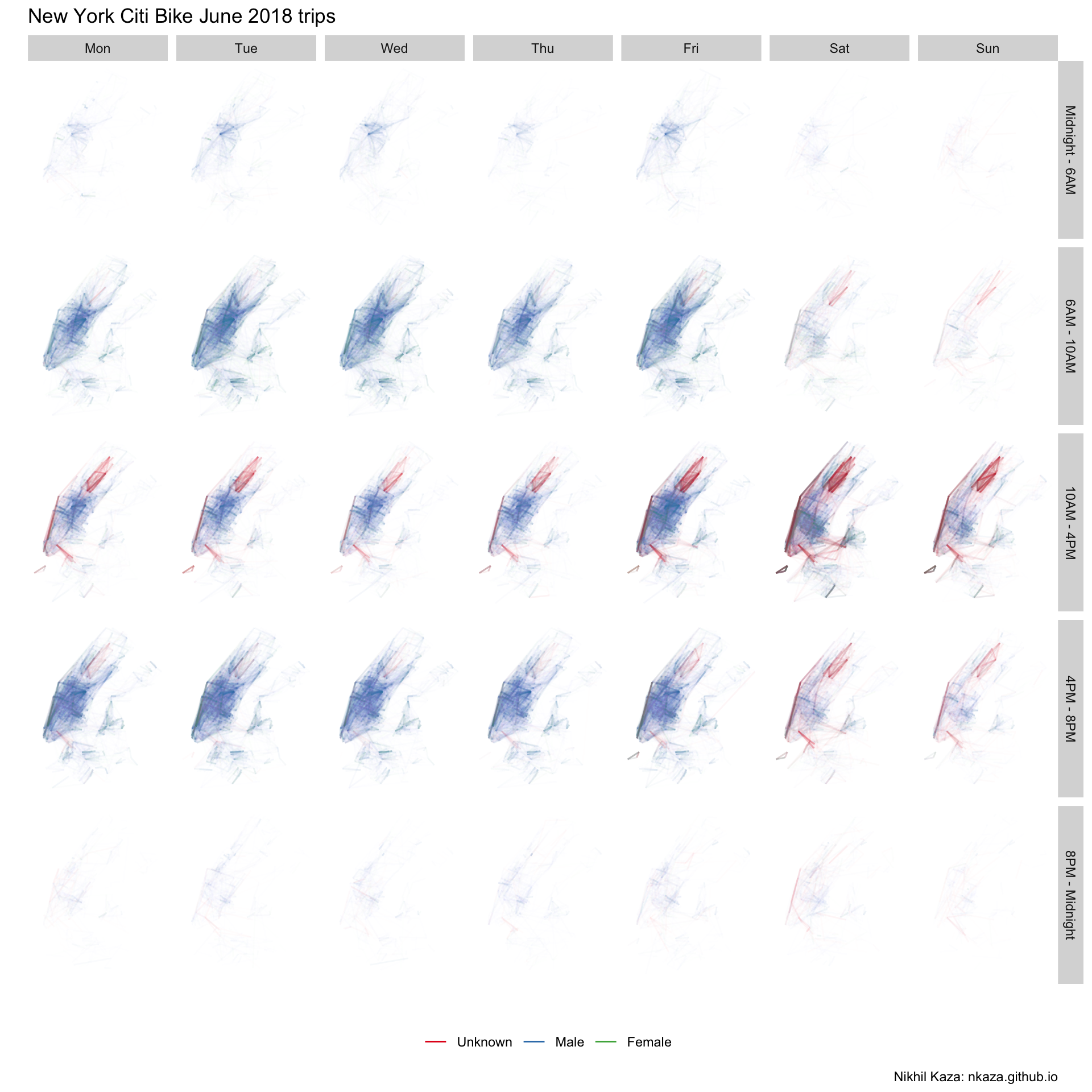
Since men are overwhelmingly large proportion of the trip makers, the plots are largely blue. There are also very few trips, outside Manhattan. Few trips from 8PM to 6AM. As we noted earlier, since large number of customers (who are not subscribers) are of ‘unknown’ gender the red lines showup more prominently around Central Park, on the weekends and in between non-commuting hours. This can be visualised as follows.
numtrips <- diffdesttrips %>%
  mutate(day_of_week = wday(starttime, label=TRUE, week_start=1),
         hr = hour(starttime),
         time_of_day = hr %>% cut(breaks=c(0,6,10,16,20,24), include.lowest = TRUE, labels=c("Midnight - 6AM", "6AM - 10AM", "10AM - 4PM", "4PM - 8PM", "8PM - Midnight"))
         ) %>%
  group_by(Sstid, Estid, day_of_week, time_of_day, usertype) %>%
  summarise(Slon = first(Slon),
            Slat = first(Slat),
            Elon = first(Elon),
            Elat = first(Elat),
            totaltrips = n(),
            aveduration = mean(tripduration)
            )

numtrips %>% filter(totaltrips >2) %>%
 ggplot()+
  #The "alpha=" is degree of transparency conditioned by totaltrips and used below to make the lines transparent
  geom_segment(aes(x=Slon, y=Slat,xend=Elon, yend=Elat, alpha=totaltrips, colour=usertype))+
  #Here is the magic bit that sets line transparency - essential to make the plot readable
  scale_alpha_continuous(range = c(0.005, 0.5), guide='none')+
  #scale_color_manual(values=c('purple', 'white','green'), labels=c('Neither/Unknown', 'Male', "Female"), guide='legend')+
  scale_color_brewer(palette="Set1", guide='legend')+
  facet_grid(time_of_day~day_of_week)+
  #Set black background, ditch axes
  scale_x_continuous("", breaks=NULL)+
  scale_y_continuous("", breaks=NULL)+
  theme(panel.background = element_rect(fill='white',colour='white'), legend.position = "bottom")+
        #legend.key=element_rect(fill='black', color='black')) +
  labs(title = 'New York Citi Bike June 2018 trips', colour="",caption="Nikhil Kaza: nkaza.github.io")
While OD pairs give us a sense the popular origins and destinations, they give us very little information about what routes are taken by these bicyclists. Citi Bike, for vareity of reasons including privacy, data storage and usefulness does not release actual routes. However, we can use Google Maps Bicycling routes or Open Source Routing Machine (OSRM) to calculate the shortest bicycling route between the 188,337 unique O-D pairs in the dataset. The following code produces the shortest routes between Origin and Destination station using the OSRM and is pre-computed to save time.
library(osrm)
unique_od_pairs <- diffdesttrips[!duplicated(diffdesttrips[,c('Sstid','Estid')]), c('Sstid', 'Slon', 'Slat', 'Estid', 'Elon', 'Elat')]
options(osrm.server = "http://localhost:5000/", osrm.profile = "cycling")
k <- osrmRoute(src=unique_od_pairs[i,c('Sstid', 'Slon', 'Slat')] , dst=unique_od_pairs[i,c('Estid','Elon','Elat')], overview = "full", sp = TRUE)

fastest_od_routes <- list()
for(i in 1:nrow(unique_od_pairs)){
try(fastest_od_routes[[i]] <- osrmRoute(src=unique_od_pairs[i,c('Sstid', 'Slon', 'Slat')] , dst=unique_od_pairs[i,c('Estid','Elon','Elat')], overview = "full", sp = TRUE))
}

sapply(fastest_od_routes, is.null) %>% sum()

fastest_od_routes2 <- do.call(rbind, fastest_od_routes)
writeOGR(fastest_od_routes2, dsn=".", layer="od_cycling_routes", driver="ESRI Shapefile")
Let’s read in the data using read_sf and visualise it. We will merge the spatial route information with the OD trip information from earlier.
(od_fastest_routes <- here("tutorials_datasets","nycbikeshare", "od_cycling_routes.shp") %>% read_sf())
# Simple feature collection with 188337 features and 4 fields
# Geometry type: LINESTRING
# Dimension:     XY
# Bounding box:  xmin: -74.03213 ymin: 40.64316 xmax: -73.90463 ymax: 40.81573
# Geodetic CRS:  WGS 84
# # A tibble: 188,337 × 5
#      src   dst duration distance                                        geometry
#    <int> <int>    <dbl>    <dbl>                                <LINESTRING [°]>
#  1    72   173     5.47     1.29 (-73.99397 40.76721, -73.99372 40.76711, -73.9…
#  2    72   477     8.56     1.92 (-73.99397 40.76721, -73.99372 40.76711, -73.9…
#  3    72   457     6.51     1.42 (-73.99397 40.76721, -73.99372 40.76711, -73.9…
#  4    72   379    12.3      2.83 (-73.99397 40.76721, -73.99372 40.76711, -73.9…
#  5    72   459    13.3      2.60 (-73.99397 40.76721, -73.99372 40.76711, -73.9…
#  6    72   446    13.9      3.36 (-73.99397 40.76721, -73.99372 40.76711, -73.9…
#  7    72   212    14.9      3.21 (-73.99397 40.76721, -73.99372 40.76711, -73.9…
#  8    72   458     9.04     2.02 (-73.99397 40.76721, -73.99372 40.76711, -73.9…
#  9    72   514     6.41     1.32 (-73.99397 40.76721, -73.99372 40.76711, -73.9…
# 10    72   465     8.66     2.05 (-73.99397 40.76721, -73.99372 40.76711, -73.9…
# # ℹ 188,327 more rows
(numtrips <- inner_join(numtrips, od_fastest_routes, by=c('Sstid' = 'src', "Estid"='dst')) %>% st_sf())
# Simple feature collection with 1054248 features and 13 fields
# Geometry type: LINESTRING
# Dimension:     XY
# Bounding box:  xmin: -74.03213 ymin: 40.64316 xmax: -73.90463 ymax: 40.81573
# Geodetic CRS:  WGS 84
# # A tibble: 1,054,248 × 14
# # Groups:   Sstid, Estid, day_of_week, time_of_day [987,815]
#    Sstid Estid day_of_week time_of_day usertype    Slon  Slat  Elon  Elat
#    <dbl> <dbl> <ord>       <fct>       <fct>      <dbl> <dbl> <dbl> <dbl>
#  1    72    79 Mon         4PM - 8PM   Subscriber -74.0  40.8 -74.0  40.7
#  2    72    79 Tue         6AM - 10AM  Subscriber -74.0  40.8 -74.0  40.7
#  3    72    79 Thu         4PM - 8PM   Subscriber -74.0  40.8 -74.0  40.7
#  4    72    79 Fri         10AM - 4PM  Subscriber -74.0  40.8 -74.0  40.7
#  5    72    79 Sat         6AM - 10AM  Subscriber -74.0  40.8 -74.0  40.7
#  6    72    79 Sat         10AM - 4PM  Subscriber -74.0  40.8 -74.0  40.7
#  7    72    79 Sun         6AM - 10AM  Customer   -74.0  40.8 -74.0  40.7
#  8    72   127 Mon         6AM - 10AM  Subscriber -74.0  40.8 -74.0  40.7
#  9    72   127 Mon         10AM - 4PM  Subscriber -74.0  40.8 -74.0  40.7
# 10    72   127 Tue         6AM - 10AM  Subscriber -74.0  40.8 -74.0  40.7
# # ℹ 1,054,238 more rows
# # ℹ 5 more variables: totaltrips <int>, aveduration <dbl>, duration <dbl>,
# #   distance <dbl>, geometry <LINESTRING [°]>
Subsetting and saving the object to a file on a disk is relatively straight forward as below.
numtripsgt2 <- filter(numtrips, totaltrips>2)
write_sf(numtripsgt2, dsn='numtrips.shp')
Once the Shapefile is created, it could be styled in standard GIS such as QGIS.

We can also visualise it using ggplot. The outputs rely on geom_sf and coord_sf. There is an intermittent bug in geom_sf on Mac. So I am simply going to show the output.

Exercise
-
Interpret the above image? Is this a good visualisation? Does it convey the right kind of information to the audience?
-
What differences can we observe, if we were facet by type of user?
Areal Data
More often than not, we use areal data to visualise ane explore the spatial distribution of a variable. Partly because visualisations are easier and partly because other ancillary data is associated with polygons. Polygons are simply areas enclosed by a line where the start and end of the line string are the same. A valid polygon is the one, whose boundary does not cross itself, no overlapping rings etc. Holes are allowed, as are collections of polygons for a feature.
For this post, I am going to use the census blocks for New York city from 2010. Population data is available from American Community Survey for 2016 for block groups. Since blocks are perfectly nested within block group, we can simply extract the block group id from blocks and merge with the population data
(blks <- here("tutorials_datasets","nycbikeshare", "nyc_blks.shp") %>% read_sf() )
# Simple feature collection with 39148 features and 17 fields
# Geometry type: MULTIPOLYGON
# Dimension:     XY
# Bounding box:  xmin: -74.25909 ymin: 40.4774 xmax: -73.70027 ymax: 40.91758
# Geodetic CRS:  NAD83
# # A tibble: 39,148 × 18
#    STATEFP10 COUNTYFP10 TRACTCE10 BLOCKCE10 GEOID10  NAME10 MTFCC10 UR10  UACE10
#    <chr>     <chr>      <chr>     <chr>     <chr>    <chr>  <chr>   <chr> <chr>
#  1 36        061        029900    2020      3606102… Block… G5040   U     63217
#  2 36        061        029300    1000      3606102… Block… G5040   U     63217
#  3 36        061        030700    2001      3606103… Block… G5040   U     63217
#  4 36        061        029900    2005      3606102… Block… G5040   U     63217
#  5 36        061        001501    1009      3606100… Block… G5040   U     63217
#  6 36        061        027900    2000      3606102… Block… G5040   U     63217
#  7 36        061        027700    2001      3606102… Block… G5040   U     63217
#  8 36        061        027900    6001      3606102… Block… G5040   U     63217
#  9 36        061        026900    6000      3606102… Block… G5040   U     63217
# 10 36        061        027700    1002      3606102… Block… G5040   U     63217
# # ℹ 39,138 more rows
# # ℹ 9 more variables: UATYP10 <chr>, FUNCSTAT10 <chr>, ALAND10 <chr>,
# #   AWATER10 <chr>, INTPTLAT10 <chr>, INTPTLON10 <chr>, COUNTYFP <chr>,
# #   STATEFP <chr>, geometry <MULTIPOLYGON [°]>
The blocks are in a coordinate system different from WGS84. Because we will be doing spatial operations, it is useful to make them all consistent. We will use the crs from station locations.
station_loc <- station_loc %>%
st_as_sf(coords = c('Longitude', 'Latitude'), crs = 4326)
blks <- st_transform(blks, st_crs(station_loc))
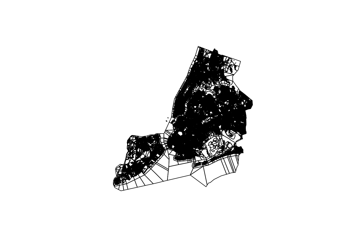
blks %>% st_geometry() %>% plot()
blks <- blks %>% filter(ALAND10>0) # Ignore all the blocks that are purely water. This may be problematic for other analyses.
nrow(blks) #Compare this result with rows before
# [1] 38542
While block groups have 15 digit GEOID, these are nested within a 12 digit ID Block group. The summarise statement automatically unions the geometry.
blks$BGID10 <- substr(blks$GEOID10, 1, 12)
bg <- blks %>%
  group_by(BGID10) %>%
  summarise()

bg %>% .[,1] %>% plot()
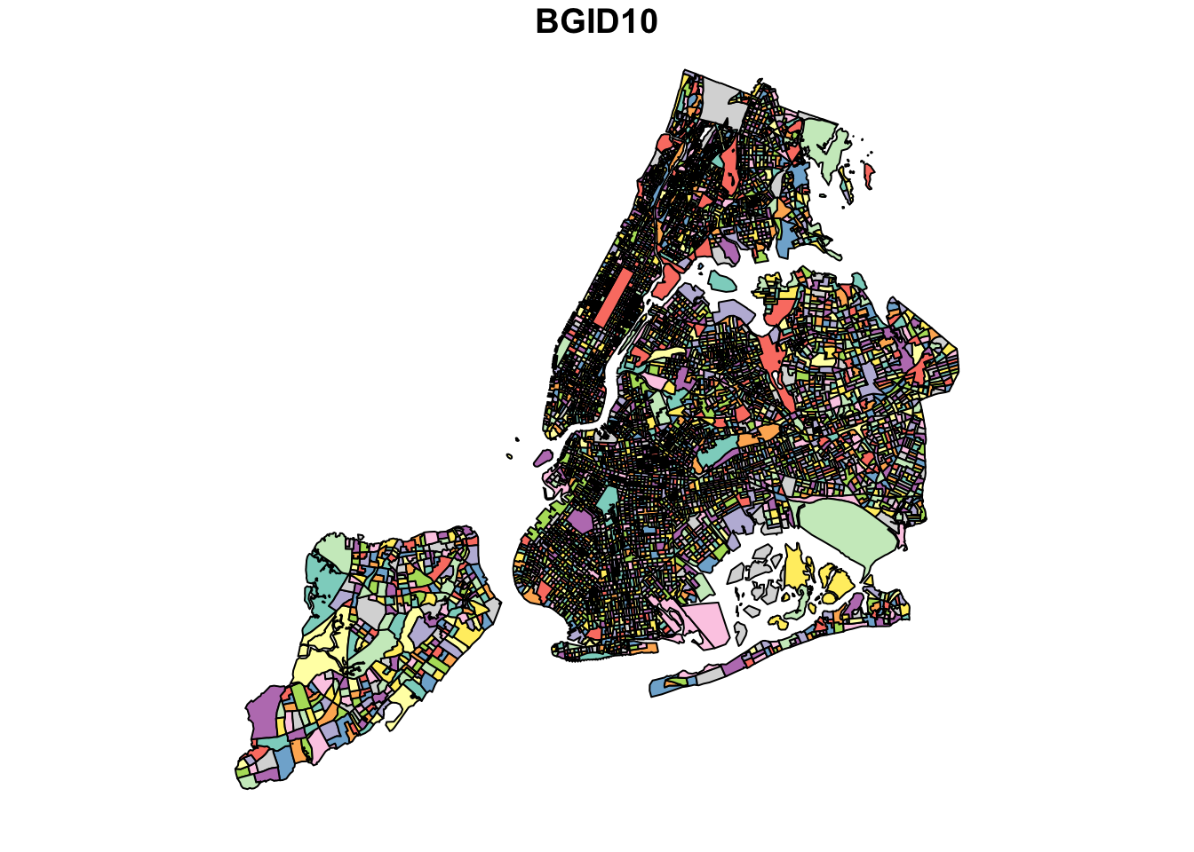
While the above looks fine, it would be good to look under the hood. Summarize automatically uses st_union to summarize geometries. This is usually a good idea. However, on occasions, it might results in inconsistent geometries and therefore the geometry is cast to higher level type such as “GEOMETRY” instead of “POLYGON” or “MULTIPOLYGON”. So we explicitly cast it to MULTIPOLYGON as we should expect all Block groups to be polygons.
(bg <- bg %>% st_cast("MULTIPOLYGON"))
# Simple feature collection with 6287 features and 1 field
# Geometry type: MULTIPOLYGON
# Dimension:     XY
# Bounding box:  xmin: -74.25589 ymin: 40.49593 xmax: -73.70027 ymax: 40.91528
# Geodetic CRS:  WGS 84
# # A tibble: 6,287 × 2
#    BGID10                                                               geometry
#    <chr>                                                      <MULTIPOLYGON [°]>
#  1 360050001001 (((-73.87551 40.793, -73.87864 40.79441, -73.88385 40.79543, -7…
#  2 360050002001 (((-73.86006 40.81305, -73.85914 40.81317, -73.85821 40.8133, -…
#  3 360050002002 (((-73.86161 40.81136, -73.86116 40.81113, -73.86136 40.81084, …
#  4 360050002003 (((-73.8568 40.81131, -73.85772 40.81119, -73.85865 40.81107, -…
#  5 360050004001 (((-73.85778 40.81553, -73.8587 40.8154, -73.8596 40.81528, -73…
#  6 360050004002 (((-73.85318 40.8141, -73.85115 40.8144, -73.85163 40.81635, -7…
#  7 360050004003 (((-73.85363 40.80296, -73.84955 40.80356, -73.84907 40.80359, …
#  8 360050004004 (((-73.84647 40.81231, -73.8461 40.81308, -73.84663 40.81301, -…
#  9 360050016001 (((-73.85967 40.81962, -73.85777 40.81988, -73.85826 40.82201, …
# 10 360050016002 (((-73.8596 40.81528, -73.8587 40.8154, -73.85778 40.81553, -73…
# # ℹ 6,277 more rows
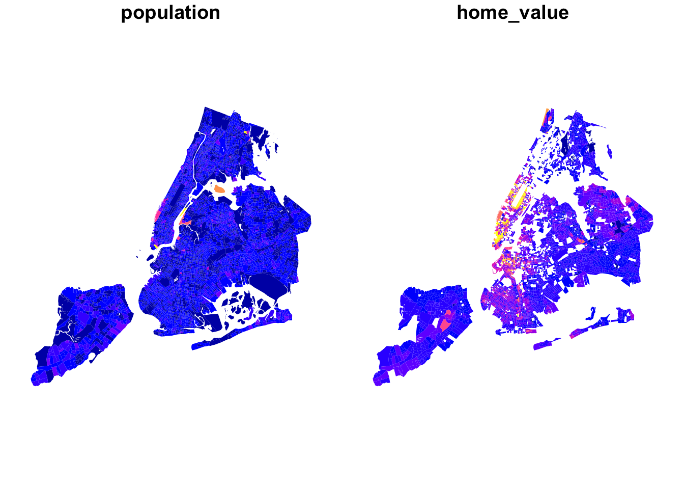
Let’s read in the population and home values from the American Community Survey data. The geographies do not change in the inter decadal years while the variables do. So it is OK to attach to geography data of a different vintage.
bg_pop <- here("tutorials_datasets","nycbikeshare", "nypop2016acs.csv") %>% read_csv()
bg_pop$GEOID10 <- stringr::str_split(bg_pop$GEOID, '15000US', simplify = TRUE)[,2]
bg_pop$GEOID10 %>% nchar() %>% summary()
#    Min. 1st Qu.  Median    Mean 3rd Qu.    Max.
#      12      12      12      12      12      12
Since we are merging population data with polygon data, we can use the dplyr::inner_join.
bg_pop <- inner_join(bg_pop, bg, by=c("GEOID10"="BGID10")) %>% st_sf()
bg_pop %>% select(population, home_value) %>% plot(border=NA)
Exercise
-
To create a visualisation that allows some dynamism, you can use
mapviewandleafsyncpackages. Mapview function quickly creates a leaflet like plot and sync function from leafsync allows you to link two plots together so that changes in one (zoom, pan etc) get reflected in the other. Use these to functions to recreate the above plot. Hint: use zcol argument. -
You can also use
tmappackages to create small multiples and usetm_facets. Work through the arguments withtm_facetsand create the two maps that are synced with one another. Hint: You may have to create a long form table from a wide form table first.
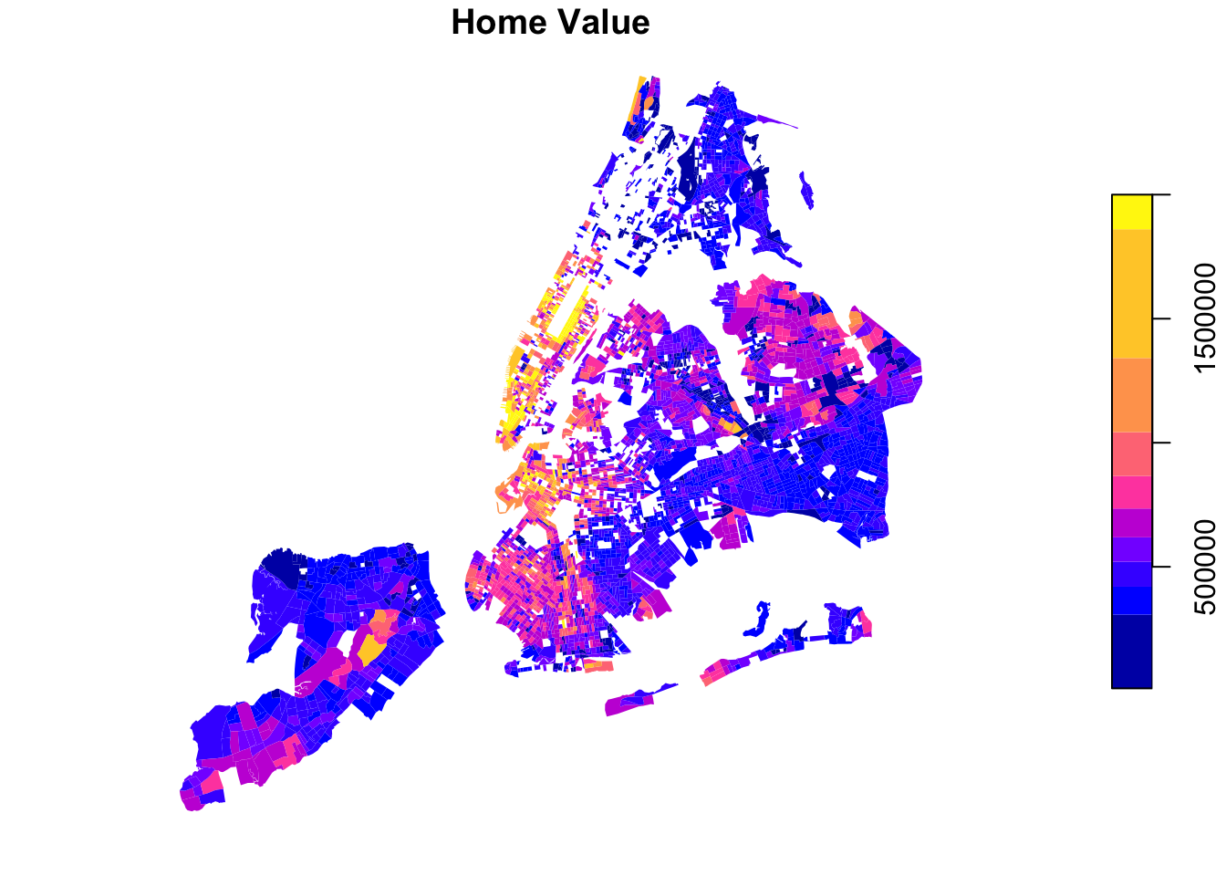
As you know, changing the color breaks dramatically changes the meaning that is being conveyed by the map.
plot(bg_pop["home_value"], breaks = "fisher", border='NA', main="Home Value")
As mentioned topological operations are key advantages of spatial data. Suppose we want to find out how many stations are there in each block group, we can use st_covers or st_covered_by.
summary(lengths(st_covers(bg_pop, station_loc)))
#    Min. 1st Qu.  Median    Mean 3rd Qu.    Max.
#  0.0000  0.0000  0.0000  0.1206  0.0000 14.0000
bg_pop$numstations <- lengths(st_covers(bg_pop, station_loc))
Exercise
Visualise the numstations using leaflet or mapview or tmap. Experiment with different colour schemes, color cuts and even different types of visualisations. What happens if you use blocks instead of block groups? Consider if a map is the most useful representation?
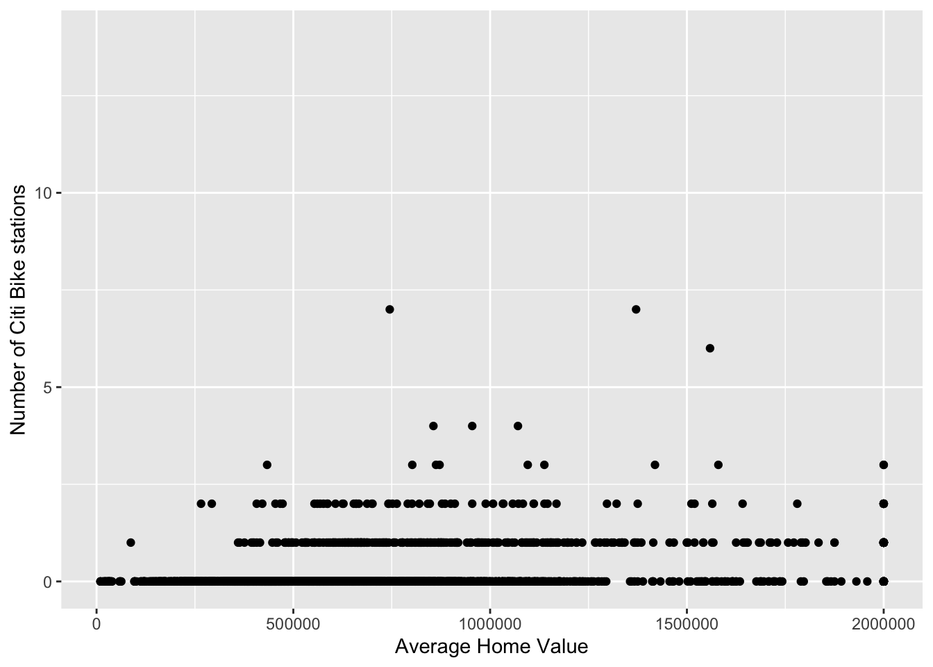
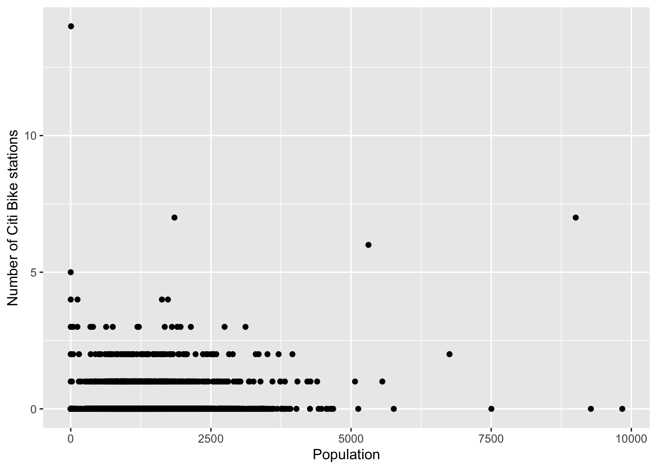
While it is fine to visualise in space how stations are concentrated using choropleths, the main advantage is to allow for exploration of relationships with other data such as home values and total population. Some analyses are presented below that should be self-explanatory.
ggplot(bg_pop) +
  geom_point(aes(x=home_value, y= numstations)) +
  labs(x='Average Home Value', y='Number of Citi Bike stations')
ggplot(bg_pop) +
  geom_point(aes(x=population, y= numstations)) +
  labs(x='Population', y='Number of Citi Bike stations')
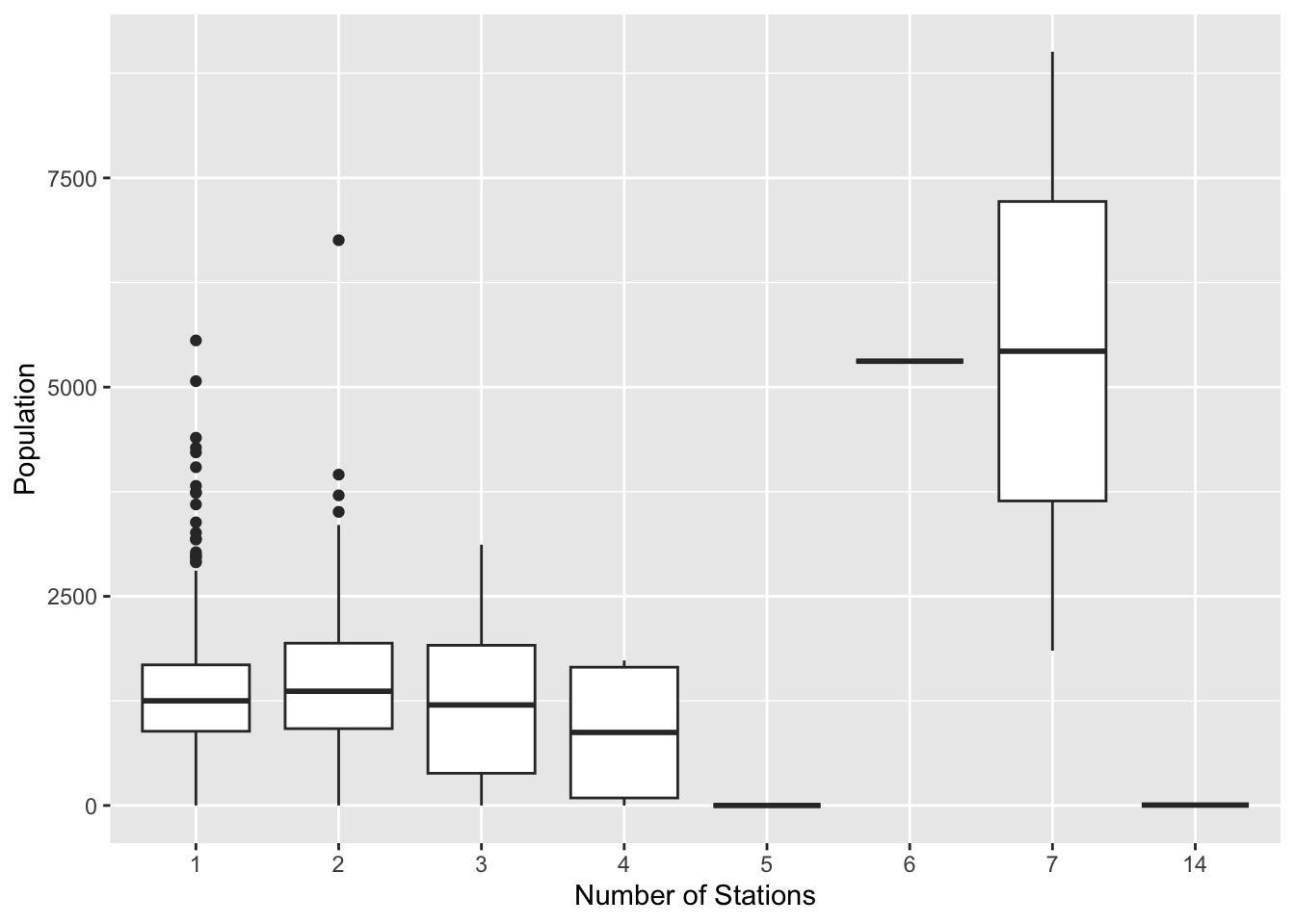
ggplot(bg_pop[bg_pop$numstations > 0,]) +
  geom_boxplot(aes(x=factor(numstations), y= population)) +
  labs(x='Number of Stations', y='Population')
# merging trip starts on different days with
numtrips <- diffdesttrips %>%
mutate(day_of_week = wday(starttime, label=TRUE, week_start=1),
hr = hour(starttime),
time_of_day = hr %>% cut(breaks=c(0,6,10,16,20,24), include.lowest = TRUE, labels=c("Midnight - 6AM", "6AM - 10AM", "10AM - 4PM", "4PM - 8PM", "8PM - Midnight"))
) %>%
group_by(Sstid, Estid, day_of_week, time_of_day, usertype) %>%
summarise(Slon = first(Slon),
Slat = first(Slat),
Elon = first(Elon),
Elat = first(Elat),
totaltrips = n(),
aveduration = mean(tripduration)
)
numtrips <- st_as_sf(numtrips, coords = c('Slon', 'Slat'), crs = 4326)
bg_numtrips <- st_join(numtrips, bg_pop, join=st_covered_by)
bg_numtrips <- st_join(numtrips, bg_pop, join=st_covered_by) %>%
group_by(day_of_week, time_of_day, usertype, GEOID10) %>%
summarise(
totaltrips = sum(totaltrips),
population = first(population),
home_value = first(home_value)
)
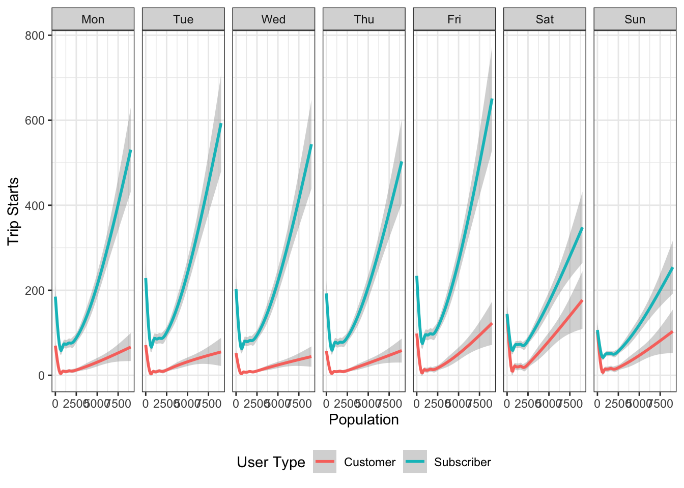
ggplot(bg_numtrips) +
geom_smooth(aes(x=population, y= totaltrips, color=usertype)) +
facet_grid(~day_of_week)+
labs(x='Population', y='Trip Starts', colour= 'User Type') +
theme_bw() +
theme(legend.position = 'bottom')
Exercise
- What are the patterns that emerge from these visualisations?
- Show at least one other type of data visualisation using this dataset.
It is important to realise that, these represent only block groups where trips originate. Large numbers of block groups do not have trip starts associated with them. The relationships presented above are skewed based on the availability of the stations. We should recognise how our data generation processes conditions our results and their interpretations.
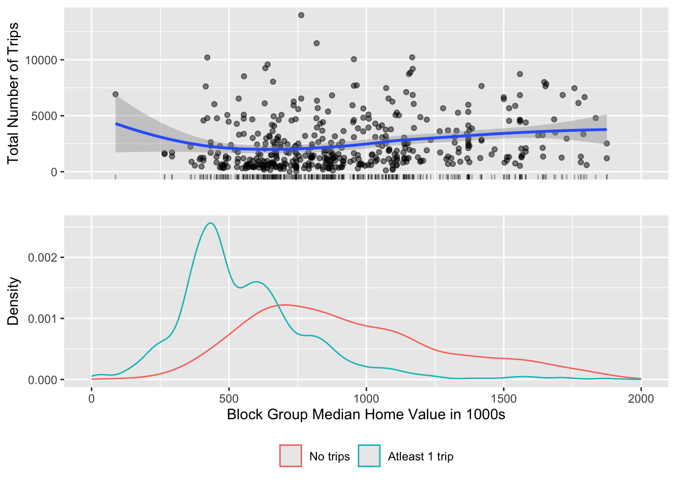
To understand the limitation of the bikeshare to wealthier parts of New York, once could visualise the entire set of block groups and show the block groups that do not have any trips associated with them, in addition to block groups that do.
It turns out that maps may not be best way to visualise them but complicatedly arranged statistical graphics might. Take a look at the following code and carefully deconstruct what is going on and the resultant visualisations. Think through, if this is indeed the best way to visualise this for the particular story you want to tell.
numtrips <- diffdesttrips  %>%
  group_by(Sstid) %>%
  summarise(Slon = first(Slon),
            Slat = first(Slat),
            totaltrips = n(),
            aveduration = median(tripduration, na.rm=TRUE)
  ) %>%
  st_as_sf(coords = c('Slon', 'Slat'), crs = 4326)

bg_trips <-
  st_join(bg_pop, numtrips, join=st_covers)


g1 <- bg_trips %>%
      filter(!is.na(.$totaltrips)) %>%
      mutate(home_value = home_value/1000) %>%
  ggplot() +
  geom_jitter(aes(x = home_value, y = totaltrips), alpha=.5) +
  geom_rug(aes(x= home_value), alpha=.3)+
  xlim(0,2000)+
  geom_smooth(aes(x= home_value, y=totaltrips), method='loess')+
  ylab('Total Number of Trips') +
  xlab('')+
  theme(axis.text.x = element_blank(),
        axis.ticks.x= element_blank())

g2 <- bg_trips %>%
       mutate(notripsbg = factor(is.na(bg_trips$totaltrips), labels=c('No trips', 'Atleast 1 trip')),
                home_value = home_value/1000) %>%
        ggplot()+
        xlim(0,2000)+
        geom_density(aes(x=home_value, color=notripsbg))  +
        xlab('Block Group Median Home Value in 1000s') +
        ylab('Density') +
        theme(legend.position = 'bottom',
              legend.title = element_blank())


library(gtable)
library (grid)

g3 <- ggplotGrob(g1)
g4 <- ggplotGrob(g2)
g <- rbind(g3, g4, size = "last")
g$widths <- unit.pmax(g3$widths, g4$widths)
grid.newpage()
grid.draw(g)
Exercise
Strictly speaking the above graphic is a misrespresentation. It is treating NAs as 0. Furthermore, having no station in a block group would preclude a trip from starting there. So you probably only want to visualise block groups that have at least one station not all block groups? How do such a visualisation differ from the one above? Does it change the story you want to tell?
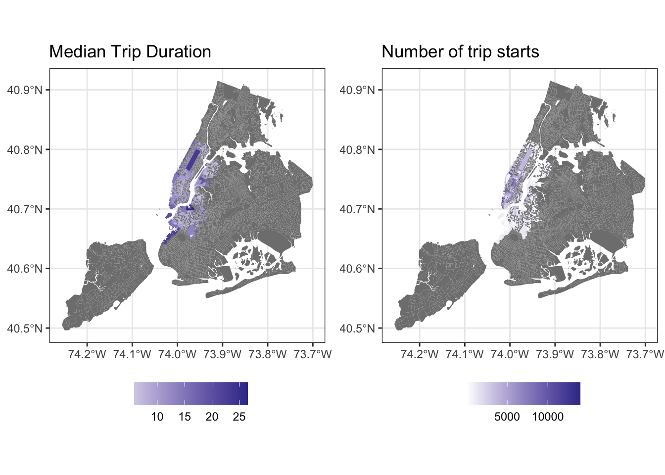
ggplot can also be used to visualise geographical objects, using geom_sf directly.
g1 <- bg_trips %>% mutate(aveduration = aveduration/60) %>%
  ggplot() +
  geom_sf(aes(fill=aveduration), lwd=0) +
  scale_fill_gradient2() +
  labs(fill= '', title="Median Trip Duration") +
  theme_bw() +
  theme(legend.position = 'bottom')

g2 <- bg_trips%>%
  ggplot() +
  geom_sf(aes(fill=totaltrips), lwd=0) +
  scale_fill_gradient2() +
  labs(title= 'Number of trip starts', fill="") +
  theme_bw() +
  theme(legend.position = 'bottom')

library(gridExtra)
grid.arrange(g1,g2, ncol=2)
Finally, as_Spatial() allows to convert sf and sfc to sp objects. These allow for functions from rgeos and spdep to be used. In general, support for sp objects is more widespread for modelling, while sf objects are more of a leading edge and we should expect to see their adoption in other packages that rely on spatial methods.
Conclusions
I hope that I made clear that analysis of big datasets (and small for that matter) rely heavily on user judgements. These judgements and intuitions are developed over time and could be a function of experience. Much of analytical work is iterative and goes in fits and starts. In any case, use of various tools available in R can help us see and communicate patterns in spatial and non-spatial data, without giving primacy to one or the other.
Nikhil Kaza
Professor
My research interests include urbanization patterns, local energy policy and equity