Identifying Clusters of Events
Introduction
In this post, I am going to demonstrate some methods that can be used to identify clusters/hotspots. Clusters of points are usually locations where there are higher than expected frequency of incidents happening. These could be clusters of disease incidences, accidents, flood insurance claims, fatalities etc. Identifying where these clusters exists and are emerging is important to take either mitigating or preventative actions.
Acquire Data
We are going to use crime data from data.police.uk for the greater Manchester Area. The data on this site is published by the Home Office, and is provided by the 43 geographic police forces in England and Wales, the British Transport Police, the Police Service of Northern Ireland and the Ministry of Justice. Most of spatial data boundaries can be acquired either from Ordinance Survey or the Census.
After I started creating this tutorial, I found a tutorial by Dr. Fabio Veronesi that is remarkably similar in the illustrative dataset, though the topics covered are slightly different. Check it out!
Since I wrote this tutorial, many have transitioned to using sf objects instead of sp objects. Please adapt as necessary.
Crime data for Manchester clipped from January 2016 - May 2018 is here. You can also download the LSOA and the boundary file from here.
Additional resources
I strongly recommend that you read through Spatial Point Patterns: Methodology and Applications with R by by Adrian Baddeley, Ege Rubak and Rolf Turner.
It is also quite useful to peruse the documentation of CrimeStat and GeoDa.
Requirements
This requires R, and many libraries including spatstat,spdep, rgdal, aspace and leaflet. You should install them, as necessary, with install.packages() command.
Caveats
The crime data, especially the location data, is anonymised . This poses some problems, as the anonymisation is primarily assigning the point to the center of the street. There may be many crimes on the street that get the same location. To get around this I randomly re-jitter the points by a small \(\epsilon\). The following function is a quick way to introduce noise. This introduction of noise, might be problematic for some applications. You will have to figure out how to deal with the issue of duplicate locations one way or the other.
jitter_longlat <- function(coords, km = 1) {
  n <- dim(coords)[1]
  length_at_lat <- rep(110.5742727, n) # in kilometers at the equator. Assuming a sphere
  length_at_long <- cos(coords[,1]* (2 * pi) / 360) * 110.5742727
  randnumber <- coords
  randnumber[,2] <- runif(n, min=-1,max=1) * (1/length_at_lat) * km
  randnumber[,1] <- runif(n, min=-1,max=1) * (1/length_at_long) * km
  out <- coords
  out[,1] <- coords[,1] + randnumber[,1]
  out[,2] <- coords[,2] + randnumber[,2]
  out <- as.data.frame(out)
  return(out)
}

ls()
# [1] "filename"       "i"              "jitter_longlat" "manchesterbnd"
# [5] "manchesterlsoa" "streetcrime"    "subdirs"

streetcrime[,c("Longitude", "Latitude")] <- jitter_longlat(streetcrime[,c("Longitude", "Latitude")], km=.6)
sum(duplicated(streetcrime[,c("Longitude", "Latitude")]))
# [1] 0

#Convert it into spatial points data frame

coordinates(streetcrime) <- ~Longitude+Latitude
streetcrime@data[,c("Longitude", "Latitude")]<- coordinates(streetcrime)

wgs84crs <- CRS("+proj=longlat +datum=WGS84")
proj4string(streetcrime) <- wgs84crs
Visualisation & Explorations
As with any datasets, the first and foremost thing to do is to explore the data to understand its structures, its quirks and what if anything need to be cleaned.
theme_set(theme_tufte())

g_street <-  ggplot(streetcrime@data) +
  geom_bar(aes(x=fct_infreq(Crime_type))) +
  coord_flip() +
  facet_wrap(~year)+
  labs(x='Crime Type', y='Count')
#table(bicycletheft$Last_outcome_category)

g_street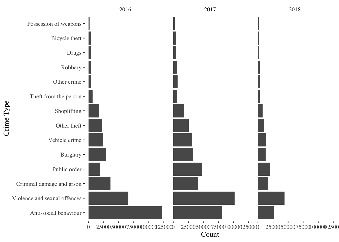
library(ggrepel)

k <- streetcrime@data %>% count(Month, fct_infreq(Crime_type), sort = FALSE)
names(k) <- c('Month', "Crime_type", "n")

k %>%
  mutate(label = if_else(Month == max(Month), as.character(Crime_type), NA_character_))%>%
  ggplot(aes(x=Month, y=n, col= Crime_type))+
   geom_smooth()+
  scale_colour_discrete(guide = 'none') +
  geom_label_repel(aes(label = label),
                   nudge_x = 1,
                   na.rm = TRUE)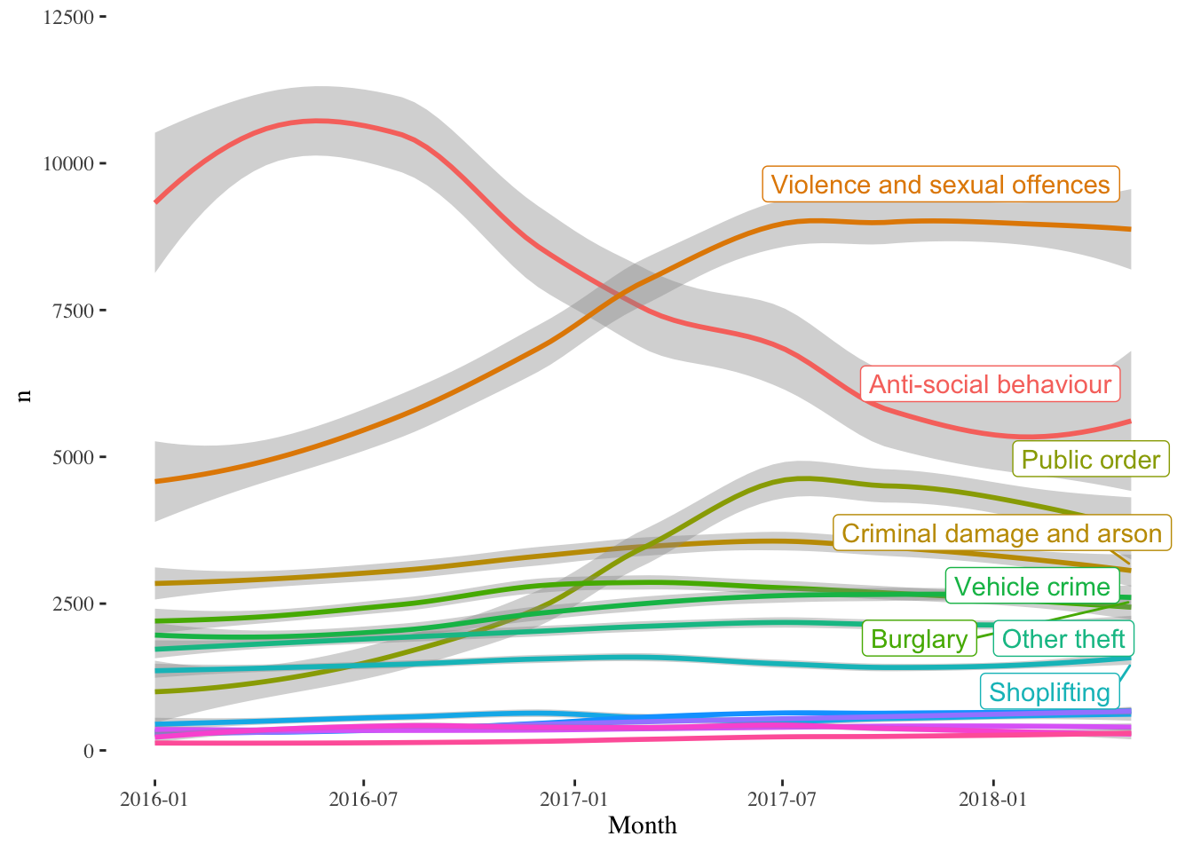
The trends should be readily apparent. Violence and Sexual Offences, Public Order crimes have increased significantly, while Anti-social behaviour crimes have declined from 2016 to 2018 Q2. These statistics include the Manchester Arena bombing in May 2017. One thing to notice though, is how few reported crimes actually result in an outcome. I am not entirely sure, if this a Manchester issue or if it is a general criminal justice issue.
Also note the mixing of %>% and + in the following code. ggplot uses + to build its graphics, while the rest of the analysis can be done with maggittr’s %>%.
 g_street_outcome <-  streetcrime@data[!is.na(streetcrime$Last_outcome_category),]%>%
  ggplot() +
  geom_bar(aes(x=fct_infreq(Last_outcome_category), y = (..count..)/sum(..count..) * 100)) +
  coord_flip() +
  labs(x='Outcome', y='Percent')

  g_street_outcome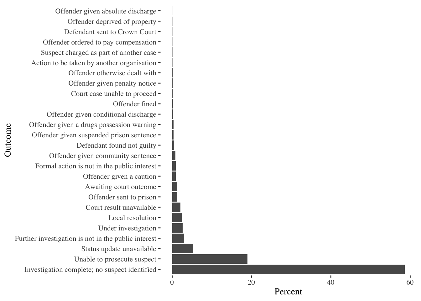
It is also illustrative to see the spatial extent and locations of crimes. We return to our standard way of visualising spatial data with Leaflet and basemaps from CartoDB. This allows us to zoom in and pan around the image to explore the data in some detail.
From now on, for the sake of convenience, I will focus on “Bicycle Thefts” as they are few of them and it is easy for illustration purposes. You are welcome to try other types of crime. Furthermore, I restrict the analysis to thefts in 2016 Q2. We will return to the full series later.
bicycletheft <- streetcrime %>% subset(streetcrime$Crime_type == "Bicycle theft")
bicycletheftQ2 <- bicycletheft[bicycletheft$Quarter == "2016 Q2",]
nrow(bicycletheftQ2)
# [1] 1151

 map_bicycle <- bicycletheftQ2 %>%
  leaflet() %>%
  addProviderTiles(providers$CartoDB.Positron) %>%
  addMarkers(clusterOptions = markerClusterOptions(),
             popup = ~as.character(Last_outcome_category),
             label = ~as.character(Crime_ID)
             )

 library(widgetframe)
frameWidget(map_bicycle)
Mapping the raw data points is not always useful. It is sometimes useful to summarize the data spatially. We can do that either by gridding the extent, aggregating to arbitrary polygonal boundaries or by creating a continuous surface through density estimates. Each has its advantages and disadvantages.
Grids/Quadrat Counts
Quadrat counts are simple mechanisms to understand, visualise and test point patterns. It is as simple a overlaying a grid and counting the number of points in the grids. Because grids are of uniform area, the count is a proxy for density and because of the uniform area, unlike choropleth maps, there are no ‘large areas’ to dominate the map. However, the downside is that quadrat counts depends quite heavily on the resolution of the quadrat. To see this see the following code.
ra300 <- raster(extent(manchesterbnd), resolution=300, crs=proj4string(manchesterbnd))
ra300 <- mask(ra300, manchesterbnd)
ra300 <- projectRaster(ra300, crs = wgs84crs )
theftcounts300 <- rasterize(coordinates(bicycletheftQ2), ra300, fun='count', background=NA)
p1 <- levelplot(theftcounts300, par.settings = plasmaTheme, margin = list(FUN = 'median'), main="300m quadrats")

ra1k <- raster(extent(manchesterbnd), resolution=1000, crs=proj4string(manchesterbnd))
ra1k <- mask(ra1k, manchesterbnd)
ra1k <- projectRaster(ra1k, crs = wgs84crs )
theftcounts1k <- rasterize(coordinates(bicycletheftQ2), ra1k, fun='count', background=NA)
p2 <- levelplot(theftcounts1k, par.settings = plasmaTheme, margin = list(FUN = 'median'), main="1km quadrats")

print(p1, split=c(1, 1, 2, 1), more=TRUE)
print(p2, split=c(2, 1, 2, 1))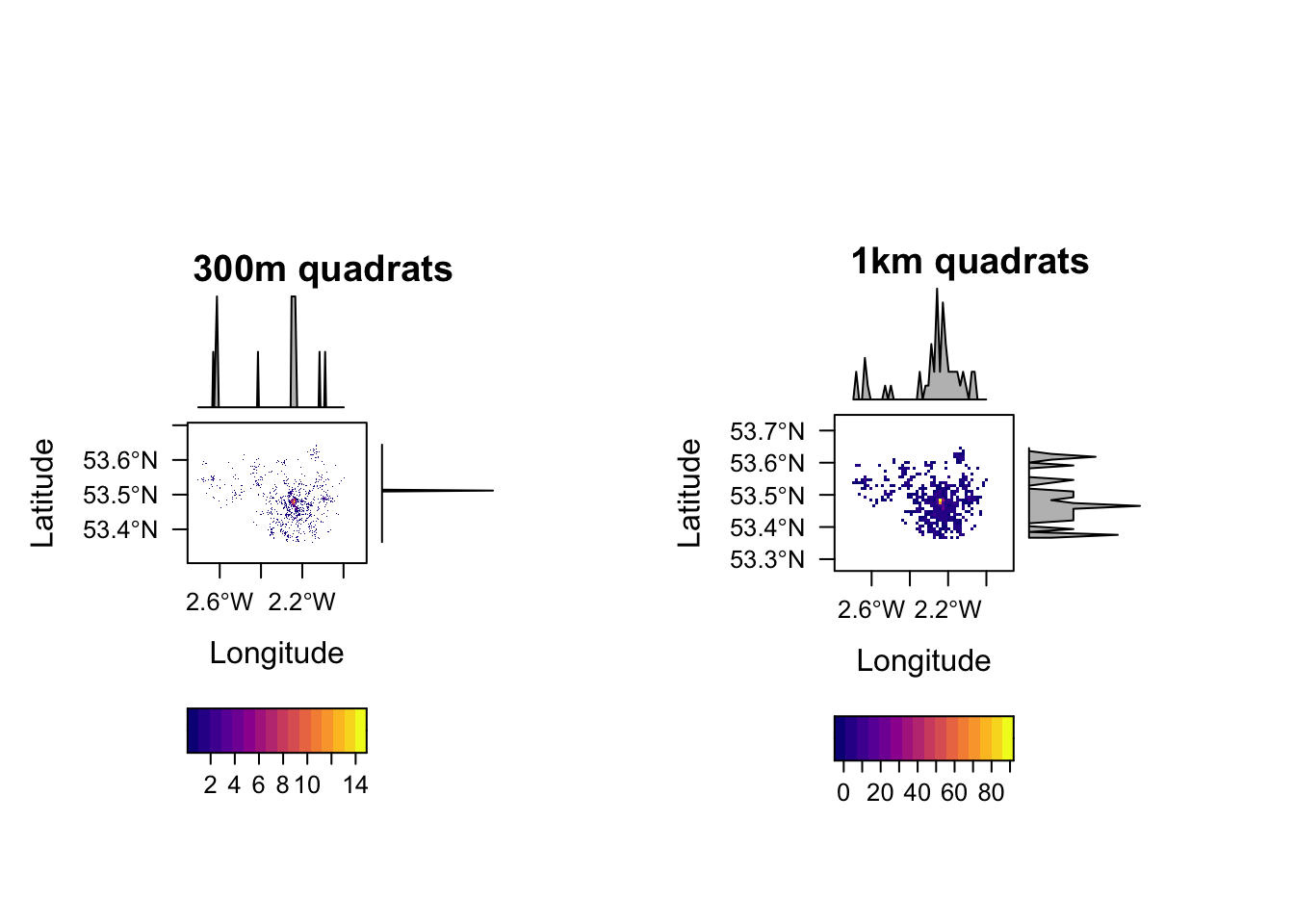
Arbitary Polygons/ Zones
One of the problems with grids/quadrats is that they are arbitary and different grids resolutions have different outputs (MAUP). The other is that the grids are artificial, in that they do not follow natural or political geographies that may be relevant. They may be relevant for bringing in other data, or assigning responsibility and other administrative reasons. To overcome this, we can also spatially aggregate the data into arbitrary shaped zones or polygons. MAUP does not disappear with polygons, however.
In this case, we will use the Lower layer Super Output Areas (LSOA). We need to make sure that they are of the same projections, for topological predicates to work. We use the over function from sp library, though one could use [ function as well.
manchesterlsoa <- spTransform(manchesterlsoa, wgs84crs)
manchesterlsoa$LSOA11CD <- as.character(manchesterlsoa$LSOA11CD)
bicyclelsoa <- over(bicycletheftQ2, manchesterlsoa) %>% group_by(LSOA11CD)%>%
  summarise(crimecount = n())
lsoa_crime <- merge(manchesterlsoa, bicyclelsoa, by="LSOA11CD")
lsoa_crime@data$crimecount[is.na(lsoa_crime@data$crimecount)] <- 0

m <-  leaflet(lsoa_crime) %>%
  addProviderTiles(providers$Stamen.TonerLines, group = "Basemap",
                   options = providerTileOptions(minZoom = 9, maxZoom = 13)) %>%
   addProviderTiles(providers$Stamen.TonerLite, group = "Basemap",
                    options = providerTileOptions(minZoom = 9, maxZoom = 13))

Npal <- colorNumeric(
  palette = "Reds", n = 5,
  domain = lsoa_crime$crimecount
)

m2 <- m %>%
     addPolygons(color = "#CBC7C6", weight = 0, smoothFactor = 0.5,
                 fillOpacity = 0.5,
             fillColor = Npal(lsoa_crime$crimecount),
             group = "LSOA"
             ) %>%
   addLegend("topleft", pal = Npal, values = ~crimecount,
             labFormat = function(type, cuts, p) {
               n = length(cuts)
             paste0(prettyNum(cuts[-n], digits=0, big.mark = ",", scientific=F), " - ", prettyNum(cuts[-1], digits=0, big.mark=",", scientific=F))
             },
             title = "Crimes",
             opacity = 1
   ) %>%
  addLayersControl(
    overlayGroups = c("LSOA", 'Basemap'),
    options = layersControlOptions(collapsed = FALSE)
      )

frameWidget(m2)
It should be relatively obvious what the issues of a choropleth maps are. Small LSOAs that have high concentrations of crimes are not readily visible, even when they are important. Color is a terrible way to represent the order; it is quite non-intuitive. One is almost better off looking at the table and identifying the top few LSOA’s that have high number of crimes.
head(bicyclelsoa[order(-bicyclelsoa$crimecount),], n=15)
# # A tibble: 15 × 2
#    LSOA11CD  crimecount
#    <chr>          <int>
#  1 E01033658         54
#  2 E01033653         37
#  3 E01033677         28
#  4 E01033664         24
#  5 E01005948         16
#  6 E01005209         13
#  7 E01005062         11
#  8 E01033656         11
#  9 E01033662         10
# 10 E01033669         10
# 11 E01005212          9
# 12 E01032687          9
# 13 E01005108          8
# 14 E01032906          8
# 15 E01006349          7
Other issues include the binning of the data into different color introduces visual bias. Depending on the cuts, the maps are different. Analogously different boundaries for the zones/polygons produce radically different maps.
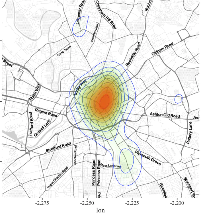
Kernel Density/ Heat Maps
Kernel density estimation (KDE) is a non-parametric way to estimate the probability density function of a random variable. It is a data smoothing problem based on a finite data sample. The standard KDE in 2-dimensions uses a bivariate normal distribution to estimate. We can visualise it using ggplot’s geom_density2d and stat_density2d directly.
ggmap works with Google to identify locations and download basemaps. Often these requirements change. Please refer to the release notes and documentation of Google APIs and ggmap, if the following code does not work.
library(ggmap)

manchester <- get_stamenmap(bbox = bbox(manchesterlsoa), zoom = 10, maptype= "toner-lite")

ggmap(manchester) + geom_density2d(data = bicycletheftQ2@data, aes(x = Longitude, y = Latitude), size = 0.3) +
  stat_density2d(data = bicycletheftQ2@data, aes(x = Longitude, y = Latitude, fill = ..level.., alpha = ..level..), size=0.01, bins = 16, geom = "polygon") +
  scale_fill_gradient(low = "green", high = "red", guide="none") +
    scale_alpha(range = c(0, 0.3), guide = "none")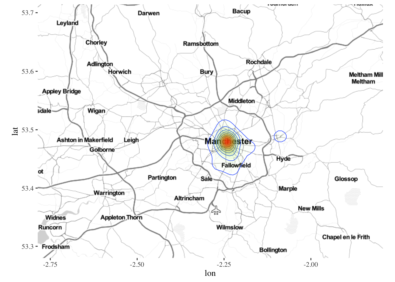
Usually, Gaussian kernels are not all that great. There would be times, when bandwidths need to be changed or kernel forms need to be changed. R provides numerous ways to do this. In particular, check out density in spatstat package or spatialkernel package or use SAGA GIS from R.
One could also use spatstat package, however, this requires creating a separate data structure that spatstat can understand.
bicycletheftQ2 <- spTransform(bicycletheftQ2, CRS(proj4string(manchesterbnd)))
bicycletheftQ2.ppp <- ppp(x=bicycletheftQ2@coords[,1],y=bicycletheftQ2@coords[,2],as.owin(manchesterbnd))
summary(bicycletheftQ2.ppp)
# Planar point pattern: 1151 points
# Average intensity 9.02051e-07 points per square unit
#
# Coordinates are given to 2 decimal places
# i.e. rounded to the nearest multiple of 0.01 units
#
# Window: polygonal boundary
# single connected closed polygon with 13669 vertices
# enclosing rectangle: [351662.6, 406087.2] x [381165.4, 421037.7] units
# (54420 x 39870 units)
# Window area = 1275980000 square units
# Fraction of frame area: 0.588
plot(density(bicycletheftQ2.ppp))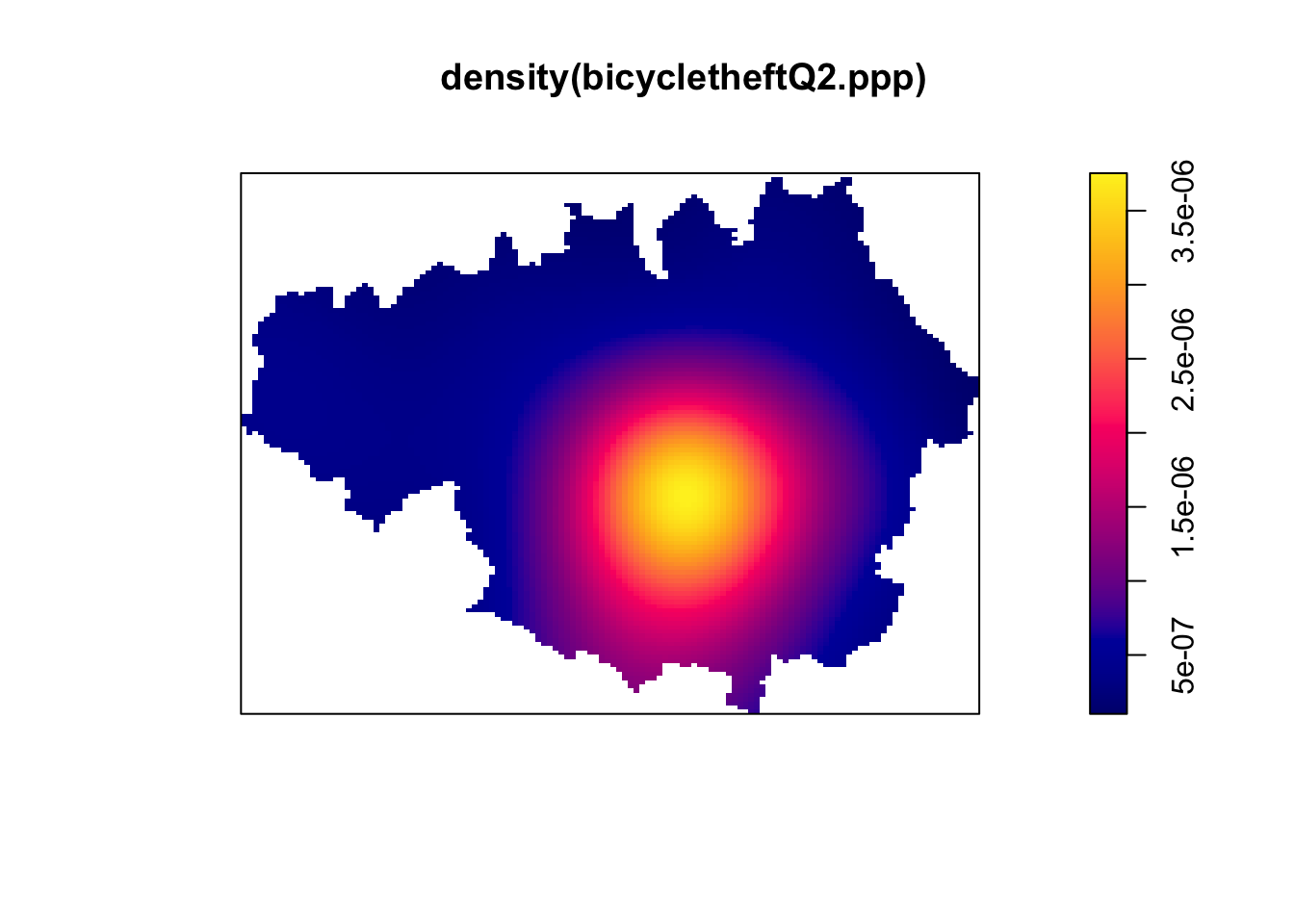 The default kernel is Gaussian in spatstat. We can define arbitrary kernel shapes using a pixel image. See
 ?density.ppp. We can also use a focal or focalWeight functions to calculate local smoothed counts in the raster package.
Global Clustering
Global clustering is a way of determining if points are significantly different from the Complete Spatial Randomness or if there is a spatial stucture to it. We can estimate the level of global clustering using clark-evans test or Ripley’s K-function or nearest neighbor distance function G or empty space function F. In general, global clustering metrics is not useful to planners working on a local scale, therefore I am ignoring it here. You are referred to Baddeley et.al excellent practical book or Cressie’s classic book
Local Clustering
Extracting local clusters of points is lot more complicated due to the issues of multiple testing and the presence of noise. The simplest way, widely accepted, is to aggregate the points to zones and estimate if the values are spatially autocorrelated using Moran’s I statistic.
Local Moran’s I statistic
The local spatial statistic Moran’s I is calculated for each zone based on the spatial weights object used. The values returned include a Z-value, and may be used as a diagnostic tool. The statistic is:
\(I_i = \frac{(x_i-\bar{x})}{{∑_{k=1}^{n}(x_k-\bar{x})^2}/(n-1)}{∑_{j=1}^{n}w_{ij}(x_j-\bar{x})}\)
, and its expectation and variance are given in Anselin (1995).
library(spdep)

lsoa_crime_tmp <- lsoa_crime@data
row.names(lsoa_crime_tmp) <- sapply(slot(lsoa_crime, "polygons"), function(x) slot(x, "ID"))

lsoa_crime <- rgeos::gMakeValid(lsoa_crime, byid=T) # Fix invalid geometries
lsoa_crime  <- SpatialPolygonsDataFrame(lsoa_crime, lsoa_crime_tmp)

lsoa_nb <- poly2nb(lsoa_crime)  #queen's neighborhood
(lsoa_nb_w <- nb2listw(lsoa_nb)) #convert to listw object
# Characteristics of weights list object:
# Neighbour list object:
# Number of regions: 1740
# Number of nonzero links: 10402
# Percentage nonzero weights: 0.3435725
# Average number of links: 5.978161
#
# Weights style: W
# Weights constants summary:
#      n      nn   S0       S1       S2
# W 1740 3027600 1740 607.6169 7209.152
lsoa_crime$s_crimecount <- scale(lsoa_crime$crimecount)  #Scale and Center the variable of interst
lsoa_crime$lag_scrimecount <- lag.listw(lsoa_nb_w, lsoa_crime$s_crimecount) #Create lagged variable

p<-ggplot(lsoa_crime@data, aes(x=s_crimecount, y=lag_scrimecount)) +
  geom_point() +
  coord_fixed() +
  geom_vline(xintercept = 0) + geom_hline(yintercept = 0)  +
  labs(x="Bicycle Thefts (standardised)", y="Spatially Lagged Bicycle Thefts (standardised)")
p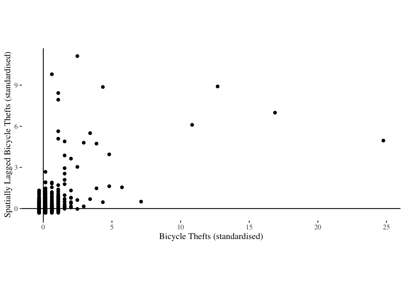
lsoa_moran <- localmoran(lsoa_crime@data$crimecount, lsoa_nb_w)  #calculate the local moran's I

nrow(lsoa_moran[lsoa_moran[,5] <= 0.05,]) #Count the number of zones that are significant.
# [1] 71

lsoa_crime@data  <- lsoa_crime@data %>%
    plyr::mutate(sig_char =
            dplyr::case_when(lsoa_moran[,5] <=.05 & s_crimecount>0 & lag_scrimecount>0     ~ "High-High",
                      lsoa_moran[,5] <=.05 & s_crimecount>0 & lag_scrimecount<0  ~ "High-Low",
                      lsoa_moran[,5] <=.05 & s_crimecount<0 & lag_scrimecount>0  ~ "Low-High",
                      lsoa_moran[,5] <=.05 & s_crimecount<0 & lag_scrimecount<0  ~ "Low-Low",
                      TRUE                     ~ "Not Significant"
            ))

lsoa_crime@data$sig_char <- as.factor(lsoa_crime@data$sig_char)
summary(lsoa_crime@data$sig_char) # Check to see if the refactorisation worked ok.
#       High-High        Low-High Not Significant
#              66               5            1669
Since we know that there are only one category of significant autocorrelation, we will just use two colors (Red and White) to visualise. However, in general case, we are usually interested in both High-High and High-Low clusters, i.e. zones that have high values surrounded by high values and zones that have high values surrounded by low values.
Fpal <- colorFactor(c("#EE0000", "#FFFFFF"), lsoa_crime@data$sig_char)

m3 <- m %>%
     addPolygons(color = "#CBC7C6", weight = .5, smoothFactor = 0.5,
                 fillOpacity = 0.7,
             fillColor = Fpal(lsoa_crime@data$sig_char),
             group = "LSOA"
             ) %>%
   addLegend("topleft", pal = Fpal, values = ~lsoa_crime@data$sig_char,
             title = "Bicycle Thefts (Significant Clusters)",
             opacity = 1
   ) %>%
  addLayersControl(
    overlayGroups = c("LSOA", 'Basemap'),
    options = layersControlOptions(collapsed = FALSE)
      )

frameWidget(m3)
Few points to note here.
The geography and zone size matters quite a bit. Changing the LSOA to a grid of arbitrary size changes the statistics and locations of the clusters. Instead of LSOA, if you use census output area (OA) or Middle Layer output area (MSOA) the results will be different. Try this as an exercise.
The weight matrix matters quite a bit as well. In this exercise, the weights are built from queen continguity of zones and are row standardised (default). There are any number of other formulations that we could have used and may be more appropriate for specific use cases. In particular, see
dnearneigh,knearneigh,poly2nb,graphneighin thespdeppackage.The presence of NAs in the variable of interest, throws off the calculations. Care should be taken to adjust NA especially when using neighbours. In some cases, NAs can be turned to 0s. In others, it is not appropriate. In any case, care should be taken about the neighbour lists, when the observations are dropped from the analysis.
Finally and more importantly, this cluster analysis does not account for the underlying population at risk. It may very well be the case that the clusters we are observing are an artefact of underlying population distribution. This can be easily rectified by using the density/propensity of bike thefts instead of the raw counts. The choice of a denominator (population, employees, number of bicycles etc.) is arbitrary and should be externally justified. I leave this as an exercise.
Using DBSCAN or Optics
If we do not need statistically significant clusters, we can use one of the more popular clustering algorithms in Unsupervised classification called Density Based Spatial Clustering of Applications with Noise (DBSCAN). DBSCAN was detailed by Ester et.al in 1996 and received the “Test of Time” award in 2014.
The algorithm uses two parameters: - \(\epsilon\) (eps) is the radius of our neighbourhoods around a data point \(P\). - \(minPts\) is the minimum number of data points we want in a neighborhood to define a cluster.

Illustration of DBSCAN algorithm, from https://commons.wikimedia.org/wiki/File:DBSCAN-Illustration.svg
Once these parameters are defined, the algorithm divides the data points into three points:
Core points. A point \(P\) is a core point if at least \(minPts\) points are within distance \(\epsilon\) .Border points. A point \(Q\) is border point for \(P\) if there is a path \(P_1\), …, \(P_n\) with \(P_1\) = \(P\) and \(P_n\) = \(Q\), where each \(P_{i+1}\)is directly reachable from \(P_i\) (all the points on the path must be core points, with the possible exception of \(P\)).Outliers. All points not reachable from any other point are outliers.
The steps in DBSCAN are simple after defining the previous steps:
- Pick at random a point which is not assigned to a cluster and calculate its \(\epsilon\)-neighborhood. If there are atleast \(minPoints\) in the neighborhood, mark it a core point and a cluster; otherwise, mark it as outlier.
- Once all core points are found, start expanding that to include border points.
- Repeat these steps until all the points are either assigned to a cluster or to an outlier.
The parameters are key and significantly affect the results. One heuristic to detrmine \(\epsilon\) is to look at the kink in the dist plot of k-nearest neighbors. The intutition is that, at the kink, each points starts having a lot of neighbors. \(k\) is usually dimension of the data + 1, in our case is 3. This is also the \(minPts\). Other values are possible depending on the external criteria.
We will use dbscan library instead of the dbscan in fpc library.
library(dbscan)
bicycletheftQ2 <- bicycletheftQ2 %>% spTransform(wgs84crs) # Doing this for visualisation using leaflet. Non-WGS84 CRS is more complicated with leaflet.
kNNdistplot(bicycletheftQ2@data[,c('Longitude', 'Latitude')], k = 5)
abline(h=.012, col='red')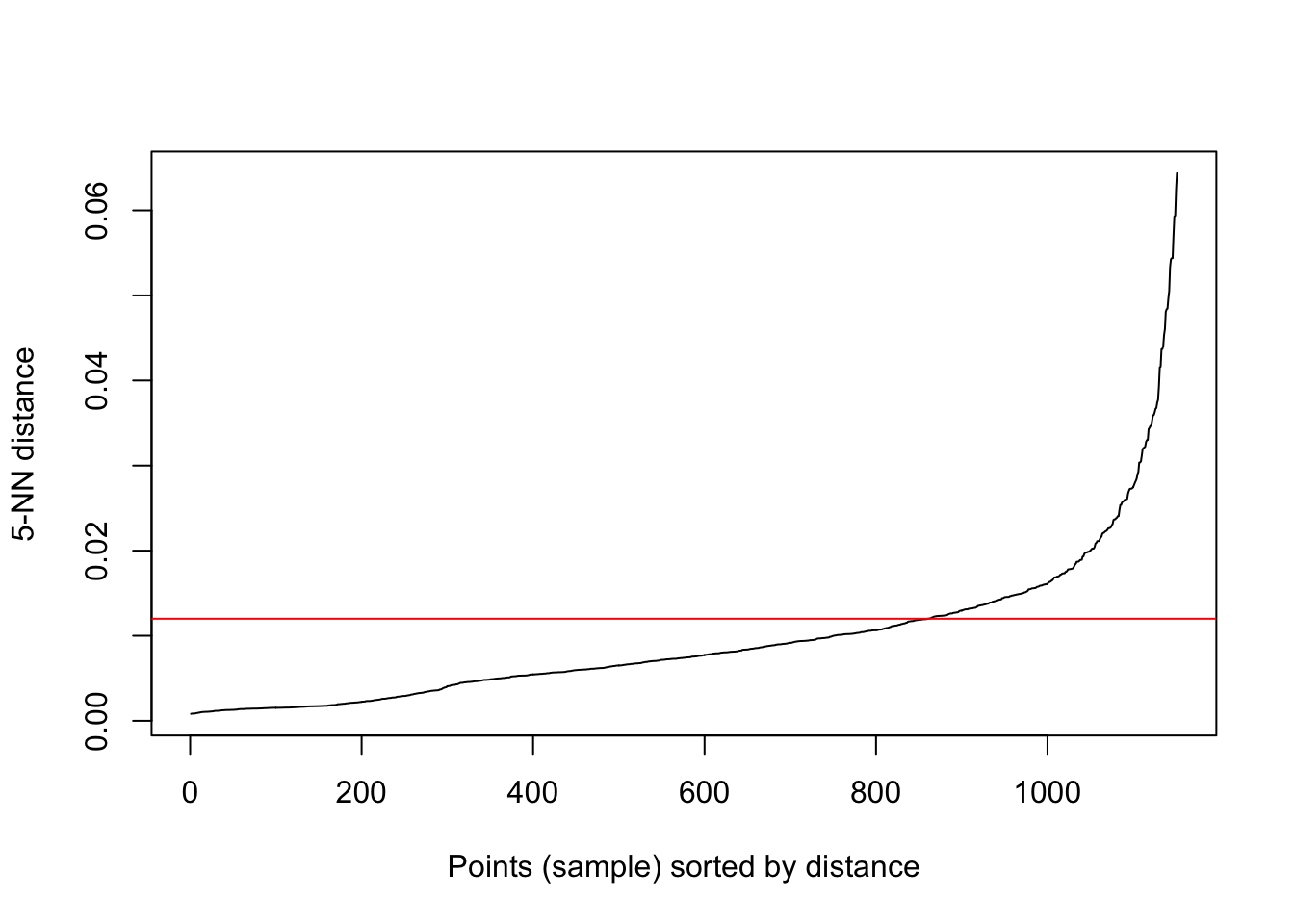
DBscan is relatively quick as evidenced by the code below.
db_clusters_bicycletheft<- dbscan(bicycletheftQ2@data[,c('Longitude', 'Latitude')], eps=0.012, minPts=5, borderPoints = TRUE)
print(db_clusters_bicycletheft)
# DBSCAN clustering for 1151 objects.
# Parameters: eps = 0.012, minPts = 5
# The clustering contains 21 cluster(s) and 143 noise points.
#
#   0   1   2   3   4   5   6   7   8   9  10  11  12  13  14  15  16  17  18  19
# 143  10  20  10 663   9  63   8  21   3   9  31  12  54  10  14  24  17   6   9
#  20  21
#   8   7
#
# Available fields: cluster, eps, minPts

bicycletheftQ2@data$dbscan_cluster <- db_clusters_bicycletheft$cluster
21 clusters of points are identified with about 12% of the points are not assigned to a cluster (noise). We can construct a concavehull around these points to identify the cluster boundaries and visualise them.
library(concaveman)
library(sf)

clusterpolys <- bicycletheftQ2 %>% st_as_sf() %>%
  split(bicycletheftQ2@data$dbscan_cluster) %>%
  lapply(concaveman, concavity=3) %>%
  lapply(as_Spatial)

clusterpolys <- lapply(2:length(clusterpolys), function(x){spChFIDs(clusterpolys[[x]],names(clusterpolys)[x])}) %>%
  lapply(function(x){x@polygons[[1]]}) %>%
  SpatialPolygons

clusterpolys <- SpatialPolygonsDataFrame(clusterpolys, data=data.frame(ID=row.names(clusterpolys)))

library(RColorBrewer)

factpal <- colorFactor(brewer.pal(nrow(clusterpolys),"Set3"), clusterpolys$ID)


map_bicycle2 <- clusterpolys %>%
  leaflet() %>%
  addProviderTiles(providers$CartoDB.Positron) %>%
  addPolygons(color = ~factpal(clusterpolys$ID), weight = 5, smoothFactor = 0.5,
              opacity = 1,
              fillColor = ~factpal(clusterpolys$ID), fillOpacity = .5,
              highlightOptions = highlightOptions(color = "green", weight = 2, bringToFront = TRUE)
  )%>%
  addCircles(data=bicycletheftQ2, weight = 3, radius=40,
             color=~~factpal(clusterpolys$ID), stroke = TRUE, fillOpacity = 0.8)

frameWidget(map_bicycle2)
Few points to note here.
DBSCAN is quite popular and the advantage is that we do not need to define the number of clusters unlike k-means or Partition around Medoids. However, it is very sensitive to the parameters.
There is no generative model that DBSCAN uses. So the clusters idenitified could be spurious depending on underlying variation in the population distribution.
If the density of the clusters vary, DBSCAN is less likely to identify them.
Extensions for anisotropic neighborhoods can be found and may be more useful than a spherical neighborhood.
DBSCAN can be relatively easily expanded to space-time cluster detection. The distance in time should appropriately be scaled to match Euclidean distance in space. dbscan can take a precomputed distance object, so the implemenation is relatively straightforward. I leave this as an exercise.
Conclusions
From all the visualisations, it should be apparent that the results are dependent on what analyses you pick. There is no right way to proceed with the analyses, but mostly conventions and acceptability in the field determine the choice of the analytical method. These soft skills and external justifications are as important, if not more, than using the cutting-edge algorithms and methods. These skills come from experience and practise and is contingent on time and place.
In these analyses, we have ignored the time dimension. We also ignored many other methods and techniques that are more prevalent in other fields (e.g.scan statistics in epidemiology. See Kaza et.al (2013) for an application to planning.)It is worth noting that the absence of observations do not matter as much in the above analyses, but could be quite important. It is also important to understand the representational assumptions. For example, crime is represented as a point, though it could have happened at an address whose buildings might have different areas in space. Such abstractions have to be justified for particular analytical purposes. Nonetheless, it is useful to keep abreast of various techniques that might help identify clusters of observed points, so that we can deliberate how resources can be prioritised and directed.
Accomplishments
- Reading point data into R. Constructing a point pattern for use with spatstat
- Vector data operations (Reproject, Buffer)
- Point-in-Polygon Operations
- Spatial kernel density estimation
- Visualising spatial data in R
- Exploratory spatial data analysis
- Spatial clustering using DBSCAN
- Neighborhood weight matrices
- Local spatial autocorrelation
Nikhil Kaza
Professor
My research interests include urbanization patterns, local energy policy and equity