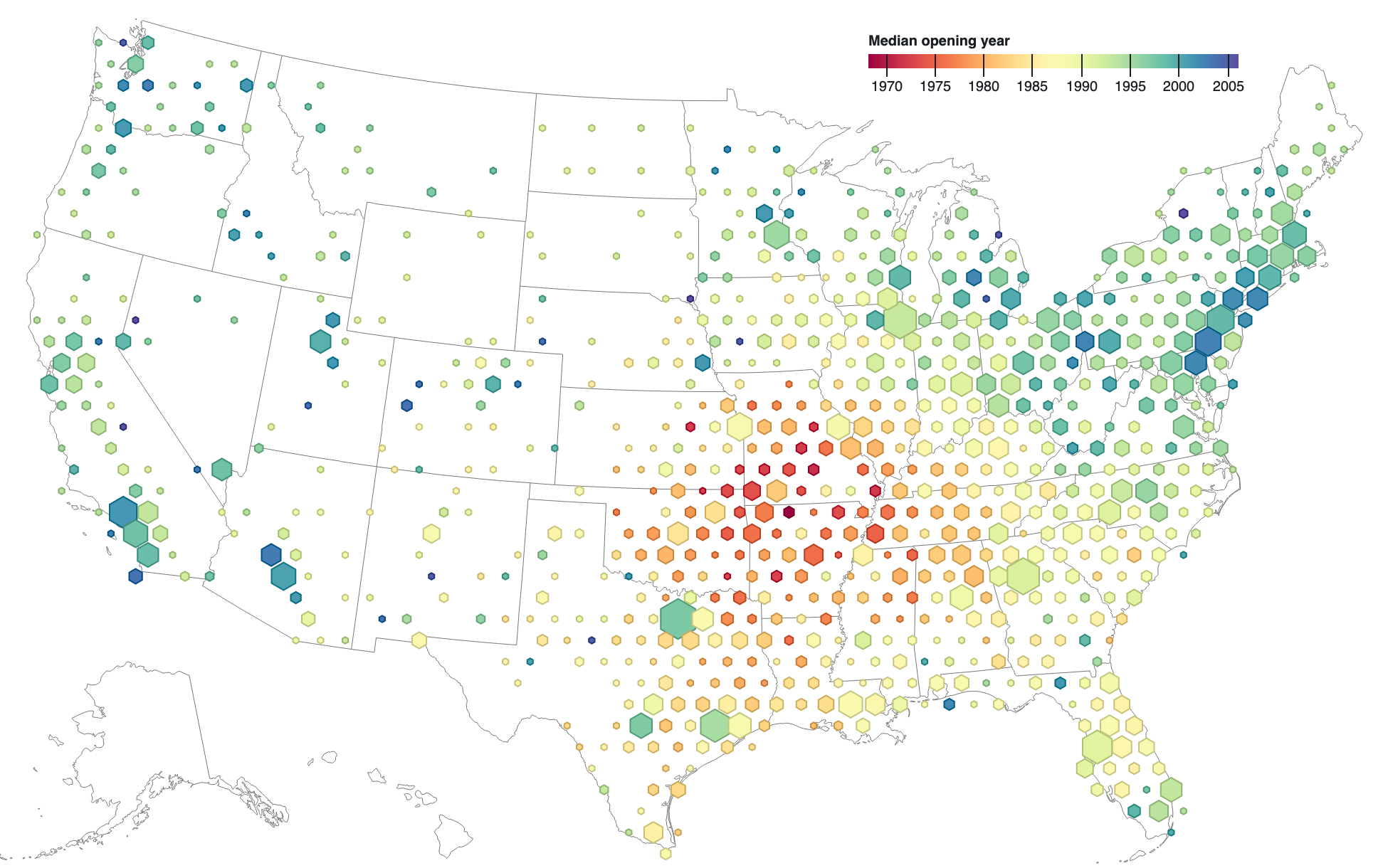
This map shows approximately 3,000 locations of Walmart stores. The hexagon area represents the number of stores in the vicinity, while the color represents the median age of these stores. Older stores are red, and newer stores are blue Source: Mike Bostock @ Observable https://observablehq.com/@d3/hexbin-map
Accuracy is overrated
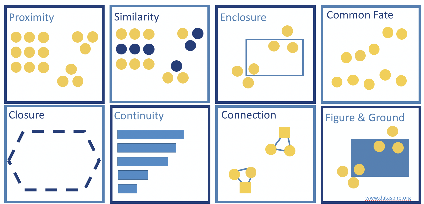
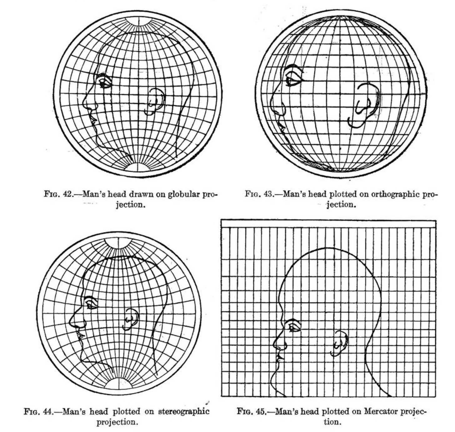
Source: Deetz and Adams (1921)
Precision even more so!
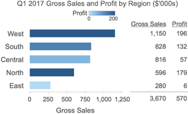
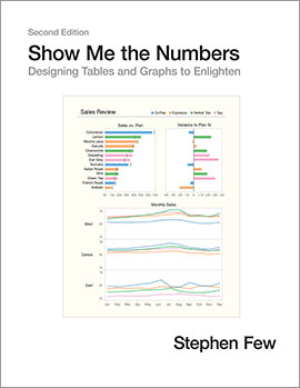
Source: Few (2017) https://www.perceptualedge.com/blog/?p=2596
Resources
Resources
Resources
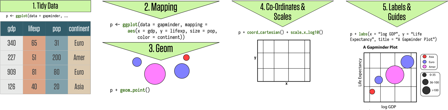
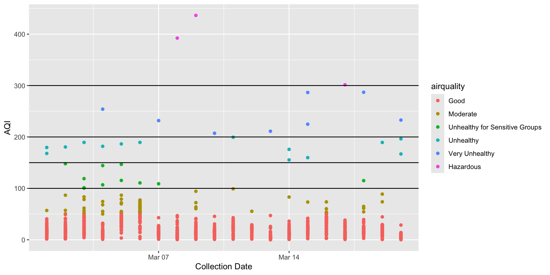
Grammar of Graphics
Grammar of Graphics
ggplot2
ggplot2
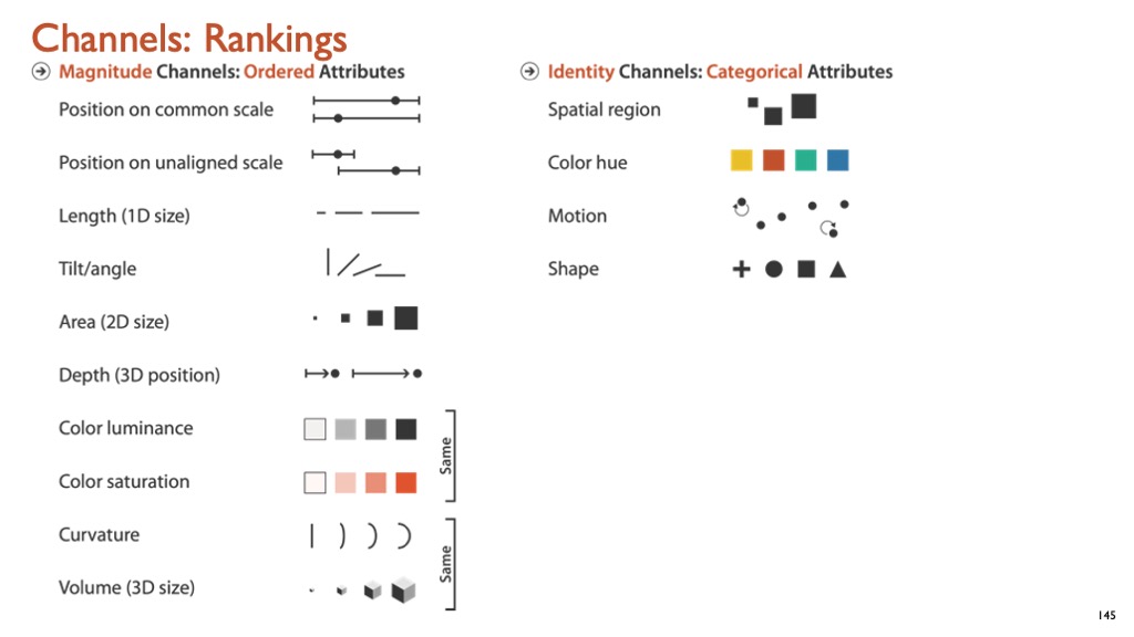
Source: Healey (2018)
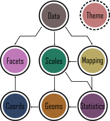
Framework
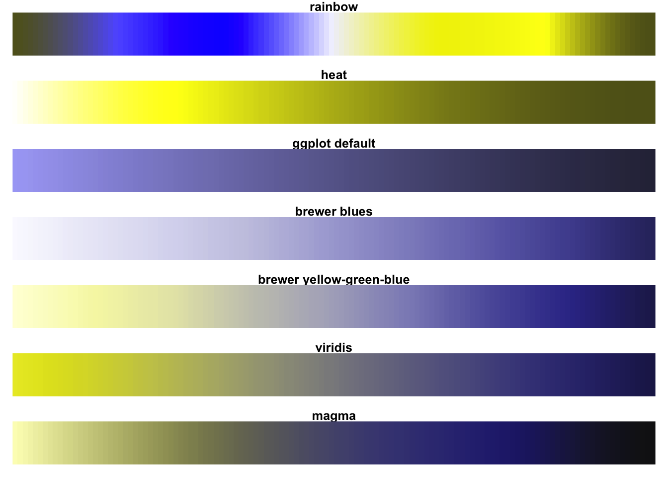
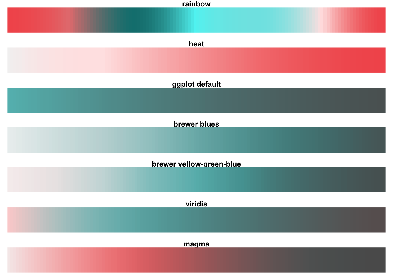
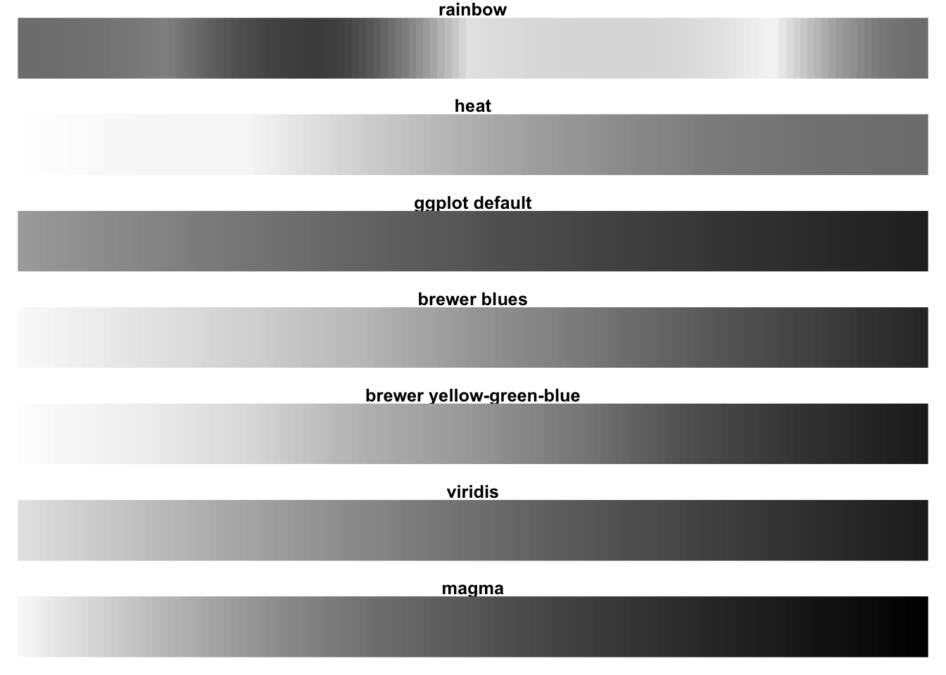
Mapping data (Channels)
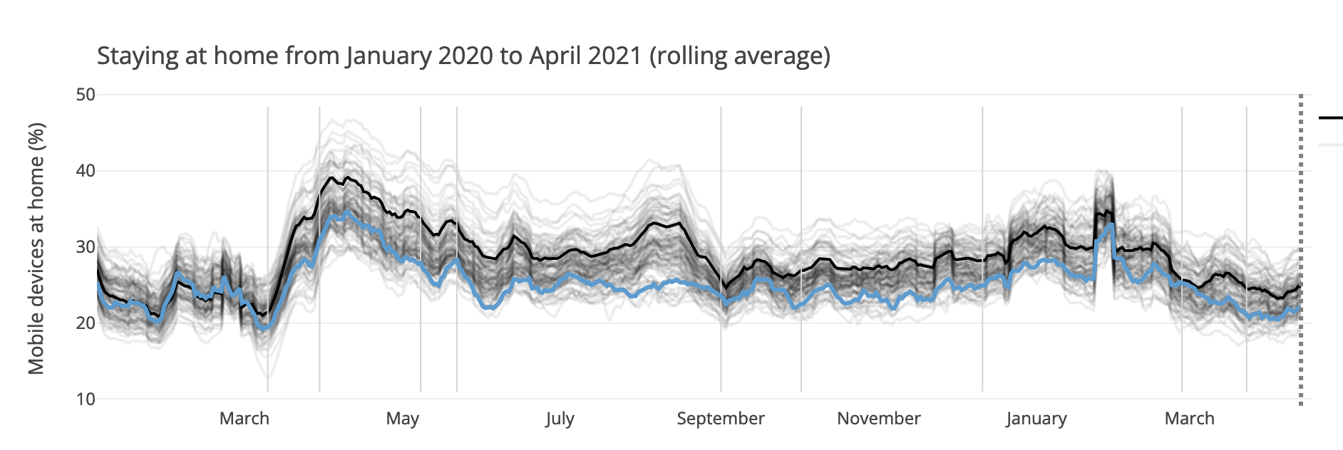
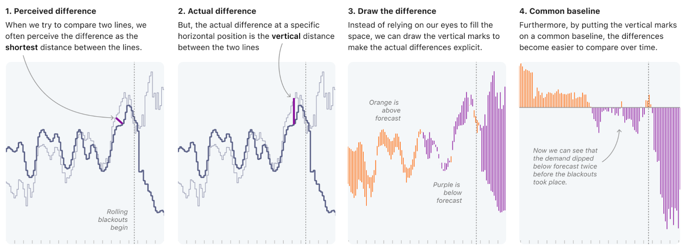
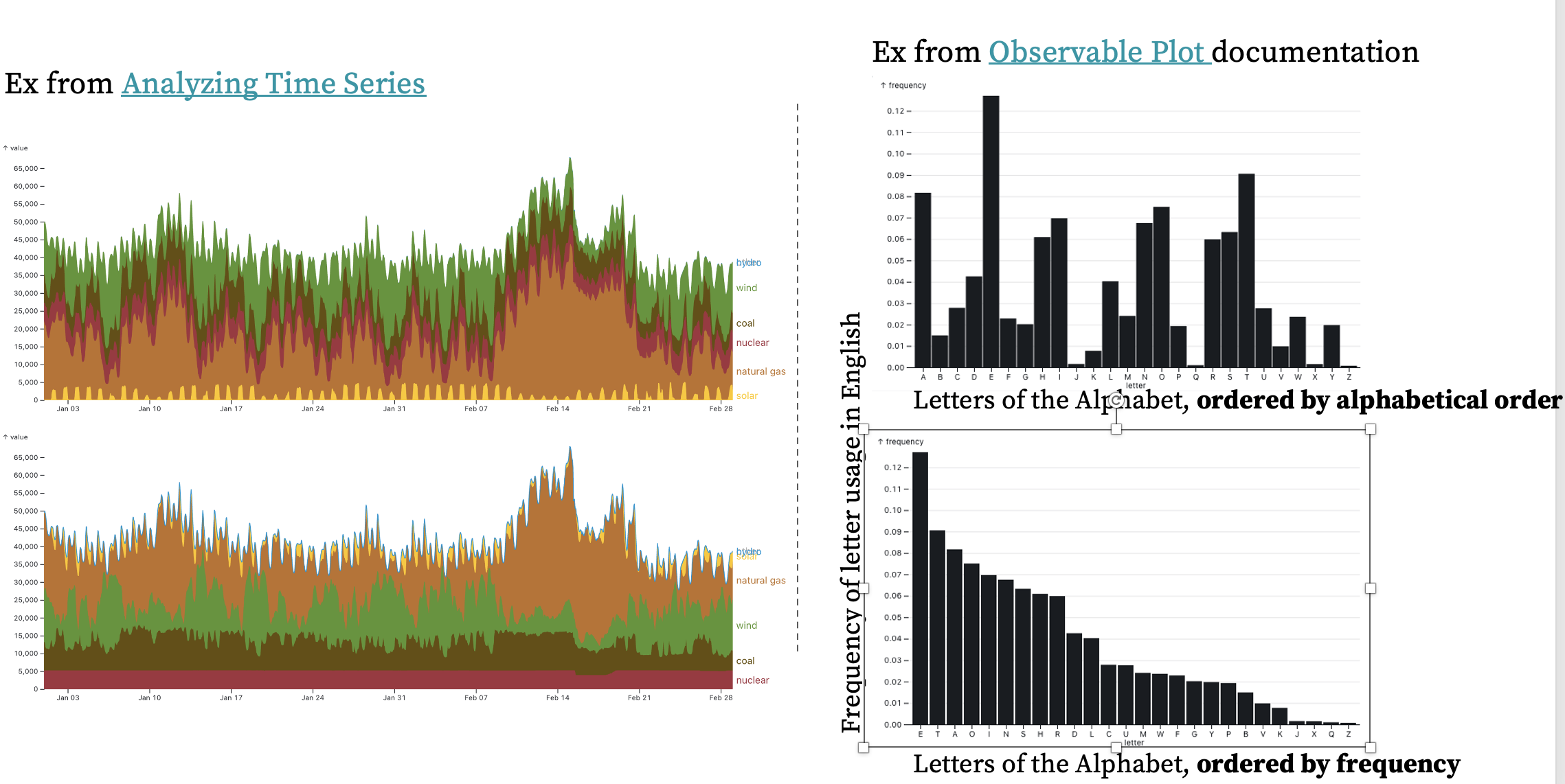
Encoding data into visual cues to highlight comparisons